
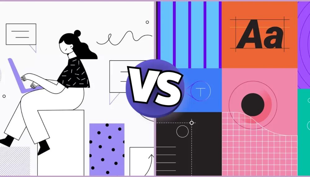
Design is everywhere in the world! When you use your favorite apps or visit websites, you see lots of shapes, colors, and pictures. This is called visual design. Good design makes things easy to understand and fun to use. Today, we are going to compare two popular design styles: flat design vs material design. Understanding these styles will help you appreciate the work that goes into making your favorite digital experiences look great!
Visual design plays a crucial role in how we interact with technology. Think about how you feel when you open an app that looks cluttered and confusing versus one that is clean and organized. The right design can make using an app enjoyable or frustrating. So, let’s dive deeper into flat design vs material design to see what makes them unique and how they affect our experience with technology.
Summary
The text discusses two popular design styles in visual design: flat design and material design. It explains their definitions, characteristics, advantages, and disadvantages, highlighting how each style affects user experience in digital applications.
Key Takeaways
- Flat Design:
- Emphasizes simplicity with bold colors and minimal elements.
- Lacks depth and visual hierarchy, which can confuse users about interactivity.
- Advantages include fast loading times and a clean, modern look.
- Material Design:
- Combines flat design principles with depth, layers, and animations to mimic real-world interactions.
- Provides clear visual cues and enhances user engagement through responsive animations.
- Disadvantages include potential complexity in development and longer loading times.
- Usage Recommendations:
- Flat design is suitable for simple apps focused on speed and text-heavy websites.
- Material design is best for interactive apps like games and social media that require user engagement.
What is Flat Design?
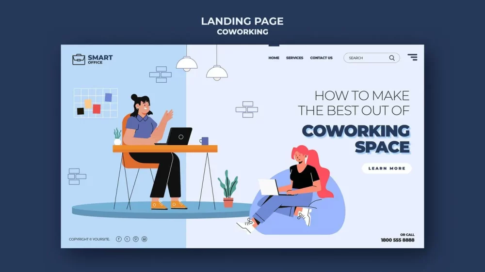
Flat design is a style that uses simple shapes and colors without any extra decorations. Let’s break it down further to understand what flat design is all about:
- Definition of Flat Design: Flat design is all about keeping things simple. It avoids shadows, gradients, and textures that can make elements look three-dimensional. Instead, flat design focuses on basic elements that communicate the message clearly without unnecessary distractions.
- Characteristics of Flat Design:
- Simplicity: Flat design is known for being simple and straightforward. There are no complicated patterns or designs that can confuse users. This simplicity allows users to focus on the content without being overwhelmed by too many visual details.
- Minimalism: This means using only what is necessary to convey information. If something isn’t needed, it’s not included. This approach helps create a calm and organized appearance, making it easier for users to find what they are looking for.
- Use of Bold Colors: Bright colors are often used in flat design to grab attention. These colors can evoke emotions and create a lively atmosphere. For example, a bright red button might make users feel excited to click it!
- Lack of Depth and Shadows: In flat design, everything looks like it’s on the same level, without any 3D effects. This can make the design feel more straightforward, but it may also lead to some confusion about what elements are interactive.
- Examples of Flat Design in Real Life: You can see flat design in apps like Instagram and websites like Dropbox. They use bright colors and simple icons that make everything easy to understand and navigate. For instance, Instagram’s user interface focuses on photo sharing with minimal distractions, allowing users to concentrate on the pictures themselves.
What is Material Design?
Material design is a different approach that was created by Google. It adds some special effects to make things feel more real and interactive.7 Best Agentic AI Platforms for Automating SMB Workflows
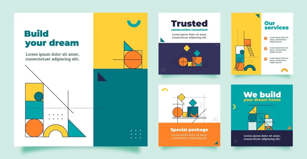
- Definition of Material Design: Material design combines the simplicity of flat design with depth and layers to create a more engaging experience. It aims to create a feeling of reality by mimicking how objects behave in the physical world.
- Origins of Material Design: Google introduced material design in 2014 to help developers create apps that look good and feel great to use. The goal was to create a unified experience across all devices, from smartphones to tablets to computers.
- Characteristics of Material Design:
- Use of Layers and Depth: In material design, elements can appear to float above one another, giving a sense of depth. This layering effect helps users understand the relationship between different components on the screen.
- Shadows and Lighting Effects: Shadows are used to show where something is placed in relation to other elements. For example, a button might have a shadow that makes it look like it’s hovering above the background, suggesting that it can be pressed.
- Grid-Based Layout: Material design encourages a layout based on a grid, which helps keep everything organized and aligned. This structure allows for a balanced look and makes it easier for users to navigate through information.
- Responsive Animations: When you interact with elements, such as clicking a button or swiping through images, they respond with smooth animations that make the experience feel alive. These animations provide feedback, letting users know that their actions have been recognized.
- Examples of Material Design in Real Life: Apps like Google Maps and Gmail use material design. You can see how buttons respond when you click them, making it clear that your actions have an effect. For example, when you tap on a location in Google Maps, the map smoothly zooms in, creating an enjoyable user experience.
Key Differences Between Flat Design and Material Design
Now that we know what each design style is, let’s look at how they differ in various aspects:
- Visual Differences:
- Color Usage: Flat design often uses bright, bold colors without any gradients or shading. In contrast, material design uses colors too but combines them with shadows and layers to create depth.
- Depth and Shadows: In flat design, everything looks flat, while in material design, shadows create the illusion of depth. This difference helps users understand which elements are interactive in material design.
- User Experience Differences:
- Interaction Feedback: In material design, when you click a button, there may be an animation or change in color that shows you the button has been pressed. This feedback makes users feel more connected to their actions. Flat design may not provide this kind of feedback, which can leave users unsure if they’ve clicked something.
- Navigation Ease: Material design often makes navigation easier because visual cues help guide users through the app or website. The use of shadows and layers gives hints about where to click next, while flat design might require users to figure things out for themselves.
- Design Philosophy Differences:
- Each style has its own way of thinking about how to make things look good and work well. Flat design emphasizes simplicity and minimalism as essential values for effective communication. On the other hand, material design focuses on creating a realistic experience that mimics the physical world while still being digital.
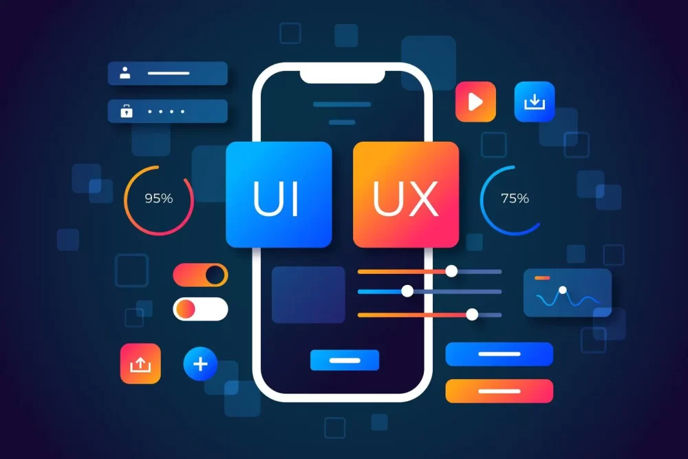
Pros and Cons of Flat Design
Let’s take a closer look at the good and bad sides of flat design:
- Advantages of Flat Design:
- Fast Loading Times: Because there are fewer graphics and effects in flat design, it can load faster on devices. This speed is especially important for users who may have slower internet connections or older devices.
- Clean and Modern Look: Many people find flat design visually appealing because it looks fresh and uncluttered. A clean interface can help users focus on the content without being distracted by unnecessary elements.
- Disadvantages of Flat Design:
- Lack of Visual Hierarchy: Sometimes it can be hard to tell which elements are most important since everything looks similar in flat design. Without clear visual cues like depth or shadows, users might miss vital information.
- Can Be Confusing for Users: Without shadows or depth to indicate interactivity, users might not know what they can click on or interact with in a flat-designed app or website. This confusion can lead to frustration when trying to navigate.
Pros and Cons of Material Design
Now let’s explore the pros and cons of material design:
- Advantages of Material Design:
- Clear Visual Hierarchy: The use of depth and shadows helps users see what’s important and what actions they can take. This clarity guides users through their experience more smoothly.
- Better User Engagement Through Animations: The animations make the app feel alive, which can keep users interested. When buttons respond with movement or changes in color, it creates an engaging experience that encourages exploration.
- Disadvantages of Material Design:
- Can Be More Complex to Implement: Developers may find it harder to create apps with all the animations and layers involved in material design. The added complexity can increase development time and costs.
- Potential for Slower Loading Times: Because there are more graphics and animations involved in material design, it can sometimes take longer to load compared to simpler flat designs. Users may become impatient if an app takes too long to open.
When to Use Each Design Style
Knowing when to use each style can help designers make better choices for their projects.Apple Watch Flashing Apple Logo: Causes, Solutions, and Prevention
- Situations Where Flat Design Works Best:
- Simple apps that need to load quickly benefit from flat design because it simplifies the interface while ensuring speed.
- Websites focused on text content rather than images may also prefer flat design for its clean presentation.
- Situations Where Material Design is More Suitable:
- Apps that require user interaction, like games or social media platforms, thrive with material design because it enhances engagement through feedback and animations.
- Websites where visual feedback is important for user engagement should consider material design’s layered approach for better navigation.
Conclusion
In this blog post, we’ve learned about two popular design styles: flat design and material design. Flat design is simple and clean, while material design offers depth and interactivity. Each style has its own advantages and disadvantages, making them suitable for different situations.
If I had to choose one style over the other for specific applications, I would recommend material design for apps requiring user interaction because it helps guide users through their experience with clarity and engagement. However, flat design can be a great choice for quick-loading websites that prioritize content over complex visuals.
As technology continues to evolve, both flat and material designs will likely grow and change as well. It will be exciting to see how designers combine these styles to create even better experiences for us all! With new tools and techniques emerging every day, we might discover fresh ways to utilize these designs in our favorite apps and websites.
How to Monetize 1 Million Views on TikTok Money: A Step-by-Step Guide