Designers often mistake “accessible” for “boring.” They assume that meeting WCAG standards means sticking to the dry, overused system fonts of the early 2000s. In 2026, that excuse no longer holds water.
Typography dictates how a user navigates your interface, absorbs your message, and perceives your brand. If your text is a struggle to read, your site is broken. Whether you are building a high-performance SaaS dashboard or a minimalist portfolio, choosing the right typeface is a fundamental UX decision.
In this guide, we bypass the generic recommendations and focus on high-performance, open-source sans-serifs that combine aesthetic polish with rigorous accessibility standards.
Why Accessible Typography is Non-Negotiable in 2026
Accessibility isn’t a “nice-to-have” feature; it is a legal and ethical requirement. With the European Accessibility Act and updated ADA enforcement in the US, 2026 marks a turning point where digital exclusion carries real legal consequences.
Inclusive design is a powerful tool for boosting SEO beyond the courtroom. Search engines track user signals like time-on-page and bounce rate. When users with visual impairments or cognitive differences can easily consume your content, your engagement metrics soar. Accessible fonts improve readability for everyone – including the millions of users viewing your site on small mobile screens in bright sunlight. To stay ahead, make sure to audit your full toolkit by reviewing our essential web design resources to ensure every asset meets these modern benchmarks.
Metro Style Pricing Table – Free PSD File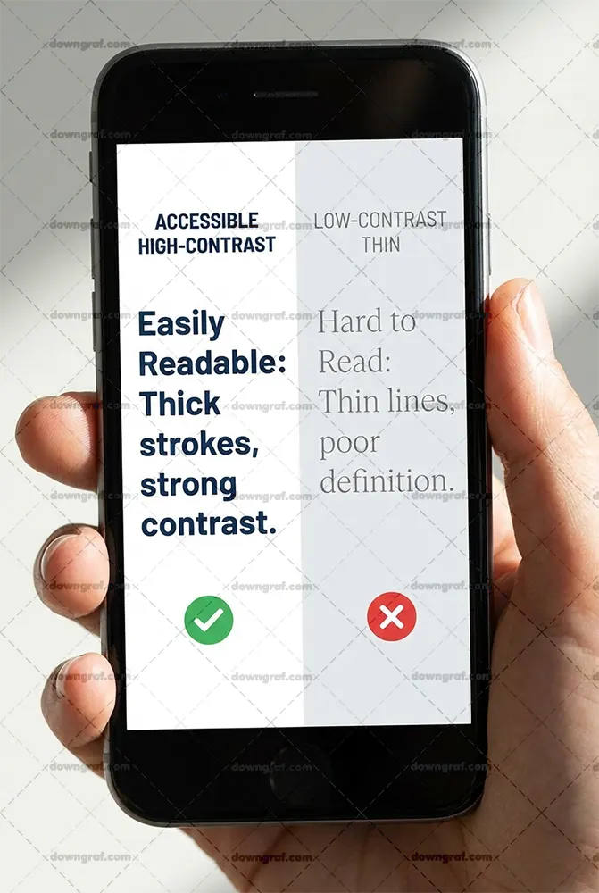
What Makes a Sans-Serif Font “Accessible”?
Not all sans-serifs are created equal. To pass a rigorous accessibility audit, a typeface must exhibit specific anatomical traits that aid the brain in processing characters quickly.
High X-Height and Open Apertures
The x-height refers to the height of the lowercase “x” relative to uppercase letters. Fonts with a generous x-height appear larger and clearer at small sizes. Equally important are open apertures – the gaps in letters like “c,” “e,” and “a.” Large apertures prevent these letters from looking like closed circles (an “o”) for users with low vision.
Character Distinctness (The I/l/1 Test)
A major pitfall in many “clean” fonts is character mirroring. In an accessible font, the uppercase “I,” the lowercase “l,” and the number “1” must look distinct. If they are all simple vertical lines, users with dyslexia or visual impairments will struggle to decode the text. The same applies to the “O” and the number “0.”
Best Fonts for Signs OutdoorWeight Versatility (Avoid Ultra-Thin)
While ultra-light weights look elegant in a high-fashion magazine, they disappear on low-resolution screens. Accessible sans-serifs provide a wide range of weights, from regular to bold, that maintain their structural integrity across different pixel densities.
The Top Free Accessible Sans-Serif Fonts for Web Design
We’ve curated this list based on legibility tests, OpenType features, and real-world performance.
1. Inter (The Modern Standard)
Inter was designed specifically for computer screens. It features a tall x-height and exceptional letter spacing. Inter includes “contextual alternates” that allow you to swap out characters to improve the distinctness of the “I” and “l.”
35 Free Checkout and Delivery Icons (AI, EPS, SVG, Sketch, PSD, PNG)- Distinctness Score: 10/10
- Best For: Complex UI, SaaS dashboards, and body text.
2. Raleway (Best for Elegant UI)
If you need a typeface that feels sophisticated without sacrificing clarity, look no further. You can download the elegant Raleway font family to bring a touch of class to your headings and subheadings.
While its lighter weights are popular, the medium and bold weights are remarkably sturdy for web use. Its unique “W” and “A” characters provide visual anchors that help guide the eye across the page, making it a favorite for lifestyle and high-end brand projects.
3. Public Sans (The Government-Grade Choice)
Developed by the US General Services Administration, Public Sans is a fork of Libre Franklin designed for maximum neutrality and readability. It is “government-grade” because it was built specifically to be accessible to every citizen, regardless of their device or ability.
JQuery Mask Plugin by Igor Escobar- Distinctness Score: 9/10
- Best For: Long-form articles and institutional websites.
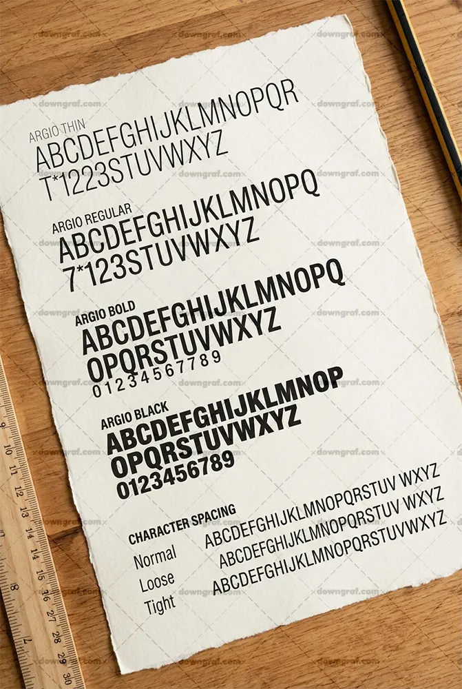
4. Argio (Best for Modern Branding)
Finding a geometric font that remains accessible is a challenge. Many geometric fonts suffer from circular characters that look too similar. However, the Argio free sans-serif font family solves this with its clear geometric clarity and generous open spacing.
Argio manages to feel modern and “tech-forward” while maintaining the open apertures necessary for readability. It’s an excellent choice for branding projects where you want a minimalist look that still passes WCAG 2.1 audits.
5. Geist (The Developer’s Choice)
Released by Vercel, Geist is a font designed for the developer ecosystem. It emphasizes precision and readability in code and documentation. Its strict adherence to a grid makes it incredibly legible even at very small font sizes, such as 12px or 14px.
6. Mona Sans (Industrial Strength)
Mona Sans is a variable font available on GitHub. Because it is a variable font, it allows for “fluid” weight adjustments, giving developers total control over the contrast and emphasis of the text. Its slightly wide stance makes it very easy to read in high-density information environments.
7. Lexend (Specifically for Readability)
Lexend was designed with a specific mission: to reduce visual stress and improve reading speed. Based on research regarding dyslexia and “visual crowding,” Lexend offers different series with varying widths and spacing. It is perhaps the most scientifically “accessible” font on this list.
| Font Name | I/l/1 Test | O/0 Test | X-Height | Verdict |
|---|---|---|---|---|
| Inter | Pass | Pass | High | Best All-Rounder |
| Public Sans | Pass | Pass | Medium | Most Stable |
| Raleway | Pass | Pass | High | Most Stylish |
| Argio | Pass | Pass | High | Best Geometric |
| Lexend | Elite | Elite | High | Best for Dyslexia |
Technical Implementation Checklist for Developers
Choosing the font is only half the battle. How you implement that font in your CSS determines whether your project is actually accessible.
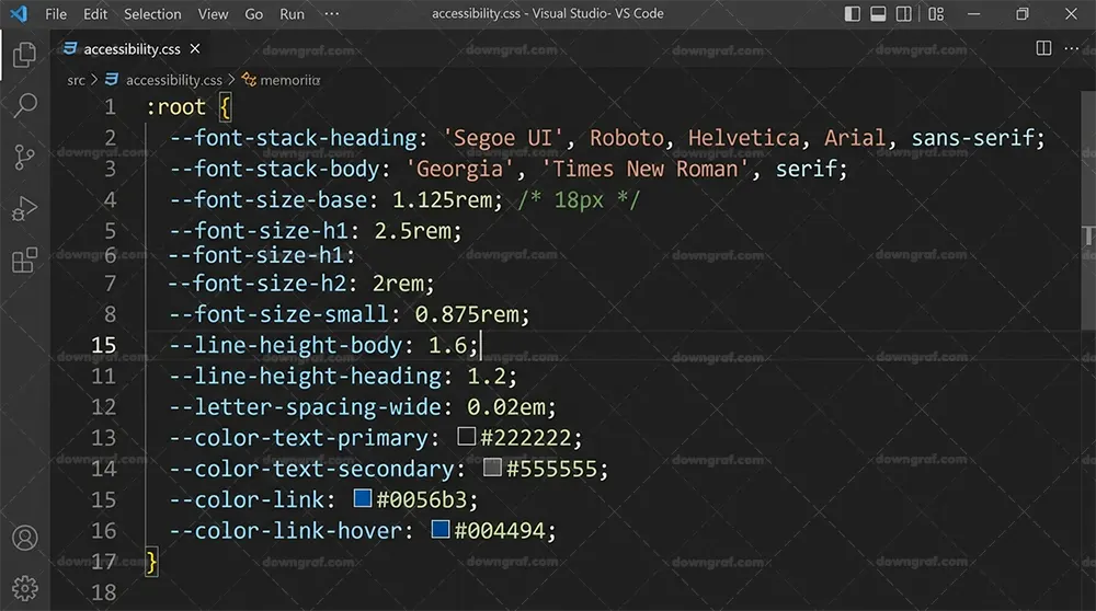
Use Relative Units (rem)
Avoid using pixel (px) font sizes. Using rem (root em) ensures that if a user has changed their default browser font size for accessibility reasons, your website will scale accordingly.
- Standard: 1rem is usually equal to 16px.
Optimize Line-Height
The British Dyslexia Association and WebAIM recommend a line height of at least 1.5 times the font size. This prevents “lines of text from blurring together” for users with visual impairments.
.accessible-text {
  font-family: 'Inter', sans-serif;
  font-size: 1.125rem; /* 18px */
  line-height: 1.6;
  letter-spacing: 0.01em;
}
Contrast Ratios
WCAG 2.1 Level AA requires a contrast ratio of at least 4.5:1 for normal text and 3:1 for large text. Before finalizing your brand colors, run your font and background combinations through the WCAG Contrast Checker.
Limit Line Length
For maximum readability, keep your text containers between 45 and 75 characters wide. Lines that are too long tire the eye, while lines that are too short break the flow of reading.
Frequently Asked Questions (FAQ)
What is the most accessible font for dyslexia on the web?
Lexend and OpenDyslexic are often cited, but clean humanist sans-serifs like Inter and Public Sans also perform exceptionally well due to their character distinctness.
Are there free ADA-compliant fonts?
Yes. ADA compliance is less about the specific font name and more about the legibility, size, and contrast. All fonts listed in this guide—including Inter, Raleway, and Argio—can be used in ADA-compliant designs.
Is Arial or Verdana more accessible?
Verdana is generally considered more accessible than Arial because it has a larger x-height and wider letter spacing, which prevents characters from touching on low-resolution screens.
Conclusion: Balancing Aesthetics and Accessibility
In 2026, the gap between “good design” and “accessible design” has disappeared. Using high-performance typefaces like the Argio free sans-serif font family or the Inter family allows you to build interfaces that are both visually stunning and universally usable.
Remember, accessibility is not a checkbox you hit at the end of a project. It is a mindset that begins with the very first typeface you choose. By prioritizing legibility, character distinctness, and proper technical implementation, you ensure that your web projects are ready for every user, on every device.