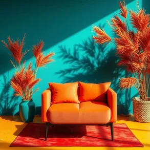
Most monochrome rooms fail for one boring reason: people pick one pretty color and repeat it until the space feels flat. Monochromatic Color Scheme Interior Design works only when you treat one color like a full cast of characters, not a single paint swatch.
You have seen the bad version. A beige sofa, beige walls, beige rug, beige curtains, and suddenly the room looks like it lost its pulse. The idea sounds safe, but the result can feel oddly tense, like nobody wants to touch anything.
The good version feels different the second you walk in. Your eyes rest, then start noticing details: a ribbed cabinet door, a wool throw, a glossy lamp, the tiny shadow under a chair leg. One color can do a lot when you give it work.
Why Monochromatic Color Scheme Interior Design Feels Fresh Again
A monochromatic room uses one main color family, then builds interest through lighter tones, darker shades, texture, finish, and shape. That sounds simple, but simple rooms expose every lazy choice. If the sofa looks cheap, the room tells on you immediately.
I used to tell nervous clients that monochrome was the safest path. But actually, it can become the riskiest one if you ignore contrast. A colorful room lets a wild pillow distract you. A monochrome room leaves nowhere for weak pieces to hide.
Discover the Hottest Fall Winter 2024 Color Trends Today!The reason it works now has less to do with trends and more to do with visual fatigue. Many people want calmer rooms because our screens already shout at us all day. A single color story gives the brain fewer decisions to process.
Research on color perception supports a practical truth designers know well: context changes everything. Josef Albers taught that one color can look different beside another. In interiors, the same greige wall shifts beside oak floors, white trim, black hardware, or sunset light.
Monochromatic Does Not Mean Matching Everything
Matching creates the showroom problem. The room looks arranged, but not lived in. Monochromatic Color Scheme Interior Design needs family resemblance, not identical twins. Think of navy, ink, denim, powder blue, blue-gray, and stormy slate sitting together at one table.
Black and White to Color Optical Illusion: Science, Creation & Viral Trends 2026If you choose green, for example, you can mix sage walls, olive linen, eucalyptus-toned tiles, moss velvet, and deep forest trim. None of those pieces need to match exactly. They just need to speak the same color language without fighting.
The mistake happens when people hold every sample against one paint card and panic if it differs. Real homes do not work that way. Light changes color by the hour. A north-facing room cools everything down. A west-facing room warms it late.
You want variation because variation makes the room feel honest. Think about your favorite worn sweatshirt after many washes. It probably has lighter seams, darker folds, and a soft fade at the cuffs. That quiet unevenness makes it feel human.
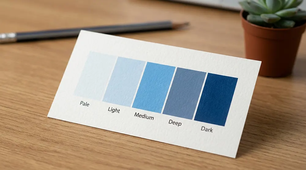
144 Different Shades Of The Color Blue With Their HEX CodesThe One Rule That Matters Most: Value Contrast
If you remember only one design rule from this article, remember value contrast. Value means how light or dark a color appears. You can use one hue across a room, but you still need pale, middle, and deep versions.
A cream room needs walnut legs, shadowy art lines, woven baskets, smoked glass, or darker stone. A blue room needs pale sky walls, mid-tone upholstery, and navy accents. A pink room needs blush, rose, clay, and maybe oxblood.
Without value contrast, your furniture blends into the walls. Your art loses its edge. Your floor starts floating in a weird way. The room may still look expensive in a photo, but in person it feels like walking into fog.
New Color Shades With Name That Will Make You Look TwiceThis matters most in open spaces. I once worked on a small apartment where the owner wanted everything warm white. The fix did not require color. We added a darker jute rug border, tan leather dining chairs, and blackened bronze picture frames.
How to Build a Monochromatic Room Without Making It Dull
Start with the permanent surfaces. Floors, tile, countertops, built-ins, and large rugs set the real color story. Paint can change in a weekend, but nobody wants to replace a stone countertop because the undertone clashes with the sofa.
Next, choose your anchor tone. This might come from a favorite chair, a rug, a tile, or the wood floor. Do not start with a random paint chip under store lighting. Bring samples home and read them in your actual room.
Here is a simple room recipe I use when clients feel stuck:
- Pick one main hue, such as green, blue, brown, cream, or terracotta.
- Choose one pale version for large surfaces like walls or curtains.
- Add one middle tone through upholstery, cabinetry, or a large rug.
- Add one deep tone through frames, lamps, legs, shelves, or trim.
- Mix at least three textures: matte, woven, and smooth.
- Keep one metal finish quiet and repeated in small places.
- Test every sample in morning light, afternoon light, and lamplight.
That recipe saves you from the “one-note” problem. It also helps you shop better. Instead of buying random pretty things, you start asking sharper questions: Is this too close to the wall color? Does this add texture? Does it create a shadow?
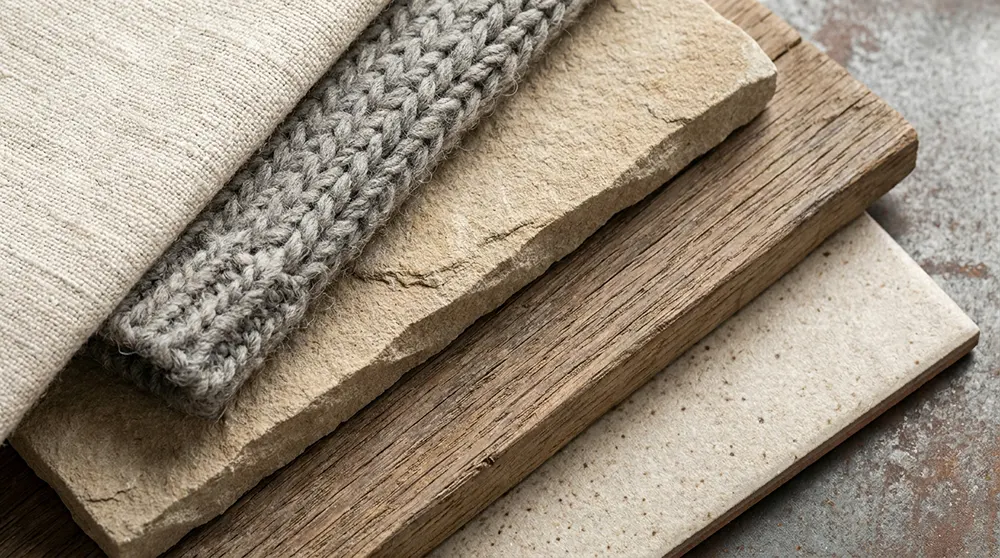
Texture Carries the Room When Color Steps Back
Texture does the heavy lifting in a monochrome space. A room with linen curtains, plaster walls, velvet cushions, leather straps, wool rugs, glazed ceramics, and ribbed glass can use one color family and still feel layered.
Flat paint beside flat cotton beside flat laminate creates trouble. Your eye finds no place to pause. Add nubby fabric, honed stone, fluted wood, bouclé, grasscloth, rattan, or handmade tile, and the same color suddenly feels richer without getting louder.
Finish matters too. A matte wall absorbs light. A satin cabinet bounces it softly. A glossy side table throws a tiny highlight across the room. These shifts create movement. You do not need another color if the surfaces already change.
Expert Tip: Test the Room After Sunset
💡 A monochromatic room can look perfect at noon and completely wrong at 8 p.m., so test every major color under the lamps you actually use.
Night light exposes weak undertones. Warm bulbs can turn white walls yellow. Cool bulbs can make taupe look gray and tired. Before you commit, tape samples near corners, beside trim, behind the sofa, and next to flooring. Then look again after dinner.
This small step prevents expensive regret. I care more about evening tests than store samples because people live at home after work, not under bright retail lights. The lamp beside your sofa tells the truth, especially on rainy days.
The Modern Way to Use Neutrals in Monochromatic Color Scheme Interior Design
Neutral monochrome rooms still dominate because they feel easy to live with. But the best ones now avoid cold, blank whiteness. They use oatmeal, sand, mushroom, putty, camel, coffee, bone, chalk, stone, and soft black in measured layers.
Warm neutrals suit homes with wood floors, brass, linen, terracotta, and natural fiber rugs. Cool neutrals suit concrete, chrome, blackened steel, pale oak, and marble. Neither choice wins automatically. Your house usually tells you which direction makes sense.
The undertone decides everything. Beige can lean pink, yellow, green, or gray. White can look creamy, blue, or stark. Gray can feel calm in one room and gloomy in another. Always compare samples against flooring, not against a blank white paper.
A neutral monochromatic room also needs one living element. Fresh branches, a bowl of pears, a clay pot, or even the soft mess of stacked books can stop the room from feeling staged. Perfect rooms often feel less welcoming than slightly imperfect ones.
Colorful Monochrome Rooms Can Feel Grown-Up Too
People often connect monochrome with beige, but colored rooms can feel just as refined. A deep green study, a smoky blue bedroom, or a burgundy dining room can feel calm when the color stays controlled and the shapes stay clean.
The secret lies in restraint. If you choose blue, do not add every blue object you see. Choose blue with gray in it, or blue with green in it, then stay near that lane. Random bright blue will break the mood.
Bedrooms handle monochrome color especially well because the eye wants rest there. Try dusty lavender with plum shadows, soft blue with ink accents, or muted rose with clay and brown. Avoid high-energy tones if you struggle to sleep.
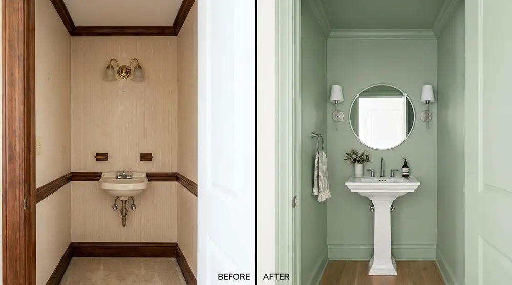
Bathrooms also love this approach. One tile color across walls and floor can make a small bath feel larger, but grout, scale, and finish must differ. Pair glossy wall tile with matte floor tile so the surfaces do not blur together.
When a Monochrome Room Needs One Break
Here is the contradiction people rarely say out loud: a monochromatic room often needs one thing that does not match. Not a loud accent wall. Not a random red chair. Just one honest break that sharpens the whole room.
That break might be black picture frames in a cream room, unlacquered brass in a green kitchen, or a dark wood table in a pale blue dining nook. It gives your eye a point of reference, like punctuation in a quiet sentence.
Use the break sparingly. If every object becomes an “accent,” you no longer have a monochromatic room. You have a room that changed its mind halfway through. One or two steady contrast points usually work better than five clever surprises.
Small Rooms Often Benefit the Most
Small rooms can handle monochromatic design better than many people think. When walls, trim, curtains, and large furniture stay in one color family, the eye moves around the room with fewer stops. That can make tight spaces feel calmer.
Powder rooms, hallways, reading corners, and compact bedrooms all respond well to this trick. Paint the trim the same color as the wall, but change the finish. Use matte on walls and satin on trim for a quiet shadow line.
Do not fear darker monochrome in a small room. A deep chocolate powder room or charcoal den can feel intentional, not cramped, when lighting, mirrors, and texture support it. Small spaces sometimes look better when you stop pretending they are large.
One small detail people forget: switch plates. A bright white plastic switch on a deep olive wall can ruin the spell. Paintable covers, aged metal plates, or color-matched options keep the room from getting interrupted by tiny rectangles everywhere.
Common Mistakes That Make Monochrome Rooms Look Cheap
The first mistake is buying everything from one collection. Matching sofa, chair, table, rug, and cushions may look easy, but it drains personality from the room. Good interiors need tension. They need a little age, a little contrast, and one odd note.
The second mistake is ignoring scale. If every pattern and texture has the same size, the room feels busy even with one color. Pair chunky weave with fine linen, large artwork with small ceramics, and wide plank flooring with slim metal.
The third mistake is forgetting negative space. Monochrome rooms need breathing room because every object contributes to the color story. If you pack shelves with too many similar items, the room turns muddy. Leave gaps. Let a wall show.
The fourth mistake is chasing a photo without checking your own light. A milky white room in a sunny Los Angeles house may look dull in a cloudy basement apartment. Copy the principle, not the exact paint name.
How to Choose Paint for a Monochromatic Interior
Paint should support the room, not boss it around. Start with fabric, flooring, or stone, then choose paint that respects those fixed materials. Designers often build palettes from the most expensive surface because changing paint costs far less than changing floors.
Test large samples, not tiny squares. Paint at least two coats on poster board or peel-and-stick samples, then move them around. Check beside windows, near doorways, behind furniture, and in corners. Corners reveal undertones faster than open walls.
If you want a soft look, paint trim and walls in close tones. If you want sharper architecture, make trim slightly darker or lighter. Ceiling color also matters. A white ceiling can look harsh if the rest of the room feels warm.
For cabinetry, choose the finish carefully. Matte cabinets can look beautiful but show fingerprints in busy kitchens. Satin often forgives daily use better. In family homes, beauty should survive backpacks, cereal dust, wet dog paws, and somebody’s forgotten coffee mug.
Monochromatic Color Scheme Interior Design for Different Rooms
In living rooms, use the sofa as the anchor. Large upholstery takes up visual space, so let it guide the palette. A taupe sofa can lead to mushroom walls, espresso tables, oatmeal curtains, and dark bronze lighting without adding another hue.
In kitchens, repeat color through cabinets, tile, stools, and hardware, but keep countertops slightly distinct. A fully green kitchen can look rich when the stone has soft veining and the hardware has enough contrast to read clearly.
In bedrooms, let fabric lead. Bedding, curtains, rugs, and upholstered headboards soften color better than paint alone. If the walls feel too strong, bring in lighter bedding. If the room feels weak, add deeper lampshades or darker bedside tables.
In dining rooms, monochrome can create intimacy. Deep red-brown, olive, or charcoal walls work well with dimmable lighting and simple table settings. The room should flatter faces, food, and conversation. If everyone looks tired under the bulbs, change them.
Budget-Friendly Ways to Try the Look First
You do not need to repaint the whole house. Start with one corner. Choose a chair, throw, pillow, lamp, and art piece in related tones. If the corner feels better after a week, you can trust the direction.
Curtains make a huge difference because they cover vertical space. Hang them high and choose a tone close to the wall for softness, or slightly deeper for shape. Even inexpensive curtains look better when they reach the floor properly.
Paint also offers a low-cost test. Try a hallway, bookcase interior, bathroom vanity, or bedroom wall before committing to larger rooms. Smaller experiments teach you how your home handles color, light, dust, fingerprints, and daily mess.
If you rent, use textiles and removable pieces. Rugs, bedding, art, lampshades, peel-and-stick panels, and storage baskets can build a color story without touching the lease. You can still create a strong monochrome room without painting a single wall.
FAQs
What is monochromatic color scheme interior design?
Monochromatic color scheme interior design uses one main color family across a room, then creates depth with light tones, dark shades, texture, finish, and material. It does not mean every item matches. The best rooms vary enough to feel natural.
Does a monochromatic room need an accent color?
Not always. Many monochromatic rooms look better without a separate accent color. They still need contrast, though. You can create contrast through black frames, dark wood, brass, shadow lines, woven texture, stone veining, or a deeper shade of the same hue.
What colors work best for monochromatic interiors?
Neutrals work well because people live with them easily, but blue, green, terracotta, plum, and brown also work beautifully. The best color depends on your light, flooring, furniture, and mood. Test samples at home before you choose.
Can monochromatic design make a room look bigger?
Yes, it can help small rooms feel calmer and more open because the eye sees fewer breaks. For the best effect, keep walls, trim, curtains, and large furniture close in tone, then add texture so the space still feels layered.
How do I stop a monochromatic room from looking boring?
Use value contrast, varied textures, mixed finishes, and strong shapes. Pair matte with glossy, soft with rough, light with dark, and large pieces with smaller details. A boring monochrome room usually lacks contrast, not color.
Is monochromatic interior design still popular now?
Yes, but the newer version feels warmer, more tactile, and less sterile than older all-white rooms. People want calm spaces, but they also want personality. That balance explains why monochromatic rooms still feel relevant in modern homes.
The Quiet Room That Still Has a Pulse
A good monochrome room does not beg for attention. It slows the room down, lets materials speak, and gives your eye small rewards as you move.
If your space feels noisy, start with one color family and build depth before adding more. That is how Monochromatic Color Scheme Interior Design works now.