Colors are a fundamental aspect of the human experience, influencing everything from art to emotions. One intriguing question often arises in color theory: What color does red and green make? The answer depends on the context and medium in which you mix these two colors. In light, red and green combine to create yellow through additive color mixing, which governs how digital screens and lighting work. On the other hand, when mixing paint or pigments, red and green create a shade of brown due to subtractive color mixing. This article explains the science behind these processes, discusses real-world applications, and explores how factors like shades, intensity, and proportions affect the final color. Whether you are an artist, designer, or simply fascinated by the magic of colors, this guide will help you understand the nuances of mixing red and green.
How Does Color Mixing Work?
Color mixing is the process of combining two or more colors to create a new one. However, the result of this process depends entirely on the mixing method, which can be broadly categorized into two systems: additive and subtractive.
Additive Color Mixing
Additive color mixing happens when colored light is combined. This system is commonly used in digital screens, theater lighting, and other contexts involving light. In this system, the primary colors are red, green, and blue (RGB). By adding different wavelengths of light, new colors are created.
For example:
- When red and green light overlap, their wavelengths combine to produce yellow.
- Adding blue light to the mix creates white light, as all three primary colors combine.
HEX Code Tip:
Discover the Hottest Fall Winter 2024 Color Trends Today!- Red + Green Light = Yellow Light
- HEX code for pure yellow (additive mixing):
#FFFF00
- HEX code for pure yellow (additive mixing):
- Red Light:
#FF0000 - Green Light:
#00FF00
Subtractive Color Mixing
Subtractive color mixing, on the other hand, occurs when pigments or paints are combined. This system is often used in traditional art and printing. The primary colors in the subtractive system are cyan, magenta, and yellow (CMY).
Mixing pigments works by subtracting (absorbing) certain wavelengths of light and reflecting others.
- When red and green paint are mixed, the pigments absorb more light, and the result becomes a muddy brown color.
HEX Code Tip:
Rediscover the 50 Shades of Red With Colour Shades Red!- Red + Green Paint = Brown Paint
- Typical brown (from red + green):
#8B5C2D
- Typical brown (from red + green):
- Bright olive brown (more lime/green):
#808000 - Dark brown (deep tones):
#3D2B1F
Expert Answer
Dr. David Briggs, color theorist (National Art School, Sydney), explains:
“The outcome of mixing red and green depends entirely on the context—additive or subtractive. On screens (additive), red and green emit light that our eyes interpret as yellow—specifically RGB yellow (#FFFF00). With paints (subtractive), the mixture absorbs much of the spectrum, resulting in a brown that can vary depending on specific pigments but usually falls close to#8B5C2D. Artists leverage these principles to achieve both vivid brightness in digital media and natural earth tones in painting.”Reference: Briggs, D. (2024). “The Dimensions of Colour,” National Art School.
What Color Does Red and Green Make in Light?
When red and green light are mixed, the result is yellow. Additive color mixing governs this outcome, as wavelengths of light combine to create new colors.
New Color Shades With Name That Will Make You Look TwiceWhy Does Red and Green Make Yellow?
The human eye perceives color through three types of photoreceptor cells (cones), each sensitive to red, green, or blue wavelengths. When red and green light combine, they stimulate both the red and green cones in your eye. Therefore, your brain interprets this overlap as yellow.
For instance, if you look at a digital screen, it uses tiny red, green, and blue pixels (known as subpixels). When the red and green subpixels light up together, they create the appearance of yellow.
HEX code for digital yellow: #FFFF00
This principle also applies to stage lighting. By shining red and green spotlights on the same area, lighting technicians achieve a bright yellow effect.
Variations in Yellow
The shade of yellow produced can vary depending on the intensity of the red and green light:
| Red & Green Ratio | Resulting Color | HEX Code |
|---|---|---|
| Equal intensity | Pure bright yellow | #FFFF00 |
| More Red | Orangish-yellow | #FFD700 |
| More Green | Yellow-green | #ADFF2F |
Additive mixing provides flexibility, making it a powerful tool for designers and lighting technicians.
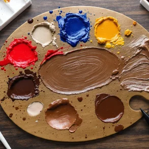
What Happens When You Mix Red and Green Paint?
When you mix red and green paint, the result is brown. Subtractive color mixing explains this outcome, as pigments absorb light rather than emit it.
Why Does Red and Green Make Brown?
Pigments work by absorbing certain wavelengths of light and reflecting others. When you combine red and green paint:
- The red pigment absorbs green and blue light, reflecting only red.
- The green pigment absorbs red and blue light, reflecting only green.
- When combined, the pigments absorb most wavelengths, leaving very little light to reflect. As a result, the mixture produces a neutral, earthy color—brown.
HEX code for typical brown: #8B5C2D
Variations in Brown
The exact shade of brown depends on several factors:
| Combination Example | Resulting Color | HEX Code |
|---|---|---|
| Bright red + lime green | Olive brown | #808000 |
| Dark red + deep forest green | Dark brown | #3D2B1F |
| Standard red + standard green (mid-values) | Medium brown | #8B5C2D |
Artists often use these variations to create depth and texture in their work. For example, mixing complementary colors like red and green helps them achieve natural tones for shadows or earthy backgrounds.
Can Red and Green Ever Make Other Colors?
While yellow (in light) and brown (in paint) are the most common results, red and green can produce other colors in certain situations.
In Light
Adjusting the intensity of red and green light can create a range of hues. For instance:
- A stronger red component may result in an orange-leaning yellow (
#FFD700). - A brighter green component might produce a yellow-green hue (
#ADFF2F).
In Paint
The type of red and green paint used plays a significant role. For example:
- Mixing a cool red (such as crimson) with a yellow-green can produce a muted olive tone (
#808000). - Combining a warm red (such as vermilion) with a bluish-green may result in a charcoal-like grayish-brown (
#6E6656).
In Filters or Transparent Mediums
When you mix transparent materials like colored glass or dyes, red and green can create unique colors due to how light passes through the medium. For example, a red and green transparency may appear yellow or amber (#FFBF00).
Why Does the Medium Matter?
The medium—whether light, paint, or another material—determines how colors interact and what final color is produced.
| Medium | Process | Result | Typical HEX Code |
|---|---|---|---|
| Light | Additive | Yellow | #FFFF00 |
| Paint | Subtractive | Brown | #8B5C2D |
| Transparent | Transmission | Amber | #FFBF00 |
Light (Additive Mixing): Adding more light creates brighter colors. Red and green light combine to form yellow because their wavelengths overlap in a way that stimulates the eye to perceive yellow.
Paint (Subtractive Mixing): Adding more pigment creates darker colors. Red and green paint mix to brown because the pigments absorb most wavelengths of light rather than reflecting them.
Other Mediums: Certain materials, like stained glass or colored gels, blend colors differently because of how they transmit or reflect light.
Practical Applications of Mixing Red and Green
Understanding how red and green interact has a variety of practical applications:
- Art and Design: Artists mix red and green paint to create neutral tones for shading, shadows, and earthy textures.
- Graphic Design: RGB principles allow digital artwork creation; yellow (
#FFFF00) is made from combining red & green pixels. - Digital Media: Additive mixing is used in screens.
- Stage Lighting: Lighting technicians mix red & green spotlights for vibrant yellow (
#FFFF00) effects on stage. - Printing: Subtractive mixing allows full-color prints using CMY primaries.
- Education & Science: Color theory education; optical sciences use additive/subtractive principles.
Common Misconceptions About Mixing Red and Green
- “Red and Green Always Make Yellow”: Only true in additive mixing (light). In subtractive mixing (paint), the result is brown.
- “All Shades of Red and Green Mix the Same Way”: The outcome depends on shades/proportions.
- “Color Mixing is Always Predictable”: Lighting conditions & pigment quality influence results.
FAQs
1. What color does red and green make in light?
Yellow (#FFFF00). This follows additive color mixing; digital screens use this principle.
2. What happens when you mix red and green paint?
Brown (#8B5C2D). This is due to subtractive color mixing—pigments absorb most visible light.
3. Why do red and green make yellow in light but brown in paint?
Because additive mixing adds wavelengths (producing brightness/yellow), while subtractive mixing absorbs them (creating darkness/brown).
4. Can red and green make any color other than yellow or brown?
Yes! Adjusting shades/intensities can give olive (#808000), amber (#FFBF00), orange-yellow (#FFD700), etc., depending on medium.
5. How does additive color mixing differ from subtractive color mixing?
Additive: lights combine to make brighter colors (screens/stage lights).
Subtractive: pigments absorb more wavelengths; result gets darker/earthier (paint/printing).
6. How do artists use this knowledge?
For creating vibrant effects digitally or naturalistic browns/olives in painting.
7. Are there any misconceptions about mixing red and green?
Yes; see above for details on medium differences & shade/intensity effects.
8. Can mixing red and green influence emotions or psychology?
Yes! Red = energy/passion; Green = calm/balance; Mixed browns/olives = stability/earthiness.
9. Why do colorblind people struggle to distinguish between red and green?
Colorblindness impairs cone cells for these colors; often both appear similar or dull/grayish.
10. Is it possible to mix red and green in fashion without looking festive?
Yes! Use muted shades (burgundy + olive), pair with neutrals—results are stylish without being seasonal.
Conclusion
The question “What color does red and green make?” has fascinating answers depending on context:
- In Light: Yellow (
#FFFF00) by additive color mixing. - In Paint: Brown (
#8B5C2D) by subtractive color mixing.
By understanding these principles—including expert insight—you can confidently use these combinations in art, design, stagecraft, or digital media for creative impact.