Fruit of the Loom has maintained a significant presence in the apparel sector for more than one hundred years. While their products have undoubtedly evolved with time, one thing has remained constant – the iconic Fruit of the Loom logos. In this blog post, we’ll delve into the fascinating history behind these emblems that have come to symbolize quality, comfort, and trustworthiness. We’ll also explore how these logos have changed over time and highlight some key achievements throughout the years.
Early Days: The Origin of Fruit of the Loom
Before diving into the world of Fruit of the Loom logos, it’s essential to understand how this brand came about. Established in 1851 by brothers Benjamin and Robert Knight in Warwick, Rhode Island, they set out to manufacture cotton textile products. Their first venture was under the name B.B & R. Knight Corporation.
In 1871 an artist named Rufus Skeel created an image depicting apples and grapes resting on a tablecloth – which would eventually become known as “Fruit on a Tablecloth.” Robert Knight inspired this image when he trademarked “Fruit of The Loom” on March 11th, 1871.
The Original Logo: A Simple Yet Effective Design
The initial Fruit of The Loom logo was quite simple compared to its modern counterpart but served as an effective way for customers to identify their products. It featured four pieces of fruit – an apple, two grapes (one red and one green), and a currant leaf – nestled within a loom. This design effectively portrayed their slogan: “An honest tale speeds best being plainly told.”
It’s worth noting that at this point in history, many people were illiterate, so having a memorable logo was crucial for establishing brand recognition among customers.
Thunderbird Unveils a Striking Logo Redesign: Embracing the Past, Leaping into the FutureEvolution of The Fruit of the Loom Logo
As the brand grew and evolved, so too did its logo. Over the years, Fruit of the Loom underwent several changes that not only reflected shifts in design trends but also their expanding product lines.
1893 – The Initial Logo
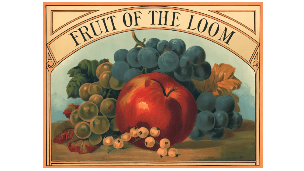
In 1893, Fruit of the Loom introduced its original logo, featuring four fruits – a red apple, purple grapes, light berries, and green grapes – enclosed within a square frame. The illustration was set against a vegetative background with a cloud hovering above it. The brand’s name “Fruit of the Loom” was inscribed on a golden brown banner in uppercase letters. This design resembled an authentic painting and remained the company’s identity for over three decades.
1927 – The First Logo Revision
Nonetheless, in 1927, the organization chose to redesign its logo and introduced its initial update. The new emblem no longer featured a square frame but instead incorporated a sphere. The fruits were redrawn to look more realistic and appealing while the vegetative background became less prominent. Nevertheless, the blue and white clouds still remained an essential component of the logo. To simplify things further, the banner was removed entirely leaving only the wordmark standing out boldly. Notably, while the name retained its uppercase letters, “Fruit” and “Loom” were enlarged to emphasize these two significant words in their brand name.
Unveiled Secrets of the United States Marine Corps Logo!The 1930s: A More Stylized Look
In the 1930s, Fruit of the Loom revamped its emblem, adopting a more contemporary and refined aesthetic. The new logo featured three stacked pieces of fruit – an apple on top, flanked by two sets of grapes with a currant leaf on either side. This rendition carried forward a simpler aesthetic while still retaining its core identity.
1968: Introduction of The Mascots
The late 1960s marked a significant shift for Fruit of the Loom as they introduced four mascots to represent their brand. Each mascot was an anthropomorphic fruit wearing clothing made by Fruit of the Loom:
- Apple (wearing briefs)
- Green Grapes (wearing a T-shirt)
- Purple Grapes (wearing boxer shorts)
- Currant Leaf (wearing socks)
These mascots were designed to evoke humor and make their advertisements appealing to a wider audience.
Bad Bunny Logo – Meaning, History, Font, and Color1983: New Font and Mascot Update
In 1983, Fruit of the Loom decided to revamp its logo once again. They retained their mascots but gave them updated clothing items:
- Apple now wore sweatpants
- Green Grapes wore a tank top
- Purple Grapes donned jeans
- Currant Leaf had shoes on its “feet.”
Furthermore, they transitioned from a serif typeface to a contemporary sans-serif typeface to enhance readability.
Present Day: Simplification and Modernization
The most recent version of the Fruit of the Loom logo is minimalist yet recognizable. It features two grape clusters on either side of an apple, with the brand name written below in a clean sans-serif font. The primary logo no longer features the mascots, yet they continue to show up in marketing campaigns and promotional content.
Batman Logo – History, Meaning, Info, PNGNotable Achievements Throughout the Years
Throughout its extensive history, Fruit of the Loom has accomplished a multitude of significant landmarks which have played a role in establishing it as a reputable clothing brand. Some notable achievements include:
- 1928: The acquisition by Berkshire Hathaway, showcased their financial stability and growth potential.
- 1976: Introduction of Lady Manhattan, an affordable women’s business wear line.
- 1985: Launch of BVD Underwear for Men, further diversifying their product offerings.
- 1999: Introduction of their online store, allowing customers to purchase products directly from their website.
Conclusion: A Legacy That Lives On
The Fruit of the Loom logos serves as an enduring symbol of quality and dependability in the world of fashion. As times change and styles evolve, so too have these iconic emblems – reflecting both the brand’s adaptability and commitment to maintaining its core values.
From modest origins in Rhode Island to global acknowledgment now, Fruit of the Loom has demonstrated that a steadfast commitment to design and devotion to client satisfaction can forge a lasting heritage in an ever-evolving sector.


