Choosing between SVG and WebP is not just a technical preference; it shapes how your website feels, loads, and scales across modern devices. As screens become sharper and user expectations rise, the structure behind your images plays a direct role in performance and clarity. Understanding this difference helps you avoid blurry visuals and unnecessary data usage.
Vector and raster graphics follow two very different philosophies. One uses mathematical instructions to draw shapes with precision, while the other relies on fixed pixels to represent real-world detail. This contrast affects everything from Retina display sharpness to bandwidth efficiency.
By understanding how browsers render these formats, you can make smarter decisions for icons, photos, and animations. The right choice ensures crisp visuals, faster load times, and a smoother user experience across all screens.
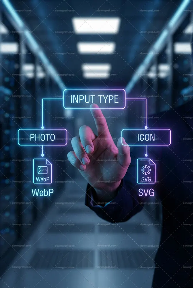
The Fundamental Difference: Vector vs. Raster
In the high-speed ecosystem of 2026, understanding the core architecture of your assets is the first step toward optimization. The debate about SVG vs WebP isn’t just about file extensions; it is a fundamental choice between mathematics and grids. To make the best decision for your user interface, we must first dismantle the underlying technology that powers these formats.
Ultimately, the choice dictates how your browser renders pixels on a screen. Vector vs Raster is the classic dichotomy. One relies on instruction sets to draw shapes, while the other relies on a fixed map of colored dots. Let’s break down exactly why this matters for Retina display optimization and modern device performance.
Generate Amazing Smoky Backgrounds with Waterpipe.js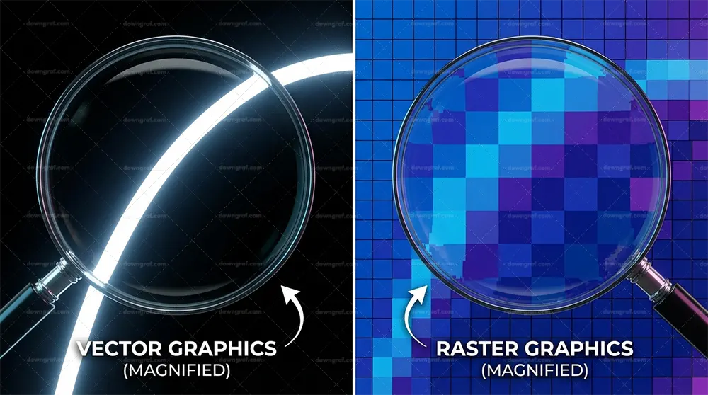
Understanding Vector Graphics (XML/Mathematics)
Scalable Vector Graphics (SVG) are not images in the traditional sense; they are documents. An SVG file is essentially an XML text file containing mathematical instructions—coordinates, curves, paths, and fills—that tell the browser exactly how to draw a graphic. Because they are code, they are resolution-independent. When a browser loads an SVG, it reads the math and renders the image fresh for that specific viewport size.
This mathematical foundation allows for infinite scalability. Whether displayed on a smartwatch or a stadium-sized 8K billboard, the browser simply recalculates the math to render perfectly crisp lines. Consequently, there is zero loss of quality, no matter the zoom level. This makes SVG the undisputed king for UI elements like icons, logos, and simple illustrations where precision is paramount.
Understanding Raster Graphics (Pixel Grids)
In contrast, raster formats like WebP (and its predecessors JPEG and PNG) operate on a pixel grid. A raster image contains a fixed number of pixels, each assigned a specific color value. When you save a photograph as a WebP, you are essentially saving a mosaic. The browser’s job is simply to paint those specific pixels onto the screen. This approach is necessary for photography because real-world images contain millions of color variations and noise that cannot be easily described by mathematical paths.
JQuery Mask Plugin by Igor EscobarHowever, this fixed grid comes with a limitation: it is finite. If you attempt to scale a raster image beyond its native resolution, the browser must invent new pixels to fill the gaps, a process called interpolation. As a result, the image becomes blurry, blocky, or pixelated. This is why WebP compression techniques focus on reducing the data needed to store these pixels without visibly degrading the grid, rather than changing how the grid is drawn.
Why Resolution Independence Matters in a Retina/4K+ World
In 2026, standard definition screens are effectively extinct. We are living in a world dominated by high-density displays, from 4K mobile screens to 5K desktop monitors. On these devices, a single CSS pixel might actually be rendered by three or four physical device pixels. This pixel density places a massive burden on raster images. To look sharp, a raster image must be served at 2x or 3x dimensions, exponentially increasing file size.
This is where Retina display optimization becomes critical. An SVG requires no extra data to look perfect on a 4K screen; the browser just draws the lines with more precision. Conversely, a WebP image needs to be significantly larger in resolution to avoid looking soft. Therefore, using vectors for UI components is not just a stylistic choice; it is a bandwidth-saving strategy.
Top 10 Free jQuery Map Plugins You Can UseThe Scalability Factor: Infinite vs. Finite
The scalability factor is the primary heuristic for choosing between these formats. If an image needs to exist in multiple sizes across your site – for example, a logo used in the header, the footer, and a mobile drawer – SVG is superior. You load the file once, and it adapts to every container perfectly. There is no need for multiple versions.
On the other hand, relying on a single WebP for variable sizes is risky. If you serve a large WebP and shrink it with CSS, you are wasting bandwidth. If you serve a small WebP and stretch it, you lose quality. Thus, responsive images with srcset are mandatory for raster formats, whereas SVGs naturally handle the scaling without complex HTML attributes.
Deep Dive: SVG (Scalable Vector Graphics)

SVG has evolved from a niche format to the backbone of modern design systems. In 2026, it is rare to find a high-performance website that doesn’t leverage Scalable Vector Graphics for its iconography and interface elements. However, simply using the `.svg` extension isn’t enough; you must understand how to optimize and manipulate the code to unlock its full potential.
jQuery scrolltop: The New Way to Keep Your Scrolling HandyBecause SVG is text-based, it interacts with the browser differently than binary image formats. It becomes part of the Document Object Model (DOM) when embedded inline, allowing for manipulation that raster formats can only dream of. Let’s explore the technical nuances that make SVG a powerhouse for mobile web performance and interactivity.
How SVG Compression Works (GZIP/Brotli)
Since SVG is just XML code, it benefits massively from text compression algorithms like GZIP and Brotli. While a raw SVG file might look heavy compared to a binary equivalent, the transfer size over the network is often significantly smaller. Web servers are incredibly efficient at compressing repetitive text tags found in XML.
Therefore, when analyzing file sizes, you must look at the compressed transfer size, not just the file size on disk. A 10KB SVG might transfer as 2KB over the wire. This text-based nature means that cleaning up your code—removing metadata, comments, and unused groups—directly correlates to faster load times. Tools like SVGO are essential in 2026 pipelines to strip this bloat before deployment.
The DOM Weight Impact of Inline SVGs
Inline SVG performance is a double-edged sword. Embedding SVG code directly into your HTML allows for instant styling and interaction, but it increases the size of your HTML document. If you inline hundreds of complex icons, you risk inflating the DOM size, which can increase the time it takes for the browser to parse the page and calculate styles.
Consequently, developers must strike a balance. For critical
Deep Dive: WebP (Modern Raster Standard)
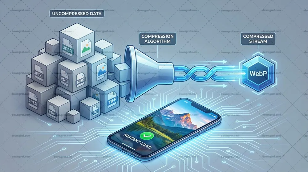
While SVG handles the geometry, WebP handles the reality. By 2026, WebP has firmly established itself as the default standard for raster imagery, pushing JPEGs and PNGs into obsolescence for web delivery. It acts as a versatile container that handles both photographic compression and graphic transparency with remarkable efficiency.
Understanding WebP compression is vital for optimizing Core Web Vitals LCP (Largest Contentful Paint). A well-optimized WebP can load faster than any legacy format, ensuring that your hero images don’t become the bottleneck for your site’s perceived performance. Let’s analyze why this format dominates the raster landscape.
Lossy vs. Lossless WebP Compression Algorithms
WebP offers two distinct modes: lossy and lossless. Lossy compression uses predictive coding to estimate values based on neighboring pixels, discarding data that the human eye is unlikely to notice. This is similar to JPEG but far more advanced, allowing for smaller files at comparable quality levels. This mode is ideal for photographs where absolute pixel precision is less important than visual perception.
In contrast, Lossless vs Lossy is a key decision point. Lossless WebP reconstructs the exact original pixels, making it the perfect replacement for PNGs. It supports transparency and sharp edges without the artifacts introduced by lossy compression. In 2026, switching your PNG icons or detailed product shots to lossless WebP is a standard optimization step that yields significant bandwidth savings.
WebP vs. JPEG/PNG: The Efficiency Gap in 2026
The efficiency gap between WebP and legacy formats has only widened as encoders have improved. On average, a WebP file is 25-35% smaller than a comparable JPEG and often 26% smaller than a PNG. Across a media-heavy website, this reduction aggregates into megabytes of saved data. For users on mobile networks, this difference is palpable.
Furthermore, WebP support 2026 is universal. The days of needing complex fallback strategies for Internet Explorer or older Safari versions are behind us. Browsers across all devices, from budget Android phones to high-end desktops, render WebP natively. This universal support simplifies the developer’s workflow, allowing you to treat WebP as the baseline rather than a progressive enhancement.
Transparency Support (Alpha Channel) in WebP
One of WebP’s strongest features is its ability to handle transparency (the alpha channel) even with lossy compression. Historically, if you wanted transparency, you were forced to use the bulky PNG format because JPEG didn’t support it. WebP solved this problem, allowing you to have a transparent background on a photographic subject with a significantly lower file size.
This capability is particularly useful for product images or cutouts placed over dynamic backgrounds. By using lossy WebP with alpha transparency, you can often achieve file sizes that are a fraction of the equivalent PNG-24, without a noticeable drop in visual quality. Thus, WebP effectively unifies the use cases of both JPEG and PNG into a single format.
Decoding Speed and CPU Usage on Mobile Devices
File size is not the only metric; decoding speed matters. Mobile devices have limited CPU resources, and complex compression algorithms can sometimes take longer to decode, delaying the paint time. WebP is designed to be decoded rapidly. In 2026, hardware acceleration for modern image formats is standard on most SoCs (System on Chips), meaning WebP decoding is incredibly efficient.
However, you should still be mindful of extremely large images. Mobile web performance depends on how quickly the main thread can process these assets. While WebP is efficient, serving an appropriately sized image via responsive `srcset` attributes is still required to prevent the device from wasting CPU cycles downsizing a massive 4k image for a 300px wide slot.
Head-to-Head Comparison: Performance & Use Cases
Now that we have established the technical foundations, it is time for the showdown: SVG vs WebP in real-world scenarios. The answer to “which is better” is almost always “it depends on the content.” In 2026, performance engineering requires a nuanced approach where you select the right tool for the specific visual job.
Making the wrong choice can lead to bloated DOM size reduction failures or blurry graphics on high-end screens. We will analyze four distinct scenarios to help you navigate this decision, focusing on SVG vs WebP file size comparison and rendering behavior.
Scenario A: Logos and Icons (The Clear Winner)
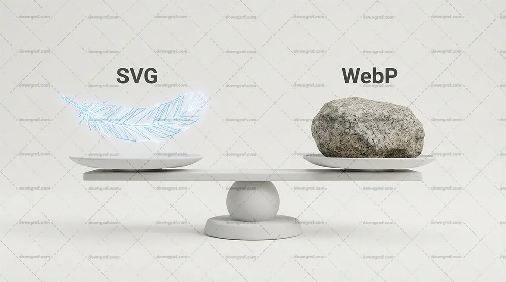
For logos, icons, and UI controls, SVG is the undisputed winner. These elements are defined by sharp edges, solid colors, and geometric shapes. Is SVG better than WebP for logos? Yes, absolutely. An SVG logo will remain crisp on a 300 DPI print and a standard monitor alike, often with a file size of under 2KB.
Using WebP for a logo is a mistake in 2026. To achieve the same sharpness on retina screens, the WebP file would need to be 3x or 4x larger, resulting in a heavier file that still lacks the infinite scalability of vector. Furthermore, you cannot style a WebP logo with CSS (like changing the color on hover), whereas an inline SVG offers full control.
Scenario B: Photographs and Real-World Imagery
When dealing with photographs, portraits, or complex textures, WebP takes the crown. Vectors are mathematically inefficient at describing the chaos of a photograph. Attempting to convert a photo into an SVG results in a massive file composed of millions of tiny paths, which crashes browser rendering engines.
Therefore, image optimization 2026 for photography strictly means raster. WebP captures the gradients, noise, and subtle lighting changes of a photo with a small footprint. In this scenario, the goal is visual fidelity per byte, and WebP delivers this far better than any vector approximation could.
Scenario C: Complex Illustrations (The Grey Area)
When to use SVG vs WebP becomes tricky with complex illustrations. If you have a flat illustration with gradients and shadows, SVG is usually better because it stays sharp. However, if the illustration is incredibly detailed—containing thousands of vectors, grain textures, or complex mesh gradients—the SVG file size can balloon to several megabytes.
In such cases, a high-quality WebP might actually be smaller and more performant. You must benchmark. If the SVG exceeds 100KB-200KB, consider rasterizing it to WebP at 2x or 3x resolution. You lose the infinite scaling, but you gain a significantly faster load time and reduced CPU strain during rendering.
Scenario D: Background Patterns and Gradients
For abstract background patterns, SVG is often superior due to its repetition capabilities. A tiny 1KB SVG pattern can repeat infinitely to cover a massive viewport without increasing file size. A WebP background would need to be large enough to cover the screen or repeat seamlessly, which often consumes more bandwidth.
Additionally, SVG gradients are smoother. Raster gradients can suffer from “banding” (visible steps in color) when compressed. SVG generates gradients mathematically in the browser, ensuring a perfectly smooth transition between colors regardless of the screen size.
File Size Benchmarks: Simple Shape vs. Complex Photo
Let’s look at the data. For a simple social media icon, an SVG might be 0.5KB. The same icon as a WebP at adequate resolution might be 5KB—a 10x difference. Conversely, a hero photograph might be 80KB as a WebP. Converting that photo to a vector art style could result in a 3MB SVG file.
This highlights the rule of thumb: complexity favors raster; simplicity favors vector. Converting SVG to WebP advantages only exist when the vector data is too complex to be rendered efficiently. Otherwise, keep vectors as vectors.
Render Blocking: Inline SVG vs. External WebP Resource
Finally, consider the loading mechanism. Inline SVGs are part of the HTML; they load instantly with the document, eliminating layout shifts (CLS) and flashes of invisible content. External WebP images require a network request. This means the browser must fetch the HTML, discover the image tag, and then request the image.
This impacts Core Web Vitals LCP. For critical above-the-fold UI elements (like a logo or search icon), inline SVG is faster. For a large hero banner, a WebP with `preload` attributes is the standard, but it will always have slightly more latency than inline code.
Animation and Interactivity

Static images are only half the story. The modern web is alive with motion. When discussing Animated WebP vs SVG animation performance, we are comparing two very different rendering engines. One is like a video; the other is like a puppeteer pulling strings. Your choice here defines the limits of your user’s interaction.
In 2026, users expect micro-interactions—buttons that morph, icons that react, and illustrations that breathe. SVG is the native language of web animation because every path and group has an ID that can be targeted. Raster formats, including animated WebP, are simply flipping through a stack of static frames.
CSS/JS Animation on SVGs (Micro-interactions)
SVG allows for granular control. You can use CSS Keyframes or JavaScript libraries (like GSAP) to animate just a single path within an icon while the rest remains still. For example, a notification bell icon where only the clapper swings. This is impossible with WebP.
Moreover, these animations are extremely performant because they often rely on CSS transforms (translate, rotate, scale), which the browser can offload to the GPU. This results in buttery smooth 60fps (or 120fps on ProMotion displays) animations that respond instantly to user input, such as hover or click states.
SMIL Animations (Status in 2026)
SMIL (Synchronized Multimedia Integration Language) is the native animation syntax inside SVG files. While it faced deprecation threats in the past, in 2026 it remains a valid, though less common, way to animate self-contained SVGs. It allows an SVG file to be animated without any external CSS or JS.
However, for complex projects, most developers prefer CSS or JS animation because it keeps the logic separated from the asset. SMIL is powerful for simple loaders or distinct “sticker” animations that need to be portable (e.g., dropping an `.svg` file into an `img` tag and having it just work).
Animated WebP vs. GIF vs. Video (MP4/WebM)
Animated WebP has effectively killed the GIF format. It supports 24-bit color and 8-bit alpha transparency, whereas GIF is limited to 256 colors and 1-bit transparency. An animated WebP is typically 10% of the size of an equivalent GIF. If you need a looping animation of a screen recording or a complex video-like sequence, Animated WebP is the standard.
However, for long sequences, modern video formats (MP4/WebM) are still superior in compression. Animated WebP is best for short, looping content where you don’t want a video player interface. It is a frame-based animation, meaning it lacks the interactivity of SVG but handles complex pixel changes (like a movie clip) much better.
Performance Costs: Paint/Composite (WebP) vs. Layout/Recalculate (SVG)
Performance costs manifest differently. Animated WebP hits the GPU memory as the browser uploads new textures for every frame. It is generally “cheap” for the CPU but heavy on memory bandwidth. SVG animation, if not optimized, can trigger “Layout Thrashing.” If you animate the shape of a path (changing the `d` attribute), the CPU must calculate new geometry every frame.
Thus, for mobile web performance, animating SVG transforms (position, rotation) is safe. Animating SVG path morphology or filters can be expensive and cause battery drain. Animated WebP has a consistent cost regardless of the visual complexity, making it predictable but less interactive.
Lottie Files vs. Animated WebP
We cannot discuss 2026 animation without mentioning Lottie. Lottie files are essentially JSON-based animations rendered as SVG (or Canvas). They sit in the middle ground—vector-based and scalable like SVG, but authored in tools like After Effects. They offer the complexity of video with the crispness of vector.
Compared to Animated WebP, Lottie files are often smaller for geometric animations but require a JavaScript runtime library to render. If your site cannot afford the JS weight, Animated WebP is a lighter, zero-dependency alternative, albeit one that loses sharpness when scaled.
The Third Challenger: Where does AVIF fit?
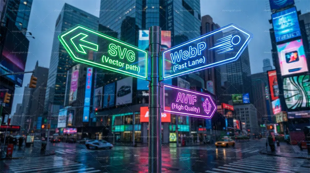
You cannot talk about Next-gen image formats in 2026 without addressing the elephant in the room: AVIF. While our guide focuses on SVG vs WebP, AVIF has matured into a dominant force for raster delivery. The question is often: AVIF vs WebP, but how does it relate to our vector comparison?
AVIF is strictly a raster format. It competes directly with WebP, not SVG. It uses the AV1 video codec compression technology to squeeze images even smaller than WebP. However, it shares the same fundamental limitations as WebP regarding scalability and resolution independence.
WebP vs. AVIF: The 2026 Landscape
In 2026, AVIF has largely caught up in browser support. It generally offers 10-20% better compression than WebP, especially at lower bitrates. It handles gradients and dark areas with fewer blocky artifacts. For massive static hero images, AVIF is often the superior choice over WebP.
However, WebP still holds an advantage in decoding speed on older hardware and slightly faster encoding times on the server. Many sites use a fallback strategy: serve AVIF to devices that support it, and WebP to the remainder. But neither replaces the need for SVG.
When AVIF outperforms WebP for Raster Images
AVIF shines in high-fidelity photography where preserving detail at low file sizes is critical. It supports HDR (High Dynamic Range) color, which WebP does not fully utilize. If your website showcases professional photography or 10-bit color depth content, AVIF is the clear winner.
Nevertheless, for the purpose of UI design—icons, logos, and flat illustrations—the SVG vs WebP (or AVIF) logic remains unchanged. AVIF is still a grid of pixels. It will still blur when scaled up. Therefore, AVIF is a better WebP, but it is not a replacement for SVG.
Does AVIF compete with SVG? (No, it is still Raster)
To be crystal clear: AVIF does not compete with SVG. If you convert a logo to AVIF, you face the exact same issues as converting it to WebP: larger file sizes for simple shapes and loss of scalability. The rule remains: Vector for shapes, Raster (WebP/AVIF) for photos.
Consequently, your optimization strategy should be: Use SVG for vectors. Use AVIF for photos where supported, falling back to WebP. This hybrid approach ensures the best Best image format for website speed across all content types.
Implementation Best Practices 2026
Knowing the theory is one thing; implementing it is another. In 2026, the developer workflow involves automated tooling and smart HTML structuring to ensure that Cumulative Layout Shift (CLS) is minimized and accessibility is maximized. We need to move beyond simple `img` tags and embrace modern standards.
Optimizing for the Core Web Vitals LCP metric often comes down to how quickly the browser can discover and render your image. Whether you are using inline SVG or external WebP, strict adherence to these best practices will prevent performance regressions.
The Picture Element: Switching between Dark/Light Mode Rasters
One major advantage of inline SVG is its ability to adapt to Dark Mode using CSS variables (`fill: var(–icon-color)`). Raster images like WebP lack this internal styling. To achieve Dark Mode switching with WebP, you must use the HTML “ element with `media` queries.
For example, you can define a source for `(prefers-color-scheme: dark)` pointing to a dark-themed WebP, and a default source for light mode. This ensures the browser loads the correct asset before painting, avoiding a jarring flash of white content on a dark background. While effective, it requires generating two versions of every raster asset, whereas SVG handles this dynamically with one file.
Lazy Loading: Native HTML attributes for WebP
Native lazy loading (`loading=”lazy”`) is fully mature in 2026. You should apply this to all below-the-fold WebP and AVIF images. It prevents the browser from wasting bandwidth on images the user hasn’t scrolled to yet. However, never lazy load your LCP element (the main image at the top).
Lazy loading inline SVGs is not possible in the same way because they are part of the initial HTML payload. This is another reason to keep inline SVGs small and efficient; they impact the initial download size of the document itself.
Optimizing SVG Code (SVGO, SVGOMG)
Raw exports from design tools like Illustrator or Figma are notoriously dirty. They contain editor metadata, useless groups, and inefficient path data. You must run all SVGs through a sanitizer like SVGO (SVG Optimizer). This can often reduce file size by 50% or more without visual change.
In 2026, this should be an automated part of your build process (Webpack/Vite plugins). For manual checks, the web tool SVGOMG remains a developer favorite for visualizing the trade-off between precision and file size.
Responsive Images: ‘srcset’ with WebP
Using a single WebP file for mobile and desktop is a performance anti-pattern. You must use the `srcset` and `sizes` attributes to provide the browser with multiple resolutions. This allows a mobile phone to download a 400px wide image while a desktop downloads a 1200px wide version.
This is crucial for mobile web performance. It saves data and battery life. Remember, Responsive images are the standard; static single-source images are the exception.
Using SVG Sprites vs. HTTP/3 Multiplexing
Historically, developers combined icons into “sprites” to reduce HTTP requests. With HTTP/3 being the standard in 2026, the cost of multiple requests is negligible due to multiplexing. However, SVG sprites (using the “ tag) are still valuable for caching.
By loading a single sprite file containing all site icons, the browser can cache that resource effectively. This is often better than inlining the same icon 50 times in the HTML, which bloats the DOM. CSS sprite alternatives now largely lean toward these SVG symbol systems.
Conclusion: The Decision Matrix
In the end, the SVG vs WebP debate isn’t a battle where one format must die. It is a strategic alliance. In 2026, the highest performing websites are hybrids. They leverage the mathematical precision of SVG for the interface and the efficient compression of WebP (or AVIF) for the content.
Your goal is to deliver the highest visual fidelity with the lowest latency. By adhering to the principles of Vector vs Raster, you ensure your site looks crisp on tomorrow’s displays while loading instantly on today’s networks.
Summary Table: Format by Use Case
- Logos / Icons: SVG (Mandatory for scaling and crispness).
- Photographs: WebP (or AVIF) (Mandatory for file size).
- Simple Illustrations: SVG (Usually smaller, infinite scaling).
- Complex Illustrations: WebP (Benchmark file size vs SVG).
- Animations: SVG (for interaction/micro-motion) vs. Animated WebP (for video-like loops).
- Dark Mode Support: SVG (via CSS) is easier; WebP requires picture element switching.
The Hybrid Approach Checklist
To finalize your strategy, follow this simple checklist: Does it have fewer than 5 colors? Use SVG. Is it a photo of a person or place? Use WebP. Does it need to animate on hover? Use SVG. By strictly following this logic, you optimize for both DOM size reduction and network bandwidth.
Stop guessing. Audit your site today: convert all icons to inline SVG and all photos to WebP (or AVIF). Download our 2026 Image Optimization Checklist to automate this process and ensure your Core Web Vitals are always in the green.
Frequently Asked Questions
When should I use SVG over WebP for website graphics in 2026?
You should use SVG whenever the graphic is composed of simple geometric shapes, such as logos, icons, charts, or flat illustrations. SVG is superior here because it is resolution-independent, meaning it stays sharp on high-density Retina screens without increasing file size. It also allows for CSS styling and interactivity. Use WebP only when the image is a photograph or contains complex noise and textures that vectors cannot efficiently describe.
Is WebP better than SVG for logos and icons?
No. WebP is a raster format, meaning it is made of pixels. If you use WebP for logos or icons, they will blur when scaled up or viewed on high-resolution screens unless you serve huge file sizes. SVG is vector-based, so it scales infinitely while maintaining a tiny file size. Always use SVG for logos and icons.
How do SVG and WebP compare regarding Core Web Vitals (LCP)?
For LCP (Largest Contentful Paint), the delivery method matters. Inline SVGs load instantly with the HTML, often resulting in a faster LCP for simple hero graphics. However, for complex hero images (photos), a well-optimized WebP is better because a complex SVG would be too heavy to parse. WebP allows for faster network transfer of photographic data, but you must ensure it is properly sized and not render-blocked.
Can WebP replace SVG for flat illustrations with gradients?
It can, but it’s often a trade-off. While WebP can display the illustration, it loses the scalability. If the illustration is very complex, an SVG file might be 1MB, whereas a WebP version might be 50KB. In that specific “complex illustration” scenario, WebP replaces SVG for performance reasons. However, for simple illustrations, SVG remains the better choice for sharpness.
What is the file size difference between animated WebP and animated SVG?
Animated SVG (via CSS/JS) is usually much lighter because you are only coding the movement of existing paths. Animated WebP is a series of raster frames (like a video), so the file size grows with every frame added. For simple movements, SVG is kilobytes; Animated WebP is megabytes. However, for complex video-like sequences, WebP is more efficient than trying to replicate reality with vectors.
Do I still need fallback images for WebP in 2026?
In 2026, generally no. Browser support for WebP is effectively universal (98%+). Unless you are specifically supporting legacy industrial hardware or extremely old browsers (like Internet Explorer), you can serve WebP directly. However, for AVIF, a WebP fallback is still recommended as a safety net.
How does AVIF fit into the SVG vs WebP comparison?
AVIF is a raster format, so it is a direct competitor to WebP, not SVG. AVIF offers better compression and quality than WebP. Your strategy should be: Use SVG for vectors. For rasters (photos), try to serve AVIF first, and fall back to WebP for older devices. AVIF does not replace the need for SVG.
Related: ⏱️1-Min Quick What is Epoch
Don’t miss: Vibe Coding Is Eating the