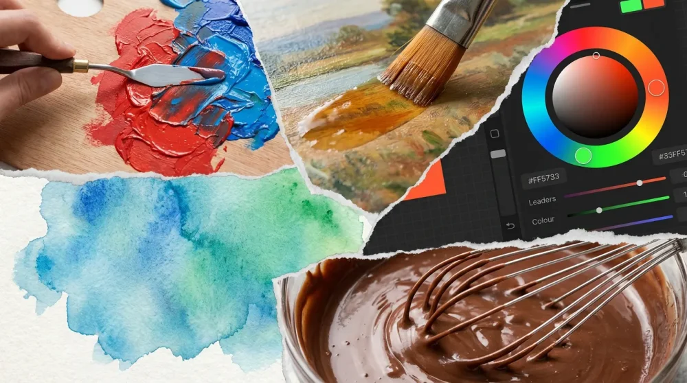
Brown isn’t just a single color; it’s a composite of every hue on the wheel. Whether you’re an oil painter, a digital artist, or mixing icing for a cake, understanding the anatomy of brown distinguishes amateurs from pros. In this guide, we break down the physics, the pigments, and the precise formulas to create every shade of brown imaginable.
As we navigate the creative trends of 2026, the demand for organic, grounding hues has never been higher. Yet, for many beginners, brown remains elusive, often resulting in accidental gray sludge rather than rich mahogany or warm ochre. If you have ever asked yourself, what are the colors that make brown, you are not alone. It is one of the most common queries in color theory because the answer involves variable methods depending on your medium.
In this ultimate guide, we will explore the three primary methods for mixing brown, specific recipes for trending shades like ‘Mushroom Brown’ and ‘Deep Terracotta’, and the digital values you need for screen-based art. Therefore, by the time you finish reading, you will possess the knowledge to mix any earth tone with confidence and precision.
Understanding the Science of Brown
Is brown actually a color? (The Dark Orange Theory)
Technically speaking, brown does not exist on the visible spectrum of light in the same way that red or violet does. Instead, physicists and color theorists define brown as dark orange. If you look at a standard color wheel, you will notice there is no specific slice for brown. However, if you take a vibrant orange and lower its luminance (brightness) while maintaining its hue, our brains perceive the result as brown. This is why color theory is so fascinating; it reveals that brown is essentially a context-dependent perception.
Consequently, when you are mixing paint, you are essentially trying to create a low-luminance orange. By adding black to orange, or by mixing complementary colors that reduce saturation and light reflection, you force the eye to see the muddy, rich tone we call brown. Understanding this relationship is crucial because it helps you realize that every brown has an underlying bias—usually towards red, orange, or yellow.
How Monochromatic Color Scheme Interior Design Works NowBrown in the Subtractive Color Model (RYB)
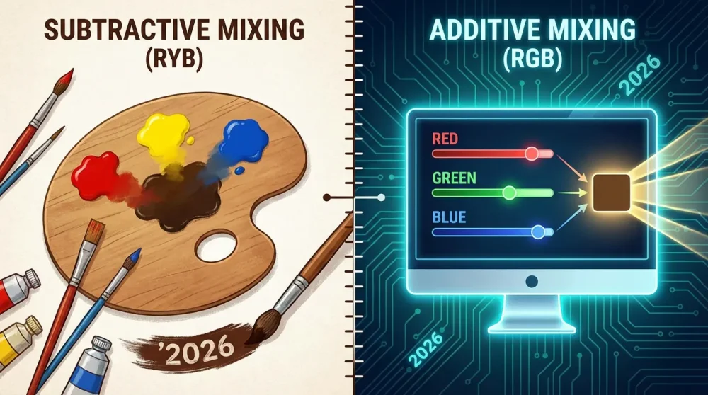
In traditional physical media like painting or printing, we operate under the subtractive color model. Here, we start with a white surface (canvas or paper) and add pigments that absorb (subtract) light waves. In the RYB (Red, Yellow, Blue) system taught in art schools, brown is known as a composite color. Specifically, it is often the result of mixing all three primary colors together or mixing a primary with its secondary complement.
Furthermore, because pigments are imperfect, mixing them subtracts significant amounts of light, leading to dark mixtures. When you mix a primary triad, the pigments absorb almost all visible wavelengths, reflecting very little back to the eye. This lack of reflected light is what creates the depth of earth tones like burnt umber or raw sienna. Thus, the more pigment types you introduce, the muddier and darker the brown becomes, which is a property we can use to our advantage.
Brown in the Additive Color Model (RGB)
On the other hand, digital artists working in 2026 face a completely different set of physics. Screens use the Additive Color Model (RGB), where light is added to a black screen to create color. In this context, brown is created by combining red and green light while minimizing blue light. For instance, a standard brown on a monitor might be represented as Red: 165, Green: 42, Blue: 42.
Discover the Hottest Fall Winter 2024 Color Trends Today!Because you are mixing light rather than physical pigment, you cannot simply “mix all colors” to get brown in RGB; doing so would result in white light. Therefore, digital artists must rely on specific RGB to brown formulas or Hex codes. Understanding this distinction is vital for hybrid artists who move between an easel and a tablet, as the intuitive mixing rules of paint do not translate 1:1 to digital sliders.
The psychology of brown in 2026 design trends
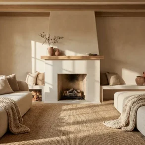
In 2026, the psychology of color has shifted heavily towards ‘Biophilic Design’—a trend that seeks to connect indoor environments with the natural world. Brown is central to this movement, symbolizing stability, reliability, and organic warmth. Shades like ‘Deep Terracotta’ and ‘Mushroom Brown’ have replaced the sterile grays of the early 2020s, offering a sense of sanctuary in a high-tech world.
Moreover, these earthy hues are associated with sustainability and eco-consciousness. Designers are increasingly using unbleached, raw brown tones to signal environmental responsibility. For an artist or designer, mastering brown is no longer just a technical skill; it is a necessity for staying relevant in a market that craves authenticity and warmth. Thus, knowing how to mix chocolate brown color or soft beige is essential for hitting these emotional notes in your work.
144 Different Shades Of The Color Blue With Their HEX CodesMethod 1: The Primary Triad (The Classic Mix)
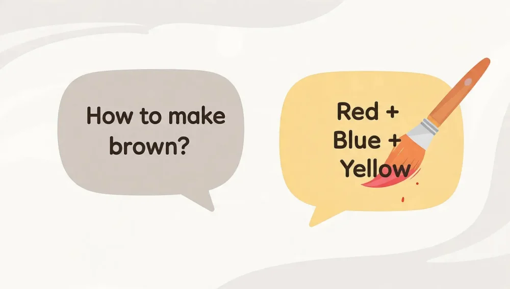
Mixing Red, Blue, and Yellow in equal parts
The most fundamental answer to how to make brown paint with primary colors lies in the triad method. By combining Red, Blue, and Yellow in equal measures, you theoretically create a neutral brown. In practice, because standard tube paints vary in strength, an exact 1:1:1 ratio often produces a dark, muddy gray. However, this ‘mud’ is the perfect base.
To start, squeeze out equal amounts of your primaries. Mix them thoroughly with a palette knife. You will notice the mixture turning into a dark, achromatic tone. This is often referred to as ‘chromatic black’ or dark neutral. From here, you must adjust the ratios to push the color towards a recognizable brown. This method gives you the most control because you are building the hue from the ground up, ensuring a harmonious result that fits with the other colors on your palette.
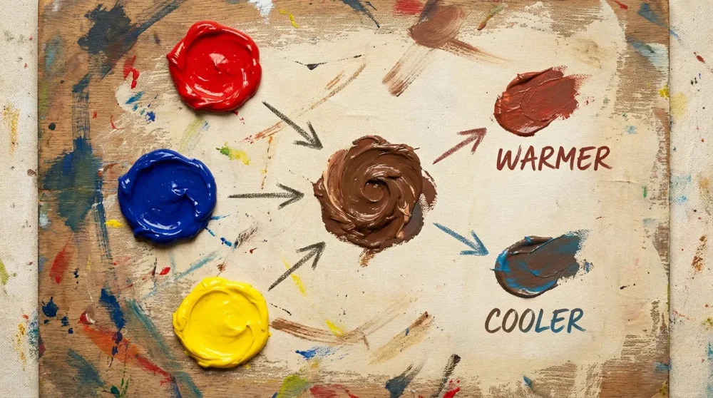
Adjusting the ratio for ‘Warmer’ Browns
If your neutral mix looks too gray or black, you likely need to warm it up. Warmer browns are red-dominant or yellow-dominant. Therefore, to create colors like brick red, rust, or mahogany, you should add more red to the mixture. Adding yellow will push the brown towards lighter, golden earth tones like ochre or sienna.
🎨🌈 1 Expert Answer: What Color Does Red and Green Make? (+ HEX Codes)For example, mixing acrylic paint for a landscape often requires warm browns for sunlit earth. Gradually add red into your base triad mix until the color shifts. It is important to do this slowly; red pigments are often overpowering. If you go too far, you can correct it with a touch of blue, but it is easier to add pigment than to subtract it. Consequently, warm browns feel inviting and advance visually in a painting, making them excellent for foreground elements.
Adjusting the ratio for ‘Cooler’ Browns
In contrast, cooler browns are essential for shadows, wet earth, or distant tree trunks. To achieve these shades, you need to increase the ratio of blue in your triad. A blue-dominant brown looks like a dark slate or a cool umber. This is where the concept of warm vs cool colors becomes critical for creating depth.
Be careful when adding blue, specifically if you are using strong phthalos, as they can quickly turn your beautiful brown into a murky green. If the mix becomes too greenish, you can neutralize it by adding a small amount of red. Mastering cool browns allows you to paint realistic shadows that don’t look like flat black holes, adding dimension and realism to your artwork.
Why primary quality matters (Cadmium vs. Alizarin)
Not all primary colors are created equal, and this significantly impacts your brown. For instance, mixing a brown using Cadmium Red (warm) and Ultramarine Blue (warm) will yield a different result than using Alizarin Crimson (cool) and Phthalo Blue (cool). The former will likely produce a rich, muddy earth tone, while the latter might result in a transparent, jewel-tone dark violet-brown.
Furthermore, opacity plays a role. Cadmiums are opaque, making them great for solid coverage, while modern organic pigments like Quinacridones are transparent, perfect for glazing. Therefore, when following a recipe for how to make brown paint with primary colors, always check which specific pigments are being recommended. In 2026, many artists use a ‘split primary’ palette (a warm and cool version of each primary) to have maximum control over these subtleties.
Method 2: Complementary Colors (The Shortcut)
Blue + Orange (The richest brown)
If you want to know what two colors make brown quickly, the answer is complementary pairs. The most popular combination is Blue and Orange. Because orange is already a mix of yellow and red, adding blue essentially completes the primary triad (Red + Yellow + Blue). However, mixing a pre-made orange with blue often yields a smoother, richer result than mixing three separate puddles.
For example, mixing Ultramarine Blue with Cadmium Orange creates a classic ‘Burnt Umber’ look. This is a favorite among portrait painters for creating deep shadow tones on skin. Consequently, this method is faster and often results in fewer ‘muddy’ surprises. If the brown is too cool, simply add more orange; if it’s too bright, dampen it with more blue.
Red + Green (The ruddy/earthy brown)
Another powerful complementary pair is Red and Green. This combination produces very deep, ruddy browns. Since green contains blue and yellow, adding red again completes the triad. This mix is particularly useful for painting natural landscapes, such as redwood trees or dried soil.
Moreover, the type of red and green matters immensely. Mixing Alizarin Crimson with Sap Green results in a transparent, dark brown that is almost black—perfect for glazing shadows. On the other hand, mixing Cadmium Red with Viridian might produce a more opaque, neutral gray-brown. This method effectively answers the long-tail query of colors that make brown without black, providing a vibrant alternative to deadening your colors with tube black.
Yellow + Purple (The golden/ochre brown)
Perhaps the most overlooked combination is Yellow and Purple. Making brown from purple and yellow creates delicate, golden browns or raw umber hues. Because purple is a mix of red and blue, adding yellow completes the trio. This mixture is often lighter and more golden than the other complementary pairs.
This combination is fantastic for sand, dried grass, or lighter hair colors. For instance, mixing Dioxazine Purple with Cadmium Yellow produces a lovely, muted tan or mustard brown. Thus, if you are struggling to make a light brown that isn’t pasty, try this complementary pair. It retains a luminance that red/green or blue/orange mixes sometimes lose.
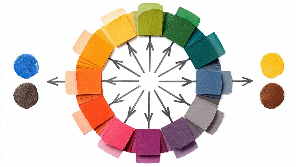
Using a color wheel to find exact opposites
To master these shortcuts, you must be comfortable using a color wheel. Brown is essentially the result of neutralizing a color. When you mix two colors that sit directly opposite each other on the wheel, they cancel out each other’s intensity, resulting in a neutral brown or gray. This is the core principle of tertiary colors and neutralization.
In addition, keep a color wheel handy in your studio. If you have a brown that looks too red, look across the wheel from red—you will find green. Adding green will neutralize the red. Similarly, if your brown is too yellow, look across to purple. Therefore, the color wheel is not just a beginner’s tool; it is a roadmap for color correction and refining your brown mixtures to perfection.
Refining Your Shade: Value and Saturation
How to make Light Brown (Adding White vs. Yellow)
Once you have a base brown, you often need to adjust its value. Many beginners ask how to make light brown paint and instinctively reach for white. However, adding white to brown often creates a chalky, pastel tint that looks unnatural. While this works for creating ‘beige’ or ‘latte’ colors, it can kill the vibrancy of an earth tone.
Instead, consider lightening your brown by adding yellow or unbleached titanium. Adding yellow lightens the value while keeping the color warm and saturated. This is ideal for wood tones or golden skin tones. If you must use white, use it sparingly or mix it with a touch of yellow to maintain the warmth. Consequently, you avoid the ‘frosty’ look that titanium white often imparts to dark mixtures.
How to make Dark Brown (Adding Blue vs. Black)
Conversely, for dark brown paint mixing, avoiding pure black is generally good advice. Tube black (like Mars Black or Lamp Black) can flatten your color, making it look dead or synthetic. A better approach is to darken your brown by adding dark blue (like Ultramarine or Prussian Blue). This deepens the value while maintaining a rich, chromatic character.
For example, if you have a chocolate brown that isn’t dark enough for a shadow, a touch of dark blue will push it towards a ‘Van Dyke Brown’ or ‘Sepia’. This creates a chromatic black feel—a dark that still has color depth. In addition, you can use Dioxazine Purple to darken yellow-based browns without making them look sooty.
Creating Beige and Tan: The role of heavy tinting
To create beige, tan, or khaki, you are essentially looking at very light tints of brown. Here, white becomes necessary. Start with a large amount of white and add a tiny speck of your mixed brown. It is always easier to darken a light color than to lighten a dark one. Therefore, start with the white base.
For a cool beige, use a brown mixed from blue and orange plus white. For a warm tan, use a brown mixed from yellow and purple plus white. You may also need to desaturate these colors slightly. A tiny touch of the complementary color (e.g., a dot of blue in a warm tan) can knock back the intensity, making the beige feel more natural and less like a creamsicle.
Muting saturation: Adding gray or complementary colors
Sometimes your brown is too vibrant—it looks like a dark orange or a dirty red rather than a true earth tone. To fix this, you need to control the saturation. You can mute a color by adding its complement (as discussed in Method 2) or by adding a neutral gray.
In 2026, muted ‘Mushroom’ tones are incredibly popular. To achieve this, take a standard brown and mix in a prepared gray or a mix of white and black. This desaturates the hue, moving it towards a neutral taupe. Furthermore, mastering hue saturation value adjustments allows you to match specific interior design trends or realistic textures like concrete, stone, and bark.
Medium-Specific Mixing Guides
Acrylics: Dealing with rapid drying and color shift
When mixing acrylic paint, you must account for the ‘color shift’. Acrylics tend to dry darker than they appear when wet. Therefore, when mixing a specific brown, you should mix it slightly lighter than your target shade. Test a small swatch on a scrap piece of paper and dry it with a hair dryer to see the true final color.
Additionally, acrylics dry fast. If you mix the perfect brown, it might dry out on the palette before you finish painting. In 2026, many artists use ‘slow-drying mediums’ or stay-wet palettes to keep their custom mixes workable. This is crucial when trying to match a specific brown hex code values equivalent on canvas, as you need time to adjust.
Oil Paints: Layering glazes for deep wood tones
Oil paints offer a unique advantage: translucency. Instead of mixing a flat brown on the palette, you can achieve glowing wood tones by layering. Start with a yellow or orange underpainting and let it dry. Then, glaze over it with a transparent dark brown (like Burnt Umber or a mix of Alizarin and Viridian).
This optical mixing creates a depth that physical mixing cannot achieve. The light travels through the transparent brown, hits the yellow underneath, and reflects back, creating a luminous effect. Thus, for realism in furniture or eyes, glazing is superior to direct mixing. Furthermore, oils allow for long blending times, making it easier to smooth out transitions between light and dark browns.
Watercolors: Controlling transparency and granulation
In watercolor, you cannot use white to lighten brown; you use water. This means your ‘light brown’ is actually a transparent wash of a dark pigment. Granulation is also a key factor. Some pigments, like Burnt Umber or Ultramarine, are granulating, meaning they leave a speckled texture. This is excellent for painting soil or bark.
However, if you want a smooth skin tone, you should use non-granulating pigments. How to make skin tone brown paint in watercolor often involves mixing Raw Sienna with a tiny touch of Alizarin Crimson and dilute Burnt Umber. Test your mix on a separate sheet, as watercolors dry significantly lighter—the opposite of acrylics.
Digital Art: Hex codes, RGB sliders, and HSB adjustments
For the digital artist, RGB to brown conversion is a frequent task. You don’t mix pigments; you adjust sliders. A good starting point for a standard brown is Hex #A52A2A. In the HSB (Hue, Saturation, Brightness) slider, brown is found in the orange hue range (around 20-40 degrees), with medium saturation and low brightness.
In 2026 software like Procreate 6 or Photoshop CC, you can also use CMYK sliders even in RGB documents to simulate print colors. The CMYK brown formula usually involves high percentages of Magenta and Yellow, with a moderate amount of Black (K) or Cyan to darken it. For example, C:30 M:70 Y:80 K:30 creates a deep coffee tone. Understanding these values helps you maintain consistency across web and print projects.
Food Coloring: Mixing for icing and fondant
Mixing food coloring presents a unique challenge: the base is often white (icing) or yellow (buttercream). To get a dark brown, you often need a LOT of gel color. Start with Red and Green gel colors. This is the most reliable method for food because packaged ‘brown’ food coloring often has a purple undertone.
Moreover, cocoa powder is a natural pigment. Before reaching for artificial dyes, mix cocoa powder into your icing. It provides a natural brown base that tastes good. If you need a darker black-brown, add a touch of black gel to the cocoa mix. Food safety is paramount, so always ensure your mixing ratios comply with consumption guidelines, especially when trying to achieve very dark colors which require heavy dye loads.
Recipes for Popular Brown Shades
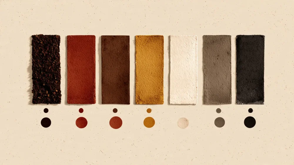
How to make Chocolate Brown
To create a rich how to mix chocolate brown color, start with a base of Orange (Red + Yellow) and gradually add Blue. The key here is to keep the mix warm. Use slightly more red and yellow than blue. If using tube paints, Burnt Umber plus a touch of Cadmium Red creates a delicious dark chocolate tone. In digital terms, aim for Hex #7B3F00.
How to make Burnt Sienna
Burnt Sienna is a reddish-brown earth tone. To mix this from scratch, combine a lot of Yellow Ochre or Cadmium Yellow with a moderate amount of Cadmium Red, and then add a very small amount of Ultramarine Blue to desaturate it. It should remain fiery and warm. This color is essential for painting rusty metal or autumn foliage.
How to make Espresso
Espresso is a very dark, almost black brown. Start with a burnt umber base and add Prussian Blue or Ultramarine Blue. Avoid black if possible, as the blue will create a deeper, richer dark. This color is effectively a ‘cool’ dark brown. It serves as an excellent alternative to black for high-contrast shadows.
How to make Chestnut
Chestnut is a medium reddish-brown, similar to the nut. Mix Red and Yellow to get a strong orange, then add a small drop of Blue or Green to mute it slightly. Unlike chocolate, Chestnut has higher saturation and red bias. It is a vibrant color often used for hair or animal fur.
How to make Taupe
Taupe is a gray-brown that is very trendy in 2026 interiors (often linked to ‘Mushroom Brown’). To mix Taupe, start with white, add a small amount of Umber (or your generic brown mix), and then add a touch of Black or Gray. The goal is to heavily desaturate the brown until it sits on the fence between gray and beige. It is a cool, neutral shade.
How to make Sepia
Sepia is historically associated with ink from cuttlefish. It is a dark, warm brown with a slight yellowish undertone. To mix it, take a dark brown (like Van Dyke Brown) and add a touch of Yellow Ochre. In watercolor, Sepia is a staple pigment. It creates a nostalgic, vintage feel in monochrome paintings.
How to make Khaki
Khaki is a light yellowish-brown with a green tint. Start with white, add Yellow Ochre, and then a tiny touch of Black or a mix of Raw Umber. The black reacts with the yellow to create a slight greenish hue (since black often acts like a weak blue). This is the classic camouflage or trouser color, useful for painting fabrics or dried vegetation.
Troubleshooting Common Mixing Mistakes

Why is my brown looking purple?
If your brown looks like a bruised plum, you have likely used a cool red (like Alizarin Crimson) and a warm blue (like Ultramarine) which biases towards violet. To fix this, you need to add the complement of purple: Yellow. Adding yellow will neutralize the violet tones and bring the mixture back towards a true brown. Alternatively, switch to a warmer red like Cadmium Red for your next mix.
Why is my brown looking gray/chalky?
A gray or chalky brown is usually the result of adding too much white or using a black pigment to darken the mix. White desaturates color rapidly. If you wanted a lighter brown but it turned gray, you should have used Yellow or Unbleached Titanium instead of pure White. To fix a chalky mix, you may need to add more pure pigment (Red, Yellow, or Orange) to re-introduce saturation.
How to fix ‘Muddy’ mixtures that lack definition
While brown is technically ‘mud’, there is good mud and bad mud. Bad mud looks flat and lifeless. This often happens when you over-mix too many different pigments on the palette. The more distinct pigments you combine, the more light is absorbed. To fix this, stop mixing. Let the colors sit slightly unblended for a marbled effect, or start fresh with a simple complementary pair (like Blue + Orange) to regain clarity.
Correcting a mix that is too green
A greenish brown is common when mixing black with yellow, or when using a strong blue like Phthalo Blue. Since green’s opposite is Red, the solution is simple: add Red. A small amount of red will neutralize the green bias instantly, warming up the brown. This is a common issue when mixing raw sienna or ochre shades, and a touch of red is usually the magic cure.
Frequently Asked Questions
To get a neutral brown, mix Red, Blue, and Yellow in equal parts. However, you must adjust based on the specific pigments. A mix of Cadmium Red, Cobalt Blue, and Cadmium Yellow is a good starting point for a neutral hue.
If you don’t have a tube of orange, simply make your own by mixing Red and Yellow. Once you have that orange mix, add a small amount of Blue to turn it into brown. This effectively uses the complementary method (Blue + Orange) starting from primaries.
Dark chocolate brown is made by mixing Red and Yellow with a significant amount of Blue (or Black) to deepen the value. Light beige is made by taking a brown base and adding a large amount of White or Yellow to tint it. The difference is purely about value (lightness/darkness).
For CMYK printing, a standard brown formula is C=30, M=70, Y=80, K=30. For RGB screens, a standard brown is R=165, G=42, B=42. These values simulate the appearance of brown in their respective lighting models.
Your brown looks gray likely because you added too much White or Black, which kills saturation. It looks ‘muddy’ in a bad way if you have over-mixed too many different pigment types. Stick to 2-3 colors for a cleaner mix.
The complementary method involves mixing two colors that are opposite on the color wheel. The main pairs are Blue + Orange, Red + Green, and Yellow + Purple. Each pair neutralizes the other to create a brown tone.
To make Burnt Sienna, mix Yellow Ochre with Cadmium Red and a tiny touch of Blue. To make Raw Umber, mix Yellow Ochre with a touch of Purple (or Blue and Red) to get a cooler, greenish-brown earthy tone.