You’ve probably never stopped to wonder about the font on your iPhone. But think about it—every time you glance at your screen, the text you read comes alive thanks to a very deliberate choice. Apple didn’t just pick any font for iOS; they crafted something that fits their design philosophy perfectly.
Fonts aren’t just letters on a screen. They shape how you feel when you read, how easy it is to understand, and even how much you trust what you see. So, what font does iPhone use? And why does it matter more than you might think?
The Evolution of Apple’s Fonts: From Chicago to San Francisco
Apple’s font journey mirrors its growth as a company. Back in 1984, the first Macintosh used a system font called Chicago. It was a bold, blocky sans-serif typeface designed for the low-resolution screens of the time. Chicago was all about clarity and usability—making sure the text was readable even on tiny, pixelated display.
Fast forward to the late 80s and 90s, Apple embraced Apple Garamond, a serif font that brought a touch of elegance to their branding. It was the font you’d see in print ads and logos, reflecting Apple’s premium, sophisticated image.
Then came Lucida Grande during the OS X era, a clean and modern sans-serif font that made on-screen reading easier and more pleasant. It was a step toward the sleek, minimalist design Apple is famous for today.
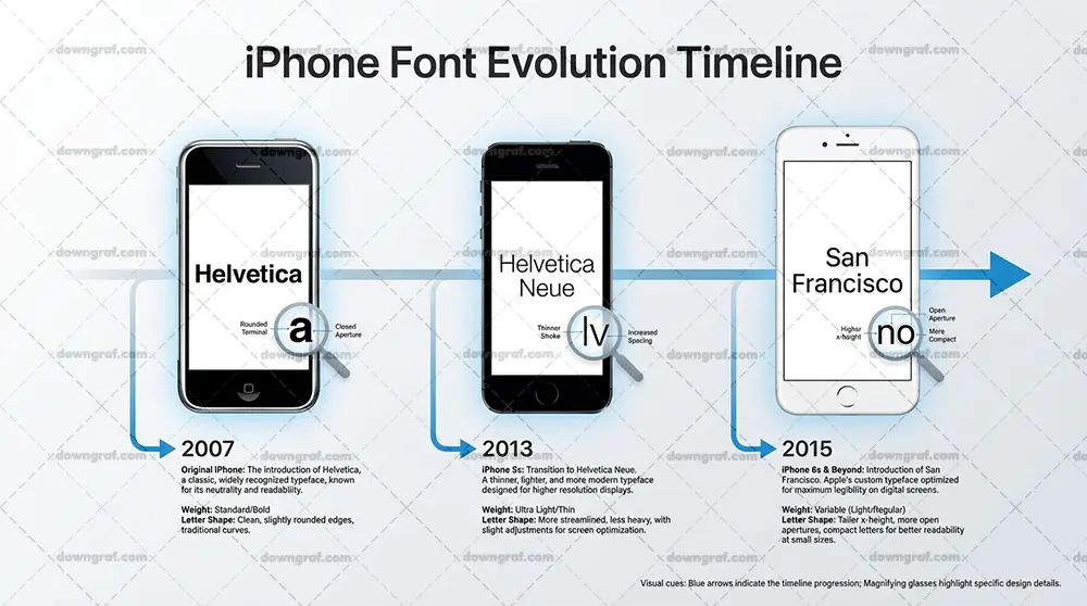
What is the Difference Between Mailchimp and Gmail?In 2013, Apple switched to Helvetica Neue for iOS 7 and OS X Yosemite. Helvetica Neue is known for its neutrality and crispness, helping unify the look across Apple’s platforms. But it wasn’t perfect for every screen size or device.
Why San Francisco Became the iPhone’s Default Typeface
Apple introduced San Francisco in 2015, and it quickly became the default system font for iPhone iOS, iPad, Mac, Apple Watch, and even Apple TV. This wasn’t just any font—it was custom-built by Francisco Apple’s design team to work flawlessly across all their devices, from the tiny Apple Watch screen to the large MacBook display.
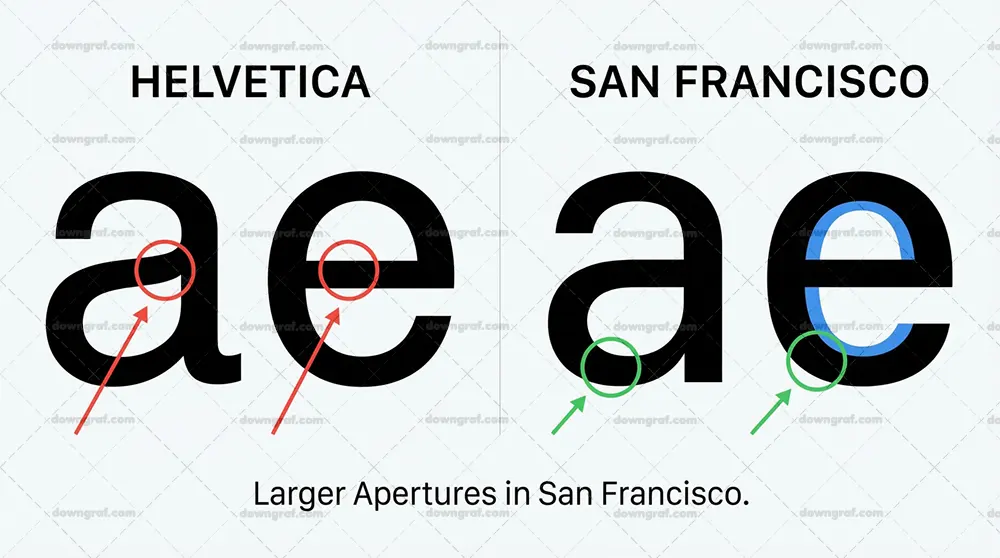
San Francisco is a sans-serif font designed for maximum legibility. It adapts to sizes and screen resolutions, making text easy to read whether you’re scrolling through messages or glancing at a notification on your watch.
10 Best Free Alternatives to DocuSign for Electronic SignatureWhat’s fascinating is that San Francisco isn’t a one-size-fits-all font. It actually has two main variations:
SF Pro: This is the standard version used on iPhones, iPads, and Macs. It’s versatile and looks great on Retina displays, balancing readability with a clean, modern aesthetic.
SF Compact: Tailored for the Apple Watch, this version is optimized for very small screens. It’s tighter and more condensed but still maintains clarity, ensuring you don’t have to squint to read.
The Ultimate Guide To Prototyping: How to Create a Prototype in 10 Minutes or LessThis level of customization shows how much Apple uses typography as a core part of their product identity. They don’t just want text to look good—they want it to feel right, no matter where you see it.
How San Francisco Works Across Different Apple Devices
San Francisco adapts not only in style but also in weight and spacing depending on the device and context. On your iPhone, SF Pro adjusts for readability at different text sizes, whether you’re reading a headline or fine print.
On the Apple Watch, SF Compact uses tighter letter spacing and slightly different shapes to make the most of the small screen space. This means notifications, app interfaces, and watch faces all remain legible without feeling cramped.
Looking for a LakeFS Alternative? Here are 20+ Options to Consider!The font’s design also accounts for dynamic type sizes and accessibility settings, so users who prefer larger text or bold fonts iphone owners frequently request get a consistent experience without losing the font’s clean look.
It’s no surprise that San Francisco’s design performs well not just on mobile but also on web pages and software used across various platforms. This makes it one of the best choices Apple has made for its users.
Can You Use Apple’s San Francisco Font Commercially?
Here’s where things get tricky. San Francisco is proprietary—use Apple’s system fonts outside their ecosystem and you may run into legal issues. That means you can’t legally use it for your marketing materials, websites, or apps outside of Apple devices.
But don’t worry, there are great alternatives. Google’s Roboto font, for example, shares a similar clean, modern feel and is free for commercial use. It’s a solid choice if you want a font that echoes Apple’s style without legal headaches.
If you want to mimic the look of San Francisco in your projects, using Roboto and other open-source sans-serif fonts like Open Sans or Lato can work well. They maintain clarity and neutrality, just like Apple’s font, but are free and easy to use in any app or website.
New tools and design systems have made it even easier to find San Francisco alternatives that look professional and load fast across all platforms.
💡 Typography Tip: Apple’s San Francisco font changes subtly depending on the device to ensure maximum readability, showing how typography can be both an art and a science.
Why Apple’s Font Choice Matters More Than You Think
Fonts often fly under the radar, but fonts Apple chooses speak volumes about their design priorities. It’s not just about looking good—it’s about making sure every user interaction feels natural and effortless.
The font’s clarity reduces eye strain and speeds up reading, which matters when you’re checking notifications dozens of times a day. It also builds a consistent brand feel across all Apple devices, reinforcing trust and familiarity. May seem like a small detail, but typography is one of the most powerful tools in product design.
Apple’s commitment to typography shows that even the smallest details—like the curve of a letter or the space between words—can shape how we experience technology. So next time you pick up your iPhone, take a moment to appreciate the font quietly working behind the scenes.
What Font Does iPhone Use? Your Takeaway
The font your iPhone uses, San Francisco, is a carefully crafted typeface designed to deliver clarity and comfort across all Apple devices. It’s a custom font tailored to the unique challenges of different screen sizes, from the smallest Apple Watch to the largest Mac display.
Apple’s font history—from Chicago to Apple Garamond, Lucida Grande, Helvetica Neue, and now San Francisco—reflects their evolving design philosophy. Each change wasn’t random but a response to technological shifts and user needs.
If you’re curious about fonts iPhone users see every day, understanding what font iPhone uses gives you a peek into how Apple balances style, function, and user experience. And if you’re thinking about your own projects, remember: the right font isn’t just about looks—it’s about how it makes your content feel and function.
FAQ
Q: Is San Francisco font available for download?
A: No, San Francisco is proprietary and only available for use within Apple’s system.
Q: Can I use San Francisco font for my website or app?
A: Legally, no. Apple restricts its use outside their devices. Consider alternatives like Roboto or Open Sans for web and app projects.
Q: What makes San Francisco different from Helvetica Neue?
A: San Francisco is optimized for digital displays and adapts across devices, while Helvetica Neue is more static and less flexible for small screens.
Q: Does the iPhone use the same font across all apps?
A: Most native apps use San Francisco as the default, but third-party apps can choose different fonts. Using a custom font is especially common in branded app experiences.