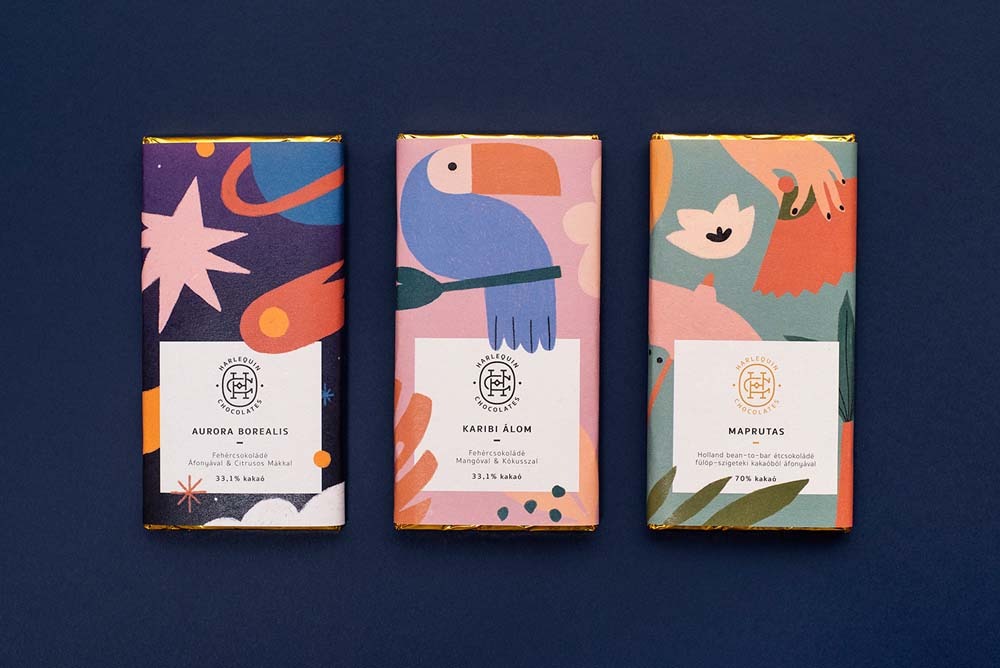
Designing packaging for chocolate products can be a tricky task. Not only do you need to create an attractive design, but you also need to make sure the product is safe to eat. Harlequin chocolate has created some of the most beautiful and innovative packagings around. Their designs are always eye-catching and their products are some of the most delicious chocolates on the market. Here are four examples of Harlequin chocolate packaging design that will blow your mind:
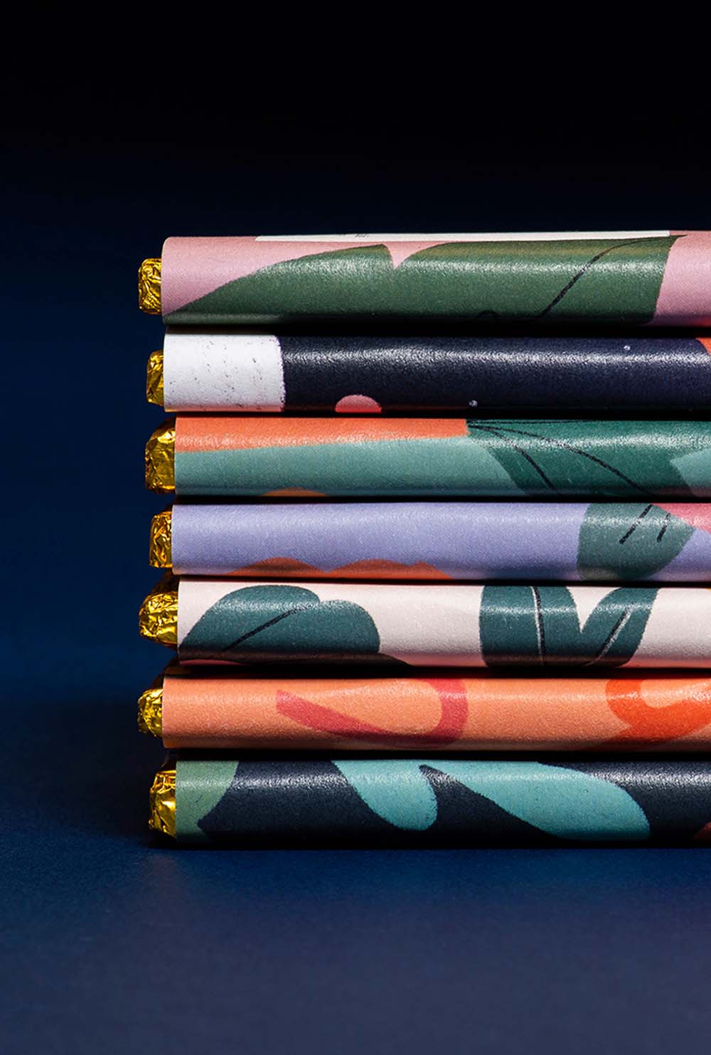
Harlequin chocolate is known for its brightly colored packaging, and designers have come up with ways to highlight that in new and inventive ways. Harlequin Chocolate has come up with some creative packaging designs that are sure to impress.
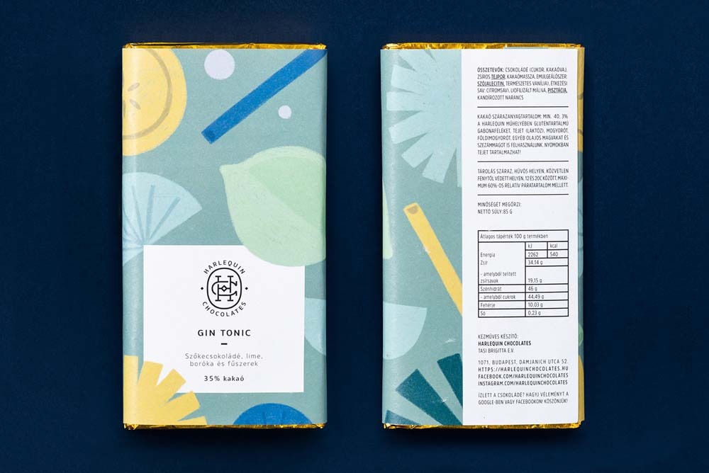
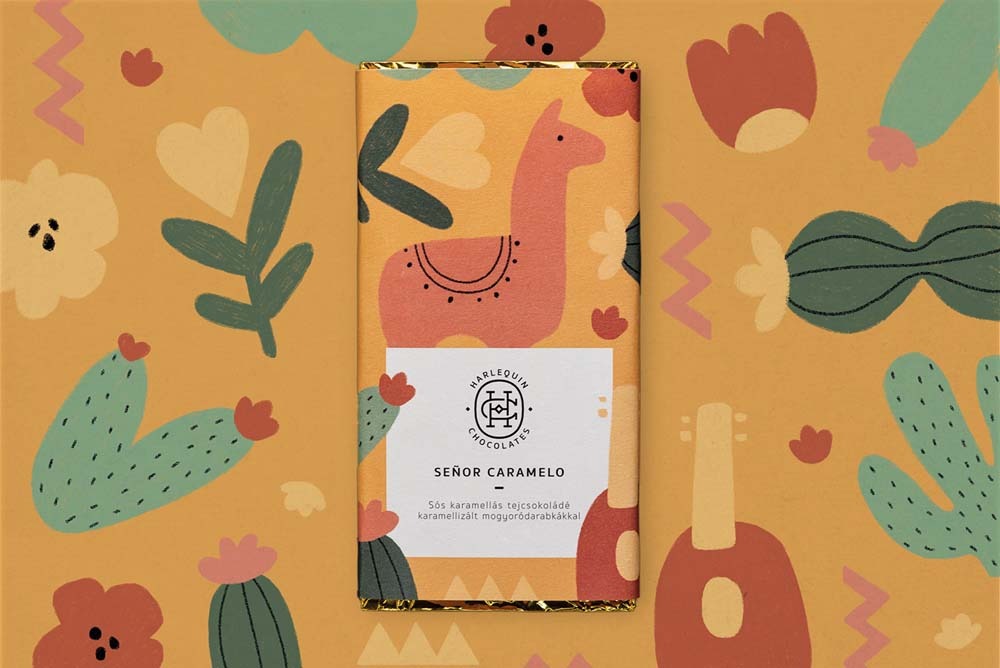
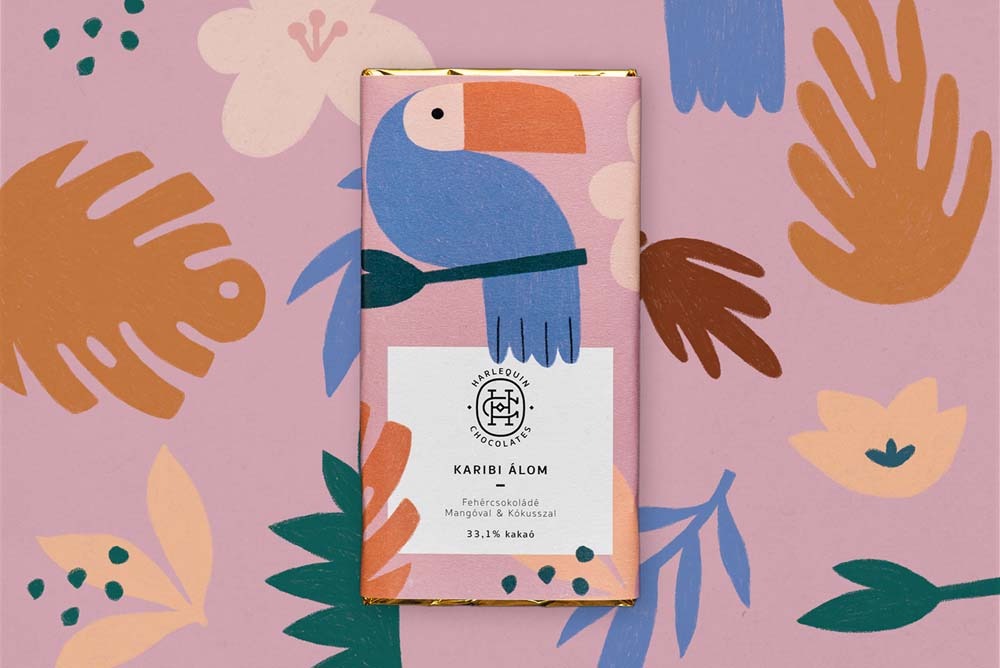
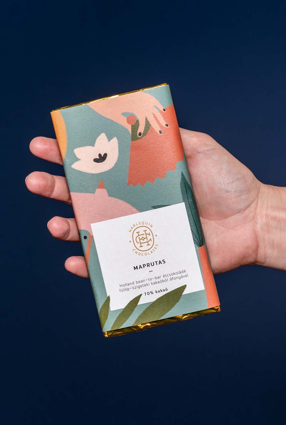
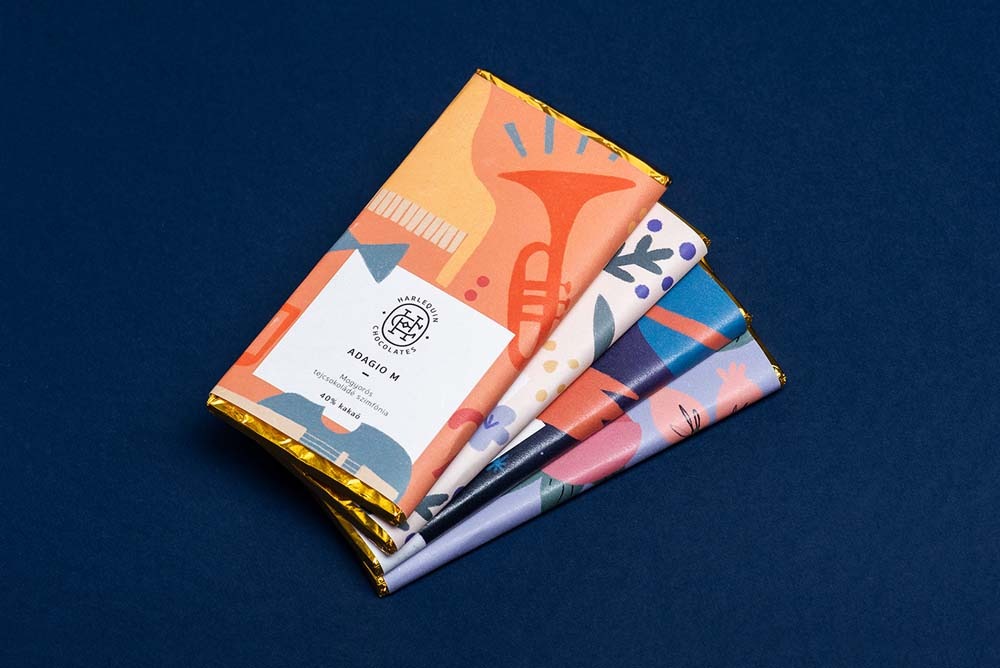
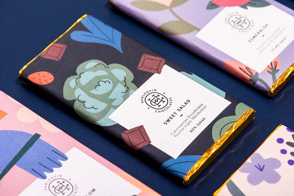
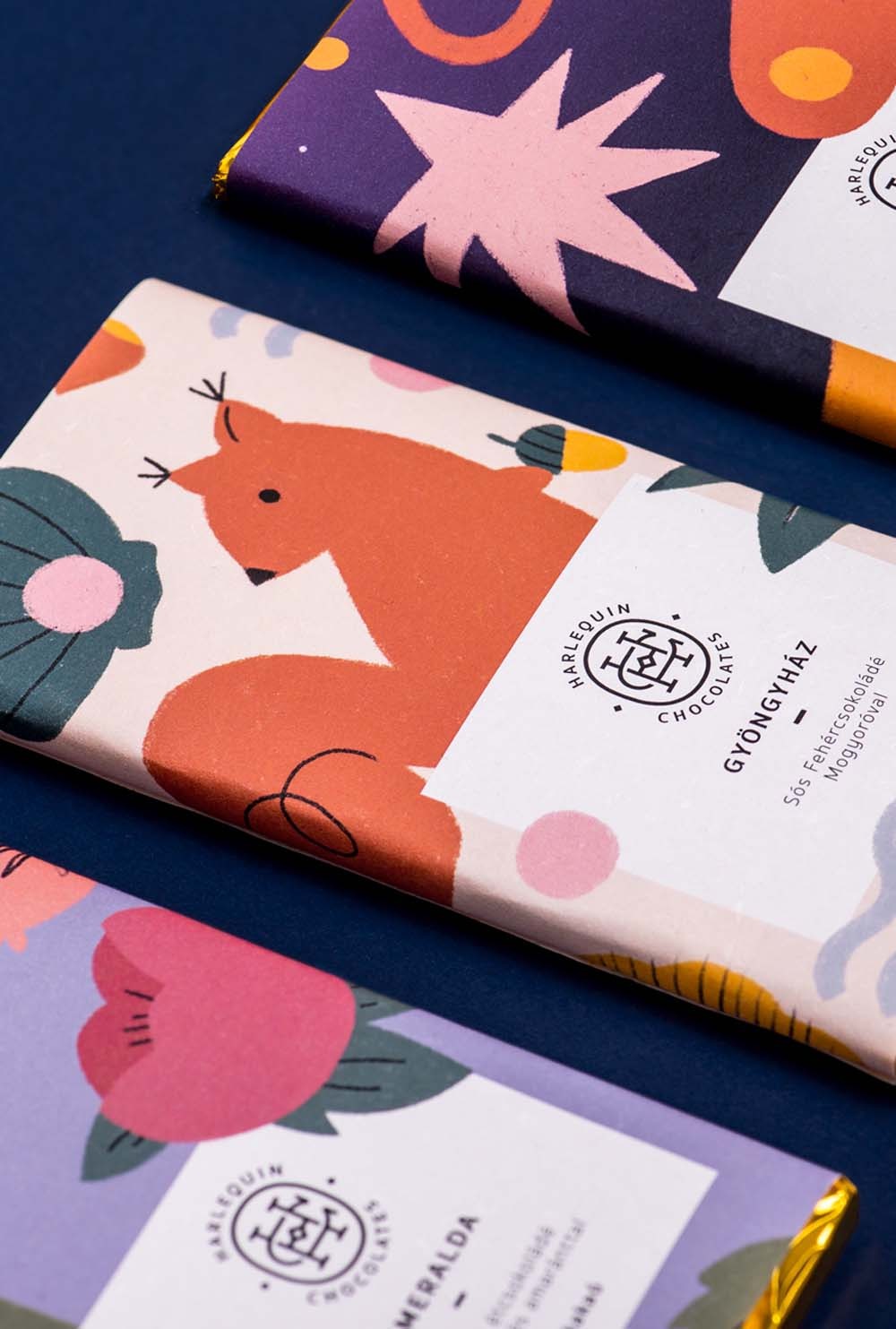
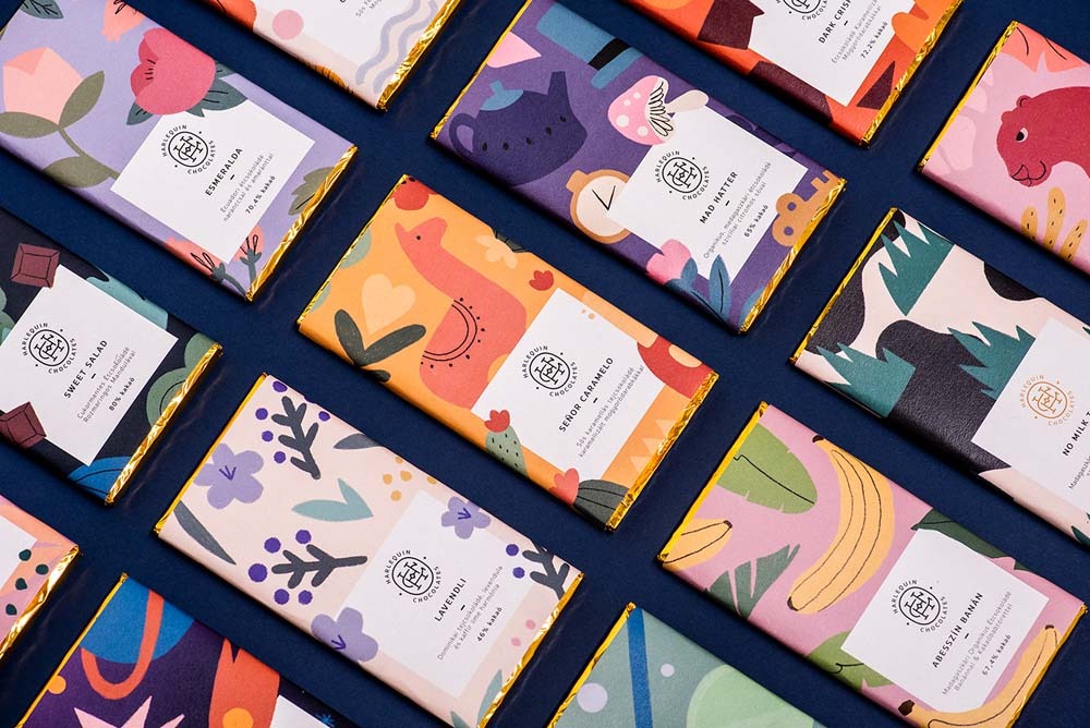
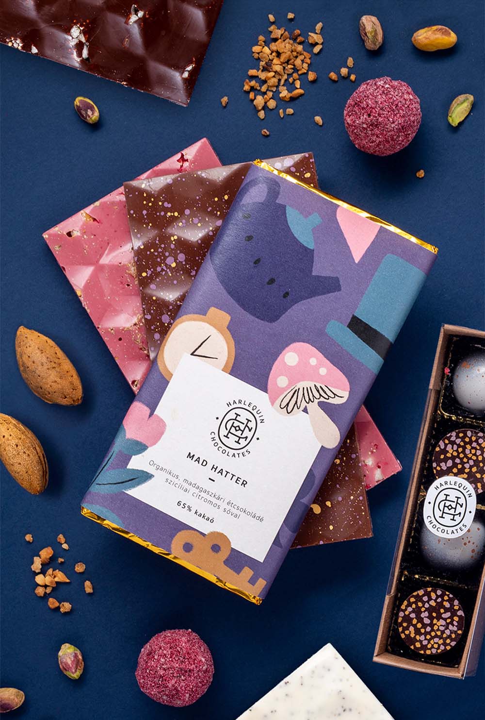
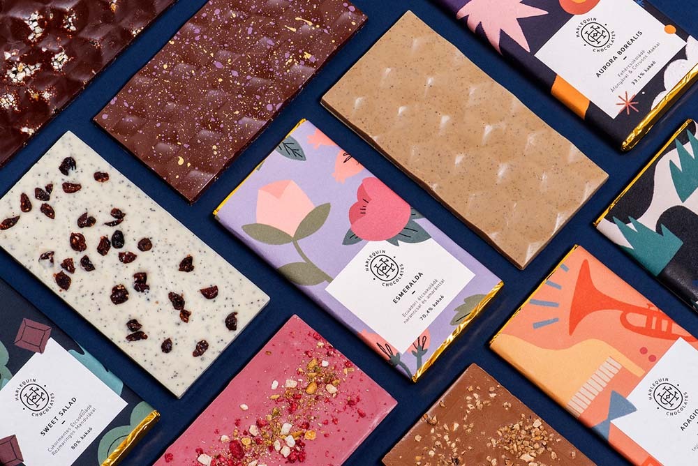
Brand and packaging design for Harlequin Chocolates. It is a small company at the Budapest hub that promises to bring its natural-quality confections directly to your table by providing branded, elegant packaging.
The historic logotype is composed of the letters H and C, but it also refers to the silhouette of a ladybird. It attempted to create a calm and impressive counterbalance to the bustling and disruptive nature of the pictures and to demonstrate class amid the merriment.
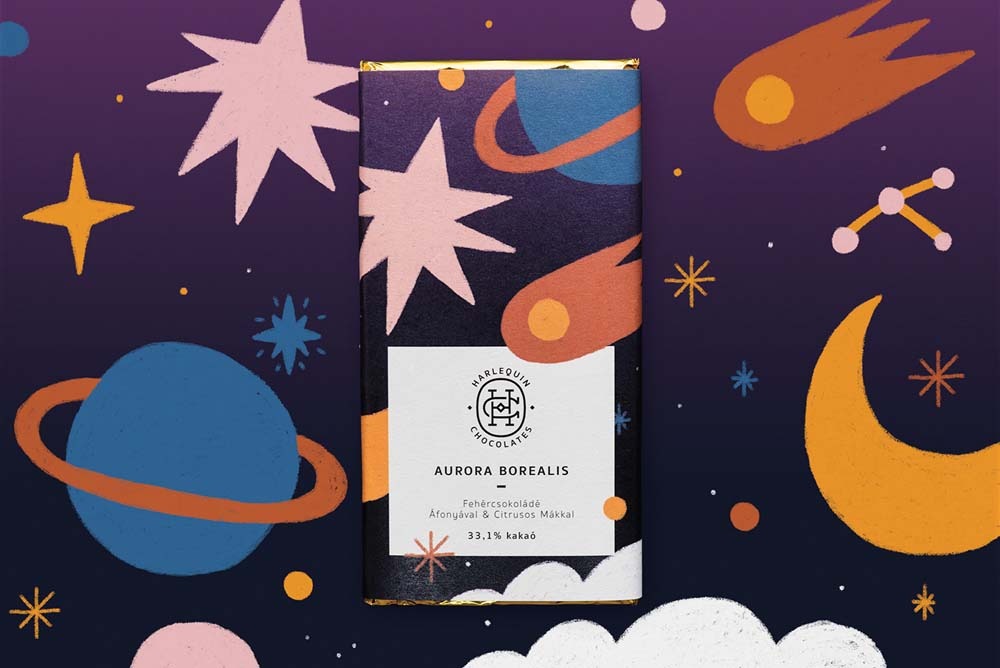
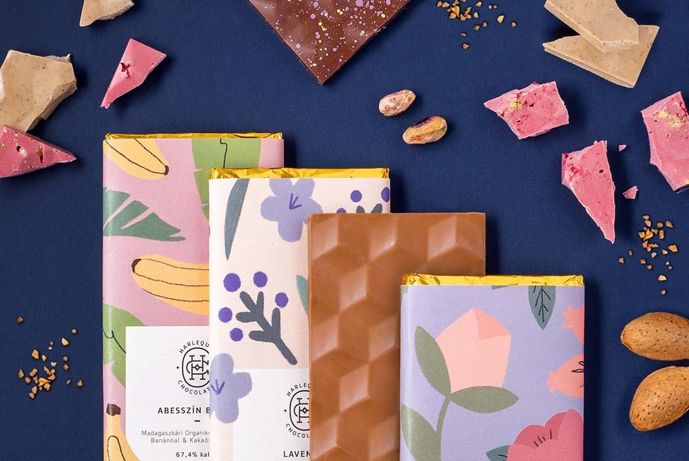
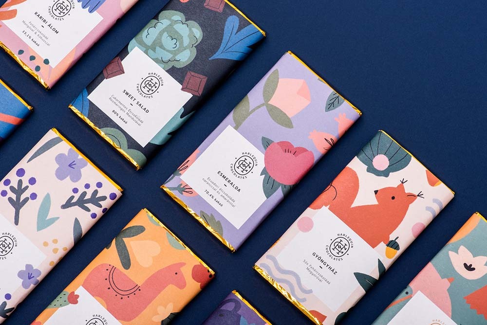
Each illustration in the illustrated label refers to the name and taste of chocolate and is meant to awaken the customer’s hunger to collect all these items.
Great Bursting Artwork Illustration of Joshua MielsHarlequin Chocolate Packaging Design
Source: Behance