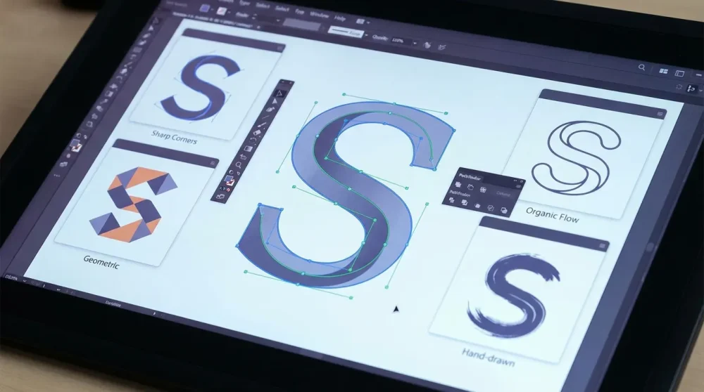
The letter ‘S’ is widely considered the most difficult character to draw—and consequently, the most rewarding to master in logo design. Its double curve requires perfect optical balancing, a feat that challenges even seasoned typographers. If you draw an ‘S’ with mathematical symmetry, it inevitably looks like it is falling over or that the top bowl is suffocating the bottom. Therefore, achieving stability in this glyph is a masterclass in visual perception.
Whether you are designing a monogram for a luxury brand or a kinetic icon for an AR app, the right typeface changes everything. In 2026, the demand for fonts for the letter s has shifted from static legibility to dynamic adaptability. Designers are no longer just looking for a pretty curve; they need a glyph that holds its integrity across spatial computing environments and variable axes. This guide curates the best fonts for the letter ‘S’ in 2026, categorized by style, anatomy, and application, ensuring your branding typography stands out in a crowded digital landscape.
The Anatomy of a Perfect ‘S’: What Designers Must Look For
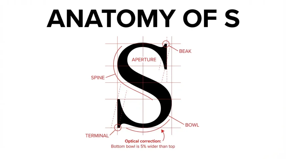
Before selecting a font, it is crucial to understand the typography anatomy spine and curves that define this character. The ‘S’ is composed of two opposing curves connected by a spine, and slight deviations in weight distribution can destroy the letter’s elegance. Consequently, when evaluating typefaces for a logo, you must look past the general style and inspect the vector points of the ‘S’ specifically.
Understanding the Spine: Heavy vs. Hairline Thickness
The spine is the central curved stroke connecting the upper and lower bowls. In high-contrast typefaces, the dynamics of the spine dictate the font’s personality. For example, a spine that transitions rapidly from thick to thin creates a sense of urgency and drama, which is typical of modern luxury branding. In contrast, a spine with consistent weight, commonly found in geometric sans-serifs, effectively conveys stability and corporate trust.
In 2026, we are seeing a resurgence of ‘reverse contrast’ spines, where the horizontal parts of the ‘S’ are thicker than the vertical spine. This subverts traditional calligraphic logic. However, this style is risky; if not executed perfectly, it can make the letter feel clumsy. Therefore, always test the spine dynamics at small sizes—if the spine is too thin (hairline), it may disappear on mobile screens or watch interfaces.
Digital Art Inspiration for Digital Creatives #47The Terminals: Beaks, Ball Terminals, and Sharp Cuts
The endpoints of the ‘S’, known as terminals, act as the entry and exit points for the eye. A ball terminal font features circular shapes at the ends of the strokes, adding a whimsical or classical feel often seen in beauty branding. Bodoni and Didot are prime examples where the ball terminal creates a visual anchor, preventing the eye from sliding off the character.
On the other hand, sharp cuts or ‘sheared’ terminals suggest speed and aggression. This is particularly popular in sports and automotive branding. A beak terminal—a sharp spur found in serif fonts—can add a predatory, assertive quality to the letter. When browsing a glyph palette, pay close attention to these endpoints; they are often the only distinguishing feature in an otherwise neutral typeface.
Optical Balancing: Top-Heavy vs. Bottom-Heavy Curves
Physics dictates that for an object to look stable, it must be heavier at the bottom. The letter ‘S’ is no exception. A mathematically symmetrical ‘S’ will appear top-heavy because the human eye perceives the upper half of a shape as larger than the lower half. Thus, professional type designers always make the lower bowl of the ‘S’ slightly wider and taller than the upper bowl.
Beautiful Life Illustration by MomoWhen choosing a font for a logo, flip the ‘S’ upside down. If it looks exactly the same, it is likely a poorly designed geometric font that will feel uneasy in a layout. In contrast, a well-balanced ‘S’ will look distinctly wrong when inverted. This optical kerning and balancing is non-negotiable for professional monogram logo design.
The Aperture: Openness of the Counter Space
The aperture refers to the opening between the terminals and the bowls. A ‘closed’ aperture, where the terminals curl in deeply (like in Helvetica), creates a compact, solid shape. This is excellent for compact headlines but can suffer from legibility issues at small sizes where the gaps fill in. Meanwhile, an ‘open’ aperture (like in Gil Sans) feels more approachable and humanistic.
In the context of 2026’s spatial design trends, open apertures are preferred for AR text overlays. Because text often floats against dynamic backgrounds, a wider opening allows more background contrast to bleed through, improving readability. Therefore, for UI/UX-focused branding, prioritize fonts with generous apertures.
Simple Objects into Creative Illustration by Javier Perez | Part 2Symmetry vs. Asymmetry in Modern Branding
While optical balance usually demands asymmetry, some modern brands intentionally break this rule for stylistic effect. Asymmetrical ‘S’ shapes, where the top bowl is exaggeratedly large or small, create a sense of quirkiness and disruption. This anti-design trend has gained traction among Web3 and Gen Alpha brands.
However, extreme asymmetry moves the character closer to abstract art than typography. If you choose a font with a wildly asymmetrical ‘S’, ensure it is paired with a neutral sans-serif for the rest of the brand name. The ‘S’ becomes the hero; the rest of the text plays the supporting role.
Vertical vs. Horizontal Stress in 2026 Type Design
Traditional calligraphy relies on vertical stress (the thickest parts are on the sides). However, 2026 has introduced a wave of horizontal stress fonts where the weight sits at the top and bottom of the ‘S’. This creates a ‘squashed’ or panoramic look, aligning with the wide aspect ratios of modern ultrawide monitors and VR headsets.
Creative Logofolio Designs for InspirationUsing a horizontally stressed ‘S’ instantly dates your design to the mid-2020s. It feels contemporary and digital-native. Nevertheless, use it with caution; it can feel alien to older demographics accustomed to traditional vertical stress derived from handwriting.
Best Serif Fonts for the Letter ‘S’ (Elegance & Tradition)
Serif fonts remain the gold standard for luxury, editorial, and institutional branding. When hunting for a serif capital S, you are looking for character—swashes, tails, and high contrast. The serifs anchor the letter, giving the slippery ‘S’ shape a foothold on the baseline.
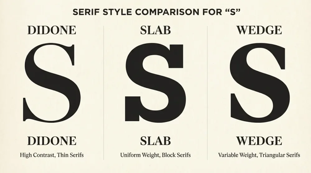
Didone Style (High Contrast): Bodoni, Didot, and 2026 Modern Variants
The Didone high contrast style is characterized by extreme differences between thick and thin lines. The ‘S’ in fonts like Didot or Bodoni is iconic, featuring a hairline spine that swells into a heavy curve before snapping back to a hairline. This style screams fashion, perfume, and high-end real estate.
In 2026, we are seeing ‘Super-Didones’—variants with even sharper contrasts designed for 8K displays. These fonts often feature teardrop terminals on the ‘S’ rather than simple balls. However, be wary of using these for small body copy; the thin spine of the ‘S’ will vanish, leaving you with two floating blobs.
Old Style: Garamond-Inspired ‘S’ with Organic Curves
Old Style serifs, modeled after Renaissance printing, offer a more diagonal axis. The ‘S’ in a font like Adobe Garamond or Sabon feels hand-written and organic. The curves are less geometric and more reliant on the logic of a broad-nib pen. This results in a sturdy, reliable ‘S’ that feels academic and literary.
For brands that want to appear established but not elitist, Old Style is the answer. The ‘S’ here is rarely showy; it performs its job with quiet competence. Furthermore, the terminals are often bracketed, meaning they curve smoothly into the stem, reducing visual harshness.
Transitional: Baskerville Variants with Wider Bases
Transitional serifs bridge the gap between Old Style and Modern. Baskerville is the quintessential example. The ‘S’ in Baskerville is famous for its elegant, upright posture and distinctively open lower loop. It feels wider and more planted than the narrower Garamond ‘S’.
Designers often choose transitional fonts for law firms and financial institutions. The ‘S’ commands respect without the fragility of a Didone. In 2026, updated transitional fonts have slightly increased x-heights, making the lower-case ‘s’ more legible on screens while maintaining that authoritative capital shape.
Slab Serifs: Heavy, Blocky ‘S’ Shapes for Industrial Brands
If you need an ‘S’ that looks like it was forged from steel, look to Slab Serifs. In fonts like Rockwell or Sentinel, the ‘S’ features thick, block-like serifs at the terminals. This removes the slippery nature of the letter, boxing it in and giving it a mechanical rigidity.
This style is a favorite for bold s font for sports branding and automotive logos. It conveys durability. Moreover, the uniform stroke width (low contrast) ensures that the ‘S’ is visible from a distance, making it perfect for stadium signage or truck decals.
Wedge Serifs: Sharp, Aggressive Terminals for Luxury Tech
Wedge serifs are the dangerous cousin of the slab serif. Instead of blocks, the terminals are triangular wedges. The ‘S’ in fonts like Noe Display or 2026’s popular Sharp Grotesk Serif features aggressive, piercing terminals. This style has exploded in popularity for ‘Luxury Tech’—brands selling high-end audio or EV cars.
The wedge terminal gives the ‘S’ a sense of forward motion and cutting-edge precision. It is less traditional than a Didone but more sophisticated than a Slab. Consequently, it captures the ‘future-luxury’ aesthetic perfectly.
Glyphic Serifs: Flared Ends Mimicking Stone Carving
Glyphic serifs, like Albertus or Friz Quadrata, have flared ends that mimic chisel marks in stone. The ‘S’ in these fonts is often very wide and majestic. It lacks the typical horizontal serifs, relying instead on the flare to terminate the stroke. This creates a silhouette that feels ancient yet timeless.
These are excellent modern fonts with unique capital S glyphs for brands related to history, gaming (RPGs), or organic products. The flare suggests a human touch, a connection to the earth, which resonates with sustainable branding trends in 2026.
Ligature Potential: Serifs That Connect the ‘S’ to Adjacent Vowels
One of the biggest trends this year is discretionary ligatures. Many modern serif fonts include special glyphs where the ‘S’ connects to an ‘T’, ‘H’, or ‘P’. For instance, the top terminal of the ‘S’ might extend to cross the ‘T’.
Using a font with rich ligature support allows you to create a wordmark that looks custom-lettered. When selecting a font, check the OpenType features for ‘Discretionary Ligatures’. A standard ‘S’ is fine, but a ligature ‘S’ that hugs its neighbor is a branding superpower.
Top Sans-Serif Fonts for the Letter ‘S’ (Modernity & Tech)
Sans-serif fonts dominate the digital world. For the letter ‘S’, the absence of serifs means the curve must stand entirely on its own. There are no decorative feet to hide mistakes in balance. Therefore, a geometric sans serif S is often the ultimate test of a typeface’s construction.
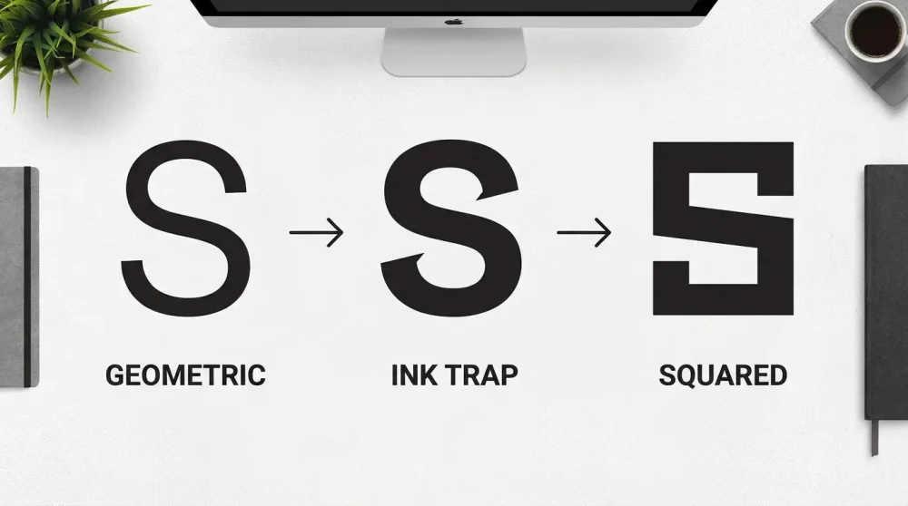
Geometric Sans: The Perfect Circle-Based ‘S’ (Futura Styles)
Geometric sans-serifs construct the ‘S’ from perfect circles and straight lines. Think Futura or Avant Garde. The ‘S’ here often looks sliced from two circles. While aesthetically pleasing in its purity, a purely geometric ‘S’ can feel top-heavy, as discussed earlier. Designers of these fonts often cheat geometry slightly to please the eye.
This style is the go-to for minimalist s logo inspiration 2026. It feels clean, efficient, and unburdened by history. However, it can also feel cold. To warm it up, designers in 2026 are softening the sharp cuts at the terminals, creating ‘soft geometry’.
Neo-Grotesque: Neutral, Corporate ‘S’ (Helvetica, Inter Updates)
The Neo-Grotesque ‘S’ (think Helvetica or Inter) is the invisible workhorse of design. It features horizontal terminals—meaning the stroke ends are cut perfectly flat, parallel to the baseline. This creates a closed aperture and a compact, boxy shape.
Why use this? Because it is neutral. If your brand needs to speak to everyone, everywhere, a Neo-Grotesque ‘S’ is the safest bet. It doesn’t distract. In 2026, the updates to fonts like Inter have optimized the ‘S’ spine for even better sub-pixel rendering on high-density displays.
Humanist Sans: Calligraphic Influence in the Spine
Humanist sans-serifs, such as Gill Sans or Frutiger, retain the ghost of the pen. The ‘S’ has distinct variations in stroke width (modulation) and usually features angled terminals. This makes the ‘S’ feel like it was drawn by a hand, not a machine.
For healthcare, non-profits, and approachable tech brands, the Humanist ‘S’ is superior. It feels empathetic. The spine usually looks thinner than the top and bottom curves, mimicking the pressure of writing, which subconsciously puts users at ease.
Squared Sans: Boxy ‘S’ Shapes for Sports and Automotive
A squared sans flattens the curves of the ‘S’, turning it into a rounded rectangle. Fonts like Eurostile defined this look for the space age, but 2026 sees a revival in ‘Tech Brutalism’. The ‘S’ looks like a link in a chain or a racetrack.
This is the definitive bold s font for sports branding. It maximizes the internal surface area of the letter, making it look massive and immovable. It says ‘power’ and ‘performance’ instantly.
Ink Traps: Exaggerated Ink Traps in the ‘S’ Curves (Huge 2026 Trend)
Originally designed to prevent ink bleeding in newsprint, ink traps are deep notches cut into the corners of letters. In 2026, this has become a stylistic feature for digital screens. An ‘S’ with exaggerated ink traps at the crotch of the curves looks technical, raw, and edgy.
Fonts like Whyte Inktrap showcase this beautifully. At large sizes, the notches in the ‘S’ create negative space interest. It signals to the viewer that the brand is ‘under construction’ or ‘beta’, a very popular vibe for Web3 startups.
Wide/Extended Sans: Stretching the ‘S’ for Display Impact
Width is the new weight. Extended fonts stretch the ‘S’ horizontally, emphasizing its serpentine quality. A wide ‘S’ takes up substantial real estate and demands attention. It feels cinematic and expansive.
Use extended ‘S’ glyphs for headlines or streetwear logos. The elongated curves allow for more appreciation of the stroke consistency. Just be careful with kerning; a wide ‘S’ creates massive gaps of white space that need to be managed manually.
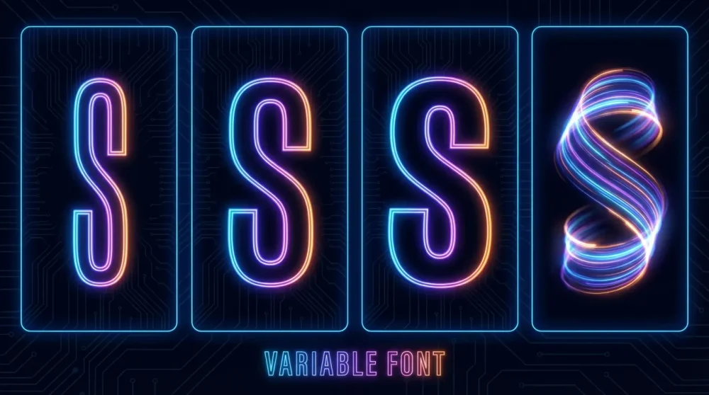
Variable Weight Sans: From Hairline to Ultra-Black
With the rise of variable font axes, you no longer choose a single weight. You slide between them. A variable sans ‘S’ can morph from a wispy hairline to a chunky, block-like ‘Ultra-Black’ where the counterspaces (the holes in the S) almost disappear.
This versatility is key for responsive logos. You might use the bold, heavy ‘S’ for the icon and the regular weight for the wordmark, all from the same file. It ensures perfect consistency in the spine geometry across all weights.
Script & Display Fonts: The ‘S’ as Art
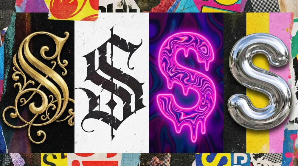
When legibility takes a backseat to personality, Script and Display fonts shine. Here, the ‘S’ is often the most decorative letter in the alphabet, offering endless opportunities for swash alternate glyphs and artistic flair.
Formal Scripts: Elaborate Capital ‘S’ Swashes
In formal scripts like Snell Roundhand or modern wedding fonts, the capital ‘S’ is a playground for flourishes. The starting stroke often spirals deep into the center, and the ending stroke can loop underneath the next three letters. This is the domain of luxury and romance.
However, restrain is necessary. A ‘S’ with too many loops can look like a treble clef or a random scribble. The best formal scripts maintain a clear spine axis even amidst the decoration. Use these for monograms where the ‘S’ stands alone.
Brush Scripts: Fast, Energetic Curves
Brush scripts capture the speed of a sign painter. The ‘S’ here is dynamic, often top-heavy, and textured. The edges might be rough or dry-brushed. This style conveys authenticity and energy, perfect for food and lifestyle brands.
In 2026, 3D brush scripts are trending—where the ‘S’ looks like a thick extrusion of paint. This adds tactile depth to digital designs, making the logo pop off the screen.
Blackletter: The Complex, Fractured ‘S’
A blackletter S is a fortress. Composed of sharp angles and fractured strokes, it is difficult to read but impossible to ignore. It is heavily associated with streetwear, brewing, and heavy metal music. The ‘S’ in blackletter often looks indistinguishable from a ‘G’ or ‘5’ to the untrained eye, so context is everything.
Modern interpretations mix blackletter structure with sans-serif minimalism, making the ‘S’ legible while retaining that gothic edge. This ‘Modern Medieval’ aesthetic is a micro-trend to watch.
Retro/Psychedelic: Liquid, Melting ‘S’ Shapes (70s Revival)
The 1970s revival is still going strong in 2026. Fonts with liquid, melting ‘S’ shapes—bottom-heavy and bulbous—are everywhere in indie music and cannabis branding. These fonts treat the ‘S’ like a lava lamp bubble.
This style relies on soft curves and zero straight lines. It is friendly, trippy, and nostalgic. The ‘S’ often hugs the letters next to it, creating tight, cozy spacing.
Graffiti & Urban: The ‘Super S’ Style Evolution
We all know the ‘Super S’ (or Stussy S) we drew in school. Urban fonts have elevated this. Graffiti-style ‘S’ glyphs are arrow-laden, bubbly, or jagged. They represent the voice of the street.
For a cursive s font for tattoo designs or streetwear, these fonts offer attitude. They break all the rules of optical balancing, favoring flow and rhythm over stability.
Hand-Drawn: Imperfect, Organic ‘S’ Variants
Sometimes you need an ‘S’ that looks naive. Hand-drawn fonts feature wobbly spines and uneven line weights. They reject the perfection of AI and vectors. This ‘anti-tech’ look is popular for artisanal brands.
The charm lies in the imperfection. An ‘S’ that looks slightly drawn by a child creates an immediate emotional connection of trust and simplicity.
Experimental: 3D and Puffy ‘S’ Fonts
With the rise of VR, display typefaces are going 3D native. ‘Puffy’ fonts, where the ‘S’ looks like an inflated balloon or a chrome pillow, are massive. These are color fonts (OpenType-SVG) that come pre-textured.
Using a puffy ‘S’ is a bold move. It dominates the layout. It’s playful, tactile, and screams ‘2026’. Ensure your background is simple to let these complex glyph palette textures shine.
Customizing the ‘S’: Logo Design Techniques
Finding the right font is often just step one. For a unique how to design a letter s monogram, you need to customize the glyph. Vector manipulation allows you to take a standard font and turn it into a trademarkable asset.
Slicing the Spine: Creating Negative Space Breaks
One of the most common techniques is slicing the spine. By cutting a gap in the middle of the ‘S’, you create a stenciled look or imply two interacting shapes. This works exceptionally well for tech and engineering firms.
When using this negative space logo technique, ensure the slice follows the angle of the spine. A horizontal cut on a diagonal spine looks jarring. The brain fills in the gap, so you can afford to remove a significant portion of the letter while retaining legibility.
Intertwining: Locking the ‘S’ with Other Letters
The curves of the ‘S’ make it the perfect candidate for intertwining. You can loop the tail of the ‘S’ through the leg of an ‘R’ or the crossbar of an ‘A’. This ‘locking’ technique creates a unified symbol that stands stronger than separate letters.
This requires precise vector curve editing. You must cut the shapes where they overlap to create the illusion of depth (over/under). It’s a classic weaving technique used in luxury fashion monograms.
The ‘S’ as a Symbol: Turning the Letter into a Bolt, River, or Path
The shape of the ‘S’ naturally resembles a winding road, a river, or a lightning bolt. Customizing the font to emphasize these qualities adds narrative to the logo. Sharp corners turn an ‘S’ into a bolt (energy); soft, flowing waves turn it into water (sustainability).
For minimalist s logo inspiration 2026, try reducing the ‘S’ to a single winding line. How much can you remove before it stops being an ‘S’? That edge is where great logos are born.
Geometric Simplification: Reducing the ‘S’ to Two Lines or Curves
Radical simplification involves deconstructing the ‘S’ into primitive shapes—two semicircles or three parallel lines. This abstraction is modern and scalable. Think of the Seat or Suzuki logos.
However, be careful not to create a ‘5’ or a ‘$’. The dollar sign connotation is the biggest trap in ‘S’ logo design. Avoid vertical lines passing through the center unless you are literally a bank.
Mirroring: Using a Double ‘S’ for Symmetry
If your brand is ‘Something Solutions’ or ‘Super Speed’, you have a double ‘S’. Mirroring the second ‘S’ creates a symmetrical shape (like a heart or a shield). This symmetry is pleasing to the eye and creates a balanced icon.
However, a backwards ‘S’ can be hard to read. Use color to distinguish the two forms, or intertwine them so the orientation is less critical.
Using AI Tools to Generate ‘S’ Variations from Base Fonts
In 2026, AI design assistants are standard. You can input a base font like Helvetica and ask the AI to ‘generate 50 variations of the letter S with organic terminals’. This rapid prototyping helps you explore directions you wouldn’t have manually drawn.
But remember: legal considerations for using AI-generated glyph modifications are tricky. Always use the AI output as a sketch, then manually trace and refine the final vector to ensure you own the copyright to your specific curve.
Motion & Interactivity: The Kinetic ‘S’
Static logos are dead. In 2026, a brand identity must move. The letter ‘S’ is uniquely suited for kinetic typography trends 2026 because of its serpentine flow. It can slither, coil, bounce, and stretch more naturally than rigid letters like ‘T’ or ‘L’.
Variable Fonts: Animating Weight and Width Along the Spine
Variable font axes allow you to animate the properties of the font via CSS or code. You can program the ‘S’ to breathe—expanding from a condensed width to an extended width on hover. Or, you can pulse the weight from thin to bold to the beat of music.
This is crucial for branding typography in apps. A loading spinner can simply be the brand’s ‘S’ cycling through its variable weight axis. It reinforces brand identity even during wait times.
Looping Animations: The Infinite ‘S’ Curve
The shape of the ‘S’ implies infinity (especially if you connect the ends). Looping animations where the ‘S’ draws itself continuously are mesmerizing. This ‘tracing’ effect guides the user’s eye and creates a sense of continuity.
For web loaders or digital signage, an infinite loop ‘S’ is hypnotic. It suggests a process that never stops—perfect for logistics or cloud computing brands.
Elasticity: Stretching the ‘S’ in UI Transitions
Elastic typography treats the letter like a rubber band. When a user scrolls down, the ‘S’ stretches vertically. When they scroll up, it squashes. This physical reaction to user input makes the interface feel alive.
The spine of the ‘S’ handles this distortion well. Unlike an ‘O’ which becomes an oval, a stretched ‘S’ retains its character complexity. It’s a subtle detail that adds high-end polish to UI interactions.
3D Rotation: How the ‘S’ Looks from Different Angles
In AR/VR, the user moves around the text. The ‘S’ must look good from the side. A flat 2D font vanishes at a 90-degree angle. Extruded 3D fonts solve this.
Consider how the curves of the ‘S’ cast shadows on itself when rotated. A rotating ‘S’ logo is a classic trope, but with 2026 rendering tech (ray tracing in real-time), the refraction of light through a glass ‘S’ creates a stunning visual anchor for spatial computing menus.
Frequently Asked Questions
For pure balance, Futura Now (Geometric) and Proxima Nova (Neo-Grotesque) remain top tier. However, for 2026 specifically, GT Walsheim offers a friendly, widened ‘S’ that feels incredibly stable. If you want a serif, Baskerville Original has one of the most optically perfect ‘S’ shapes in history.
To avoid the ‘snake’ look, choose fonts with high contrast (thick and thin lines) which breaks up the continuous motion of the curve. To avoid looking like a ‘5’, ensure the top terminal curves downward rather than going straight horizontal. Open apertures (like in Gil Sans) also help distinguish the character shape from numerals.
Bookman Swash is the classic choice for exaggerated tails. For a modern take, look at Ogg or Roslindale. These fonts feature ‘S’ glyphs with beautiful, calligraphic tails that curl inwards, perfect for distinctive monograms.
Roboto Flex and Inter V are open-source powerhouses with massive axes for weight and width. For more expressive motion, Cheee (by Ohno Type) has a ‘yeast’ axis that makes the ‘S’ bubble and inflate, which is fantastic for attention-grabbing kinetics.
Always manipulate the handles, not the anchor points. The spine of an ‘S’ is usually defined by two smooth points. Drag the bezier handles to adjust the curve tension. If you want to thicken the spine, use the ‘Offset Path’ tool rather than manually drawing it, to ensure the optical balance of the curves remains consistent.
Web3 prefers ‘Tech Brutalism’—squared-off, blocky ‘S’ shapes (like Microgramma). Spatial computing favors high-legibility sans-serifs with open apertures (like Frutiger) or 3D-native puffy fonts that have volume and catch simulated light.
Google Fonts is the obvious start, specifically looking at Syne (an art-house font with a wild ‘S’), Space Grotesk (quirky tech ‘S’), and Fraunces (a variable soft-serif with plenty of personality). These are free for commercial use and offer high-quality vector curves.