
Neobrutalism (or Neubrutalism) is the rebellious “anti-design” trend that has taken the digital world by storm. It rejects the overly polished, soft-shadowed aesthetic of “Clean UI” in favor of high contrast, bold typography, unashamedly raw outlines, and clashing colors. It is the digital equivalent of exposed concrete—honest, functional, and impossible to ignore.
This guide curates 20 distinct examples, tools, and resources that define this movement in 2025/2026, helping you understand how to break the rules correctly.
Neobrutalism is not just “ugly” design; it is calculated chaos. It marries the raw, utilitarian philosophy of architectural Brutalism with the capabilities of modern CSS and animation. While traditional Brutalism was cold and monochromatic, Neobrutalism is vibrant, playful, and deeply functional.
Below is a curated showcase of 20 websites and resources that master this aesthetic, followed by the tools you need to build them yourself.
The SaaS & Product Pioneers
These brands adopted Neobrutalism to signal innovation and disruption.
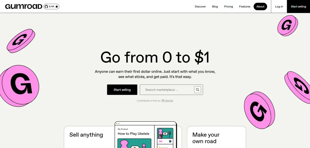
20 Excellent Custom Logo Design Collection1. Gumroad
The Archetype. Gumroad is arguably the poster child for modern Neobrutalism. They ditched the “corporate SaaS” look for vibrant pinks, sharp black outlines, and a layout that feels like a digital zine.
- Key Feature: Hard-edged distinct buttons and a “sticker-like” visual hierarchy.
- Why It Works: It feels accessible and creator-focused, not corporate.
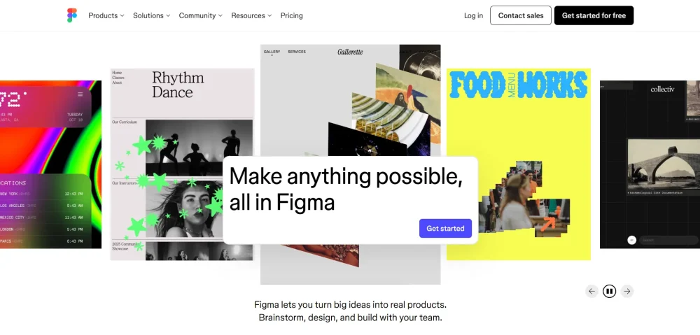
2. Figma (Config 2024 Identity)
For their annual conference, Figma leaned heavily into a colorful, shape-based brutalist identity. It uses massive typography and geometric primitives (squares, circles) that overlap in “incorrect” ways.
- Key Feature: Kinetic typography and high-saturation color clashing.
- Why It Works: It visualizes the “messy” creative process of design itself.
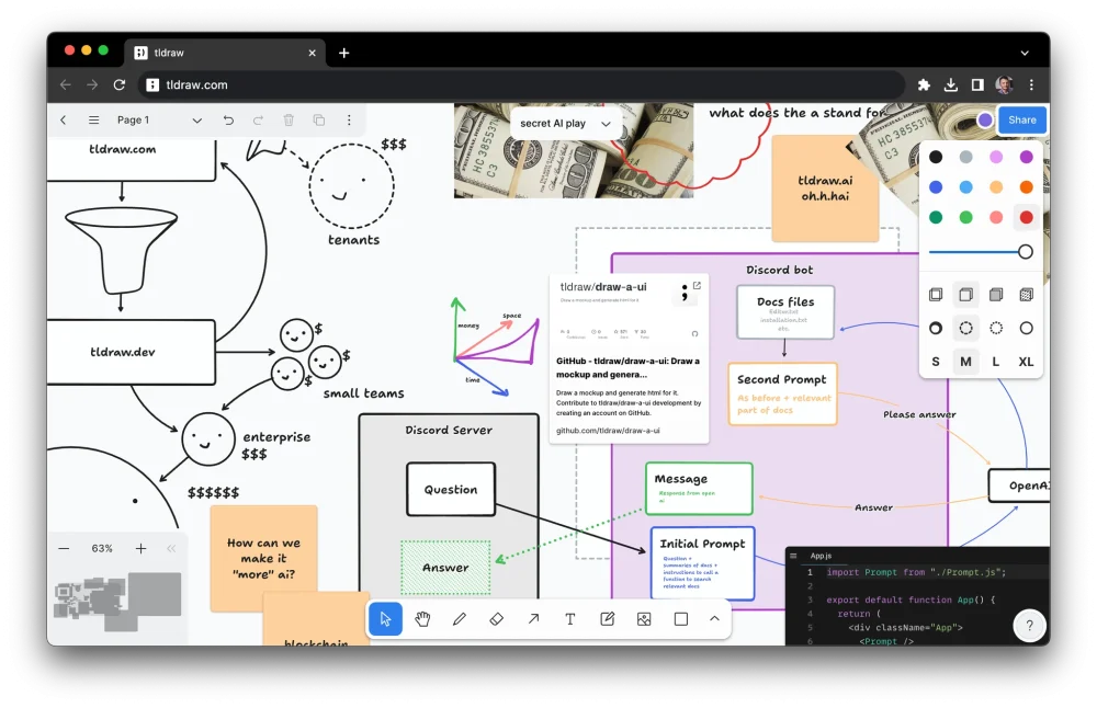
3. Tldraw
A collaborative whiteboard that feels like a sketchpad. The UI is minimal but “sketchy,” using handwriting fonts and imperfect lines that mimic a hand-drawn diagram.
Top 10 Email Design Best Practices – Infographic- Key Feature: The “Make It Real” button and UI that looks like a wireframe.
- Why It Works: It lowers the barrier to entry; it doesn’t feel precious, so you aren’t afraid to mess it up.
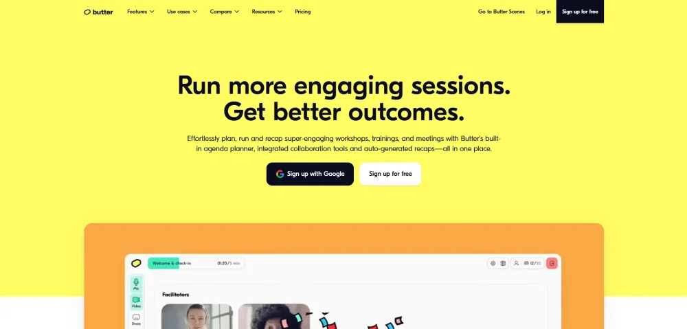
4. Butter.us
A video conferencing tool that uses “soft brutalism.” It keeps the chunky borders and bold colors (yellows and pops of blue) but rounds the corners slightly to feel friendlier.
- Key Feature: The “waiting room” UI with bold, quirky character illustrations.
- Why It Works: It makes meetings feel fun rather than draining.
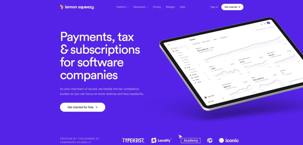
5. Lemon Squeezy
A payment platform for software. Their design is a “refined” neobrutalism—clean grids, sharp monochromatic lines, but with flashes of electric purple and neon.
- Key Feature: The high-contrast dashboard with zero drop shadows (flat design 2.0).
- Why It Works: It communicates precision and reliability while looking edgy.
E-Commerce & Agencies
Where style meets conversion.
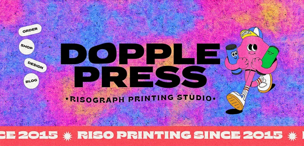
Stunning Brand Packaging Design Inspiration6. Dopple Press
A risograph printing studio that uses a chaotic, collage-like layout. Elements overlap, distinct colors vibrate against each other, and navigation feels like flipping through a physical portfolio.
- Key Feature: Overlapping images and a lack of traditional “rows.”
7. Buffl
A tech agency site that uses “glitch” aesthetics and stark typography. It treats the browser window like a terminal, often using monospace fonts and visible grid lines.
- Key Feature: Visible layout grids and “system” fonts (Courier/Space Mono).
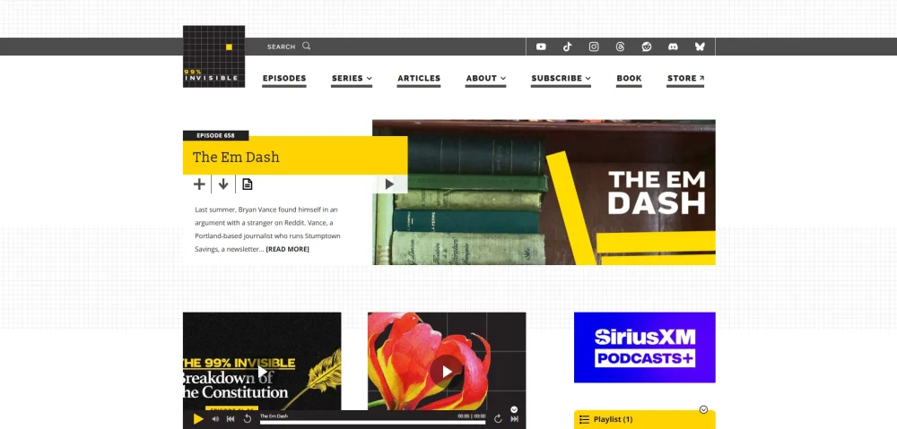
8. 99% Invisible
While primarily a podcast, their web presence often utilizes stark, utilitarian design principles—grey tones, jarring graphic blocks, and a focus on “noticed” architecture.
Cool Website Designs for Inspiration- Key Feature: “Ugly-beautiful” layout that prioritizes content structure over decoration.
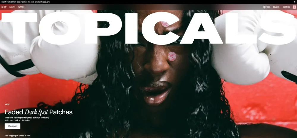
9. Topicals
A skincare brand that uses a “Y2K Neobrutalist” vibe. Think chrome effects, starry sparkles, and layout boxes that look like old Windows 95 pop-ups.
- Key Feature: Retro-internet nostalgia mixed with modern e-commerce UX.
10. Brutalist Websites (The Gallery)
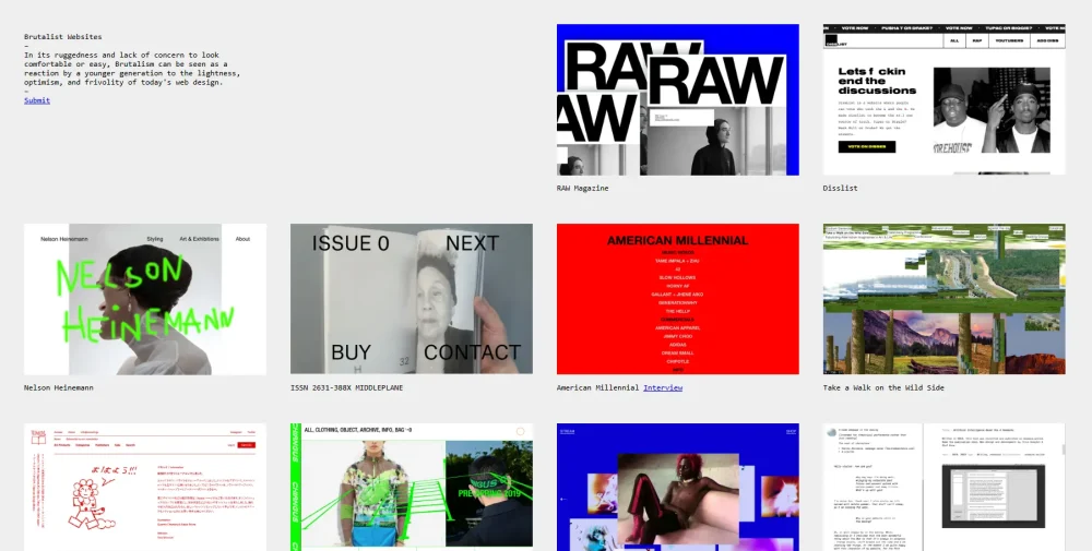
The meta-example. This gallery collects the rawest forms of the trend. It’s a great resource to see the extreme end of the spectrum—sites that are almost “broken” by design.
- Key Feature: A bare-bones list layout that proves content is King.
The “Building Blocks” (Tools & Templates)
These tools and templates embody the style and help you build it.
11. Neobrutalism.dev
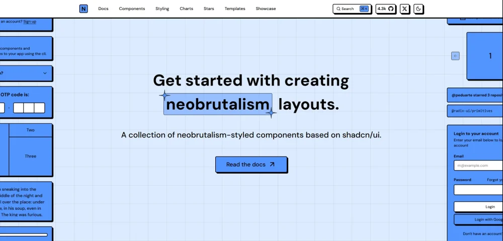
A collection of Neobrutalist components (buttons, cards, inputs) built with Tailwind CSS. It’s a live documentation site that practices what it preaches.
- Key Feature: Copy-pasteable components with hard shadows and bold borders.
12. “Racca” (Webflow Template)
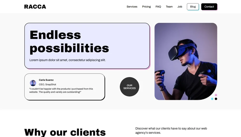
A premium template that showcases the “Agency” side of Neobrutalism. It features marquee scrolling text, oversized headers, and image masks.
- Key Feature: Smooth parallax scrolling combined with harsh static elements.
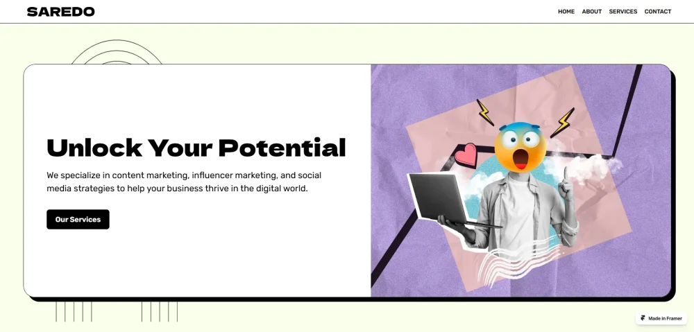
13. “Saredo” (Framer Template)
A Framer template for agencies. It uses a “Bento Grid” layout but with thick black separators and pastel background colors.
- Key Feature: The “Card” layout where every section is a distinct, bordered box.
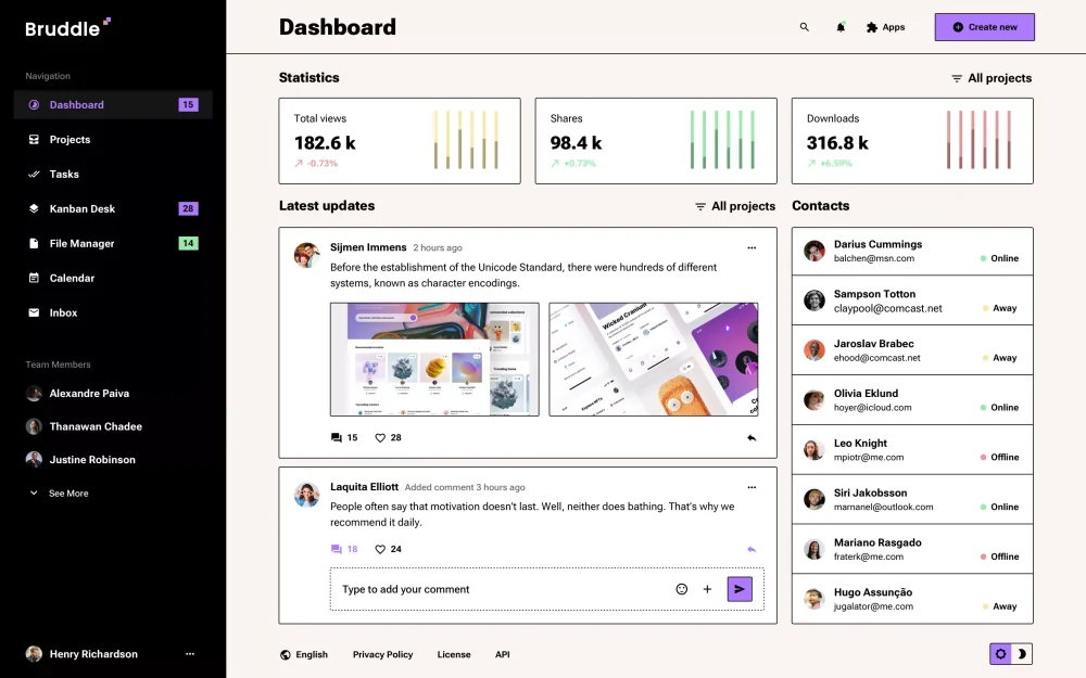
14. “Bruddle” UI Kit
One of the most popular UI kits for this style. It provides hundreds of pre-made “chunky” components for Figma.
- Key Feature: A design system based entirely on stroke weight and lack of blur.
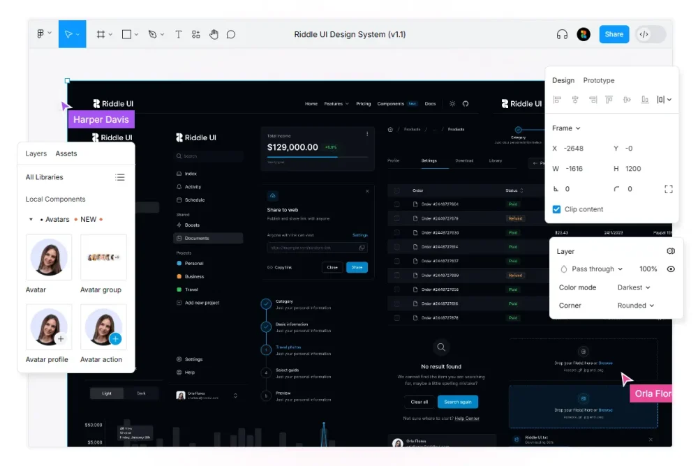
15. “Riddle UI”
A design system that markets itself as “Bold, Uncompromising, Revolutionary.” It creates interfaces that look like comic book panels.
- Key Feature: Hand-drawn icons mixed with geometric structural elements.
Creative Portfolios & Experiments
Indie designers pushing the boundaries.
16. Motherf***ingwebsite.com
The satirical “grandfather” of the movement. It argues that a website only needs HTML to be perfect. It’s text-only, highly readable, and brutally honest.
- Key Feature: Zero CSS (or close to it). Pure functionality.
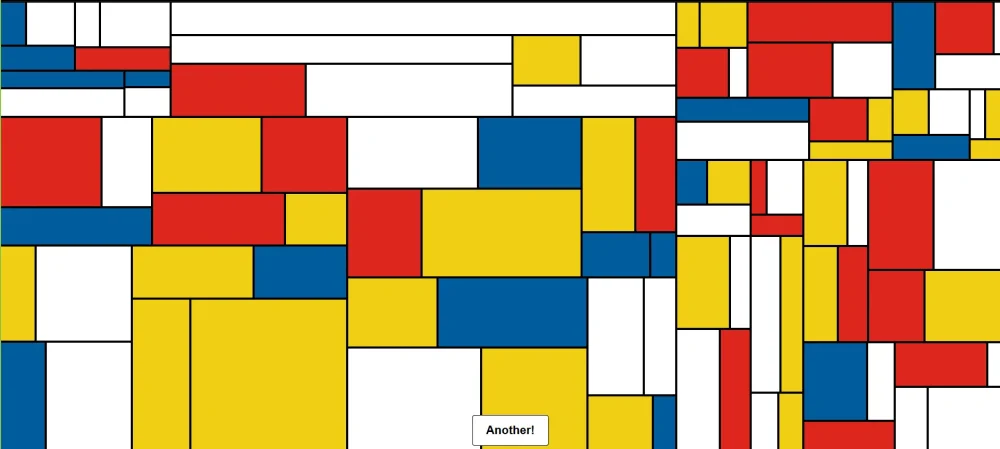
17. Piet Mondrian Generators (CodePens)
Various CodePen experiments that turn the web into a Mondrian painting—primary colors and black grids. This is the artistic root of the trend.
- Key Feature: CSS Grid pushed to its artistic limit.
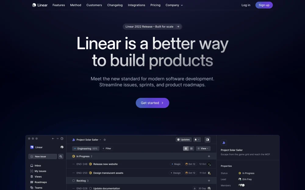
18. Linear (The “Linear Effect”)
While Linear is often called “Minimalist,” its strict adherence to grids, high contrast, and “mode” switches (light/dark) has influenced the precision side of Neobrutalism.
- Key Feature: The “Glow” effect against stark black backgrounds.
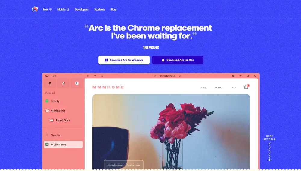
19. Arc Browser
Arc reimagines the browser chrome itself. Its use of “easels” and spaces allows users to create their own brutalist dashboards.
- Key Feature: The sidebar and “Spaces” that break the traditional top-nav convention.
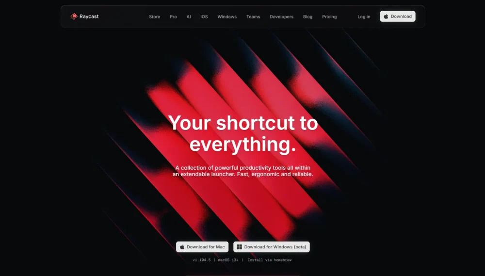
20. Raycast
A productivity tool that is purely keyboard-driven. Its website and UI are a masterclass in “Command Line Chic”—a sub-genre of Neobrutalism that fetishes the terminal.
- Key Feature: The command bar search interface.
Neobrutalism Tool Collection
Want to build this style? These are the best tools to get started quickly.
| Tool / Template | Type | Best For | Pricing |
|---|---|---|---|
| Bruddle | Figma UI Kit | SaaS & Mobile Apps | ~$48 |
| Neobrutalism.dev | Component Library | React/Tailwind Devs | Free |
| Saredo | Framer Template | Design Agencies | ~$49 |
| Riddle UI | Design System | Complex Dashboards | ~$99 |
| Gumroad | Platform | Selling Digital Goods | Free to Start |
Comparison: Neobrutalism vs. The Rest
Why does it look so different? Here is the breakdown.
| Feature | Minimalism (e.g., Apple) | Material Design (e.g., Google) | Neobrutalism (e.g., Gumroad) |
|---|---|---|---|
| Shadows | Soft, blurred, realistic | Depth-based, layered | Hard, black, 100% opacity |
| Borders | Thin, gray, invisible | minimal, used for separation | Thick, black, defined strokes |
| Colors | Pastels, whites, grays | Primary, consistent palette | High saturation, clashing, neon |
| Typography | Clean, sans-serif, modest | Readable, standard sizes | Massive, weird, decorative |
| Vibe | “Invisible” design | “Helpful” design | “Look at me” design |
Color Palettes (Copy & Paste)
Use these hex codes to instantly achieve the look.
1. The “Gumroad” Pop
- Background:
#FFFFFF(White) - Stroke/Text:
#000000(Black) - Accent:
#FF90E8(Hot Pink) - Highlight:
#FFC900(Marigold)
2. The “Terminal” Stark
- Background:
#0F0F0F(Almost Black) - Text:
#00FF41(Matrix Green) - Borders:
#333333(Dark Grey)
3. The “Soft” Brutalist
- Background:
#FDF6E3(Cream) - Cards:
#A390E4(Muted Purple) - Shadows:
#222222(Soft Black)
Detailed FAQ
Like all trends, it will evolve. We are already seeing “Soft Brutalism” (rounded corners, pastel colors) taking over. The core principles of high contrast and clear separation, however, are timeless UX rules that will stay.
Not if done right. In fact, the high contrast and clear borders often make Neobrutalism more accessible and readable than subtle minimalism. Buttons look like buttons. However, relying too much on “chaos” can confuse users, so maintain a clear grid structure.
Original Brutalism (1950s architecture) was about raw materials (concrete) and cost-saving. “Neo” brutalism is a digital revival that keeps the “raw” look (default HTML styles, strokes) but adds modern animation and branding to make it friendly, not depressing.
Probably not. This style screams “startup,” “creative,” and “disruptor.” For high-trust industries like banking or insurance, it might feel too playful or unstable. Stick to Fintech startups, not legacy banks.
You want fonts that have personality or look “default.”
– Sans-Serif: Space Grotesk, Syne, Sora.
– Serif: Courier New (or any monospace), Bricolage Grotesque.