Great landing pages all do one thing well – they help the visitor understand what the product is, and help get them excited about it. Sometimes that means the landing page is attention grabbing and bold and uses loud visuals to show off. But there’s also a trend in having very understated, elegant and tasteful landing pages that showcase the product using a clean, minimal design.
Because the designs are understated, they often help to cut through all the noise compared to their rivals. They appear clean and simple, and they help the visitor understand the product without being distracted by fussy, complicated visuals.
We’ve brought together some of our favourite examples of minimalist landing pages that all do a great job of getting rid of the unnecessary elements, and instead focus only on what matters. We hope you find these examples a source of inspiration for your next marketing page design, and that you share any other examples you’ve found with us in the comments.
Minimalist Landing Pages
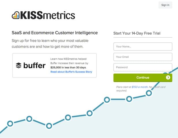
KISSmetrics
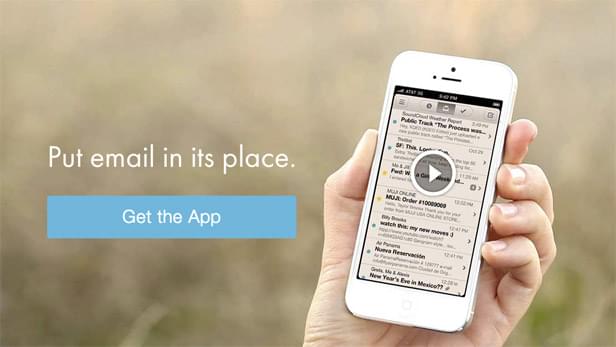
Mailbox
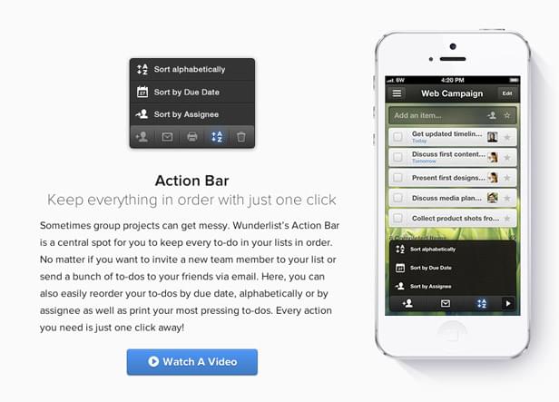
Wunderlist Pro
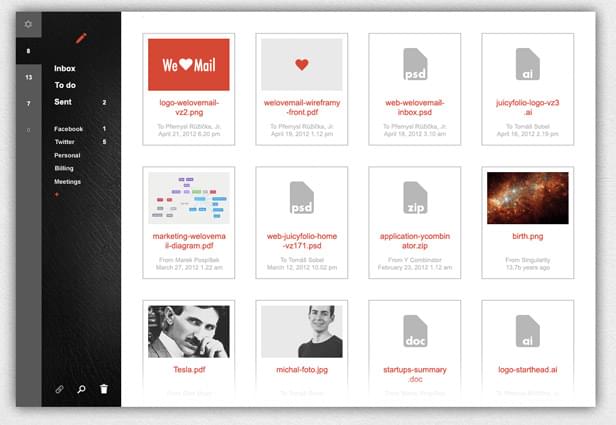
WeLoveMail
Gumroad

Minimalytics

Solo

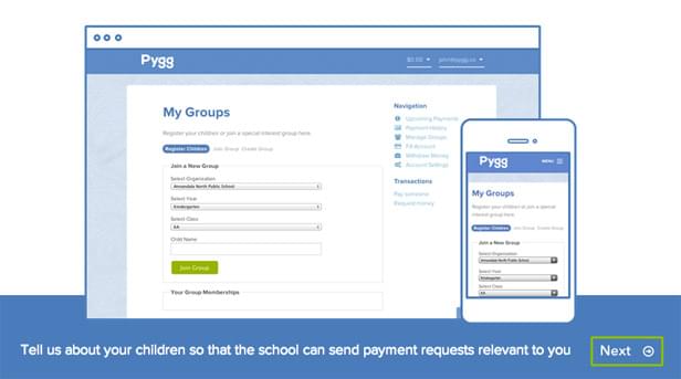
Pygg
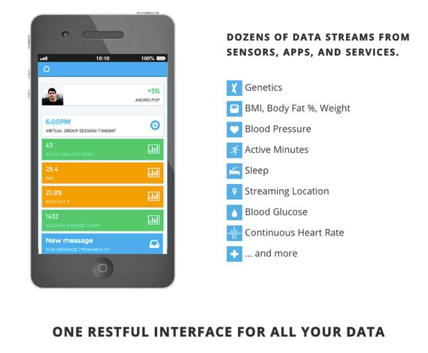
HumanAPI
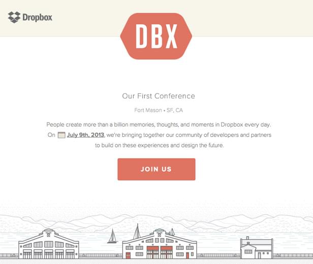
Dropbox DBX Conference
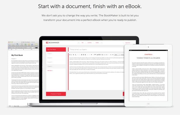
Tablo BookMaker
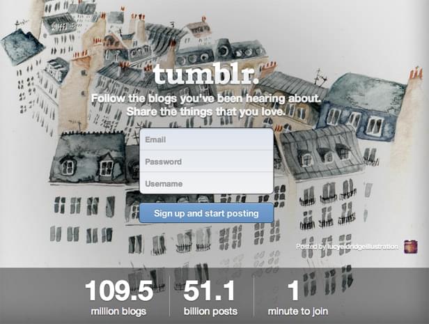
Tumblr
Mapkin

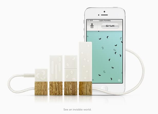
Lapka
Have you come across any clean, elegant, minimalist landing pages that you think deserve some recognition? Let us know what you’ve found in the comments!
[divider_1px_bg]
Noma Bar Brilliantly Creates Awesome Negative Space IllustrationsEditor note: Contributor Dan is a designer for The Handpicked Food store and The Handpicked Collection. In his spare time he enjoys practicing his Photoshop skills and is learning to code.