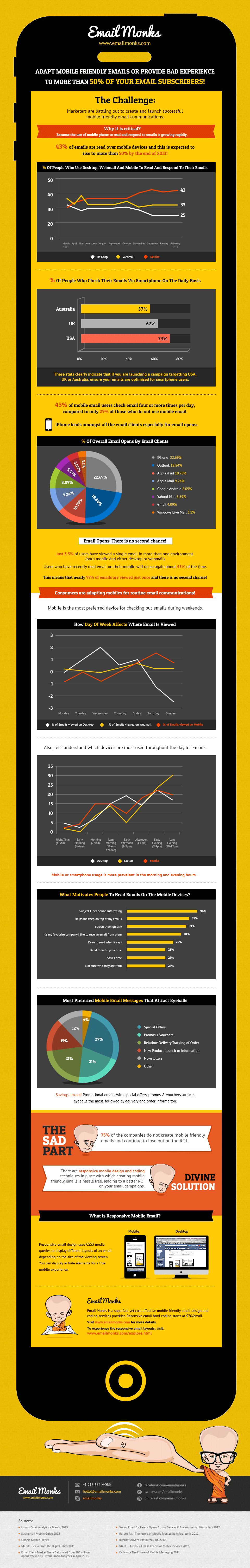
Conversing about the significance of mobile optimized email and the key considerations thereon, marketers face challenges in terms of the different screen sizes of the mobiles resulting in sad design views at times, although the email is crafted meticulously. In 2013, Marketers are battling out to create and launch successful responsive mobile friendly email communications keeping in mind every small factor.
As more people tend to respond and read emails over mobile devices, there is a high time marketers should create responsive mobile emails to increase the opens, clickthroughs and responses.
The one size fits all approach isn’t prevalent any more in the industry. I chanced upon yet another infographic from Email Monks that bring to you the vital mobile email stats, you might have long craved for. Infographic gathers unique stats from many sources and covers the recent vogue of mobile. Some of the staggering stats include:
[list style=”1″ underline=”1″]
- 43% of Emails are read over the phones and this is expected to rise to more than 50% by the end of 2013!
- 73% of the people from USA check their emails on smartphones.
- 43% of mobile email users check their emails four or more times per day, compared to only 29% of those who do not use mobile email.
- Mobile or Smart-phone usage is more prevalent in the morning and evening hours.
[/list][margin_15b]
Beautiful Digital Art Portraits of Artist’s Favourite Singer, Musicians, Actors and WritersInfographic also gives a succinct on the market share of various email clients Calculated from 205 million opens tracked by Litmus Email Analytics in April 2013.
This infographic from Email Monks also makes you understand what’s a responsive mobile email? According to the infographic, Responsive email design uses CSS3 media queries to display different layouts of an email depending on the size of the viewing screen. You can display or hide elements for a true mobile experience.