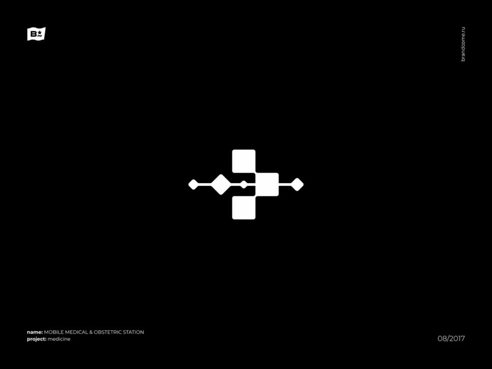
The abstract logo marks can be defined as a logo that lacks a certain level of realism in the design. This type of logo is more abstract and can, in most cases, be seen as a geometric shape. The use of a geometric shape is a common theme when it comes to this type of logo.
Abstract logos are logos that only stick to the bare essentials. They are made up of shapes, colors, and lines that are all abstract. These logos are often built on grid lines that may or may not be visible at first glance. They are often designed by creative agencies who want to offer something different than their competitors.
Get inspired by the beautiful and creative logo marks design from Alexey Netkachev and get your inspiration for your next logo design project.
