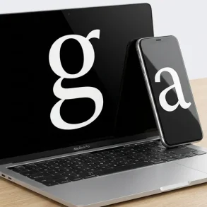

When you open The New York Times, you aren’t just reading news; you are experiencing a masterclass in visual authority. For over 170 years, “The Gray Lady” has cultivated a typographic identity so distinct that even a single sentence, stripped of all branding, remains instantly recognizable.
Whether you are a graphic designer looking to capture that “editorial” vibe, a developer tasked with building a news-heavy site, or a type geek dissecting the x-height of a serif, understanding the NYT font stack is essential.
This guide deconstructs the specific typefaces that power the world’s most influential newspaper, from its gothic masthead to its digital-first CSS.
The Anatomy of an Icon: NYT Typography Overview
The New York Times doesn’t rely on a single font. Instead, it orchestrates a complex three-pillar system designed to command attention, establish hierarchy, and ensure long-form legibility across ink and pixels.
- The Identity (The Masthead): A custom, blackletter-inspired logo.
- The Voice (Headlines): A proprietary version of Cheltenham.
- The Engine (Body Text): Imperial for print and Georgia (or custom variations) for digital.
This hierarchy ensures that the reader’s eye moves effortlessly from the urgent headline to the granular details of the story, a feat of engineering that has evolved significantly as the paper transitioned to 4K screens and mobile apps.
SEO for Single Page Applications (SPAs): The Definitive 2026 Technical GuideThe Masthead: That Famous Gothic Logo
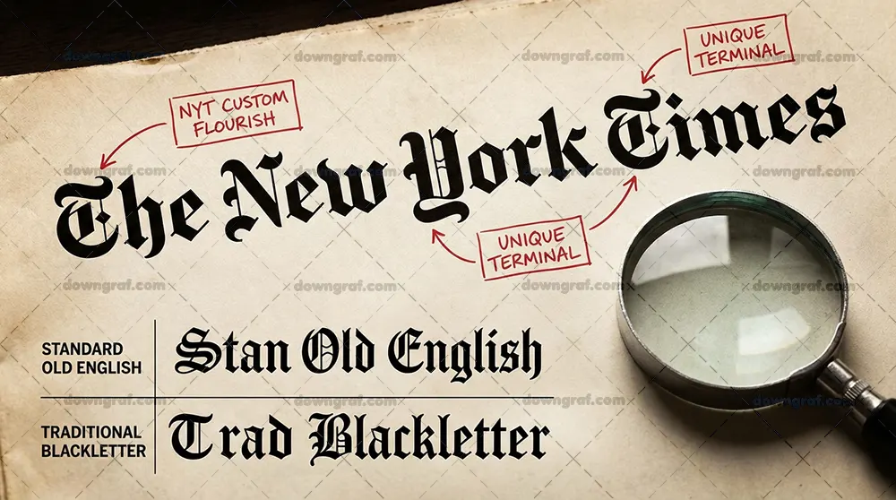
First, let’s clear up a common misconception: The New York Times logo is not a font. You cannot simply type “The New York Times” in a standard typeface and achieve this look.
The masthead is a piece of custom hand-lettering rooted in the Blackletter or Fraktur tradition. While it mimics the “Engravers Old English” style popular in the mid-19th century, the current iteration is a refined version drawn by legendary type designer Matthew Carter.
Carter cleaned up the ornaments and balanced the weights to ensure the logo remained legible even when shrunk down for a favicon or a mobile header. It evokes a sense of history and permanence—qualities essential for a brand that serves as the “paper of record.”
Headline Typography: NYT Cheltenham
If the masthead is the face of the NYT, Cheltenham is its voice.
Originally designed in 1896 by architect Bertram Goodhue, Cheltenham was a radical departure from the spindly, high-contrast serifs of the Victorian era. The Times began using it heavily in the early 2000s to modernize its aesthetic.
However, the paper doesn’t use the “retail” version you find on MyFonts. They use NYT Cheltenham, a proprietary family modified to be slightly more condensed and varied in weight.
Why Cheltenham?
- Verticality: It has long ascenders (the parts of letters like ‘b’ or ‘d’ that stick up), which gives headlines an elegant, tall appearance.
- Flexibility: The NYT uses everything from “Light Italic” for soft features to “Extra Bold” for breaking news.
- Legibility: Unlike many display fonts, Cheltenham remains readable even when tightly kerned to fit a massive headline into a three-column layout.
Reading the News: Print vs. Digital Body Text
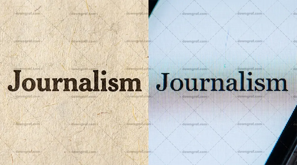
The way you consume news dictates the font you see. The NYT optimizes for the medium, recognizing that ink on paper behaves differently than light on a screen.
Print: NYT Imperial
In the print edition, the body text is set in Imperial. Originally designed by Edwin Shaar in the 1950s and later refined by Matthew Carter, Imperial was engineered specifically for the harsh conditions of a high-speed printing press. It features a large x-height (the height of the lowercase letters) and sturdy serifs that don’t disappear when the ink bleeds into the newsprint.
Digital: Georgia and NYT Magallanes
For a long time, the NYT website was the gold standard for Georgia. Designed by Matthew Carter for Microsoft, Georgia was the first serif font built specifically for low-resolution screens.
In recent years, the digital experience has shifted. While Georgia still anchors much of the site, the NYT has integrated custom faces like NYT Magallanes and refined versions of their headline fonts to bridge the gap between their heritage and the crispness of modern Retina displays. On mobile apps, the typography is further optimized to ensure that line-height (leading) provides enough white space for the eye to track comfortably.
The Supporting Cast: Franklin Gothic & Sans-Serifs
While serifs handle the heavy lifting of storytelling, the NYT utilizes Franklin Gothic (specifically a custom version called NYT Franklin) to manage the data.
You’ll spot Franklin Gothic in:
- Byline dates and timestamps.
- Photo captions and credits.
- Navigation menus and section labels.
- The “Style” and “Magazine” sections for a more contemporary feel.
Franklin Gothic provides a “functional” contrast to the academic feel of Cheltenham. It signals to the reader: “This is a fact, a label, or a navigation tool,” rather than the narrative itself.
For Developers: Recreating the NYT Aesthetic (CSS Guide)
If you’re building a blog or a news portal and want to evoke the NYT’s sophisticated atmosphere, you can mimic their font stack using CSS. While you won’t have access to their proprietary “NYT” versions, you can use high-quality alternatives.
The CSS Font Stack
To get as close as possible using standard web-safe fonts and Google Fonts, try this configuration:
/* Headline Style - Aiming for Cheltenham */
h1, h2, h3 {
    font-family: 'Playfair Display', 'Georgia', serif;
    font-weight: 700;
    letter-spacing: -0.02em;
    line-height: 1.1;
}

/* Body Text - Mimicking the digital NYT experience */
p {
    font-family: 'Georgia', 'Times New Roman', serif;
    font-size: 1.125rem;
    line-height: 1.6;
    color: #333333;
    -webkit-font-smoothing: antialiased;
}

/* Metadata & Captions - The Franklin Gothic look */
.caption, .byline {
    font-family: 'Libre Franklin', 'Helvetica', sans-serif;
    text-transform: uppercase;
    font-size: 0.75rem;
    letter-spacing: 0.05em;
}
Implementation Tip: Pay close attention to the line-height. The NYT uses generous spacing in their body text to prevent “eye fatigue” during long-form investigative pieces.
5 Free Alternatives to the NYT Fonts
You don’t need a New York Times budget to get their look. Use these free, open-source alternatives available on Google Fonts or Adobe Fonts:
- Chomsky (The Logo): Created specifically to mimic the NYT masthead. It’s the closest free version of the blackletter branding you can find.
- Playfair Display (Headlines): While more high-contrast than Cheltenham, it captures the same “prestige” editorial feel.
- Georgia (Body Text): Already installed on most computers. It remains the best “free” version of the NYT digital reading experience.
- Libre Franklin (Metadata): A perfect open-source stand-in for the NYT Franklin used in captions and navigation.
- PT Serif: A sturdy, reliable serif that mirrors the “workhorse” nature of NYT Imperial.
Conclusion: The Evolution of the “Gray Lady”
From the heavy woodblock type of 1851 to the sub-pixel rendering of 2025, The New York Times has proven that typography is not just about choosing a font—it’s about building a system.
Their shift from Times New Roman to Georgia, and eventually to custom proprietary faces like NYT Cheltenham, reflects a commitment to the reader’s comfort. They understand that the medium changes, but the need for authoritative, legible communication does not.
By balancing the “old world” gravitas of blackletter with the modern utility of Franklin Gothic and the elegance of Cheltenham, the NYT remains the gold standard for editorial design.
FAQ
Is the New York Times font free?
No. Most fonts used by the NYT are proprietary (NYT Cheltenham, NYT Franklin) or require a commercial license (Imperial). However, Georgia is widely available.
What is the NYT logo font called?
It isn’t a font; it is a custom blackletter logo based on the Fraktur style, refined by Matthew Carter.
Does the NYT use Times New Roman?
Rarely. While it was used in the past, the paper has moved toward Georgia and its custom Cheltenham/Imperial faces for better legibility and brand distinction.