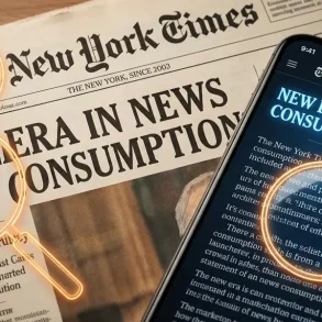

Apple does not just choose fonts; it engineers them. From the moment Steve Jobs sat in a calligraphy class at Reed College, typography became a foundational pillar of the Apple brand. Today, every pixel on an iPhone, every line of code in Xcode, and every marketing billboard reflects a meticulous obsession with letterforms. This dedication is what makes Apple’s typography stand out on Digital screens.
So, what font does Apple use?
As of 2025, the primary font used across the Apple ecosystem—including iOS, macOS, watchOS, and visionOS—is San Francisco (SF). This custom-designed sans-serif typeface replaced Helvetica Neue nearly a decade ago, marking a shift toward a more legible, adaptable, and proprietary design language.
In this guide, we will break down the San Francisco family, explore Apple’s serif companion, New York, and trace the 40-year history of the company’s typographic evolution.
The Short Answer: What Font Does Apple Use in 2025?
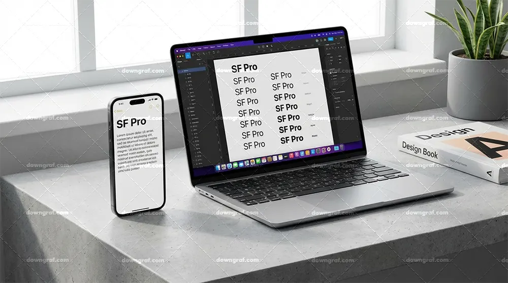
If you look at your iPhone or Mac right now, you are looking at San Francisco. Specifically, you are likely looking at SF Pro.
San Francisco is a neo-grotesque sans-serif typeface, similar in spirit to Helvetica or Akzidenz-Grotesk but optimized for the modern digital screen. Unlike off-the-shelf fonts, San Francisco is dynamic. It shifts its letter spacing and “optical size” based on the size of the text. This ensures that a tiny notification on an Apple Watch remains just as readable as a bold headline on a 27-inch iMac.
Apple uses this typeface to maintain a consistent branding identity while solving the technical challenges of legibility across wildly different screen sizes.
The San Francisco Family: Variants & Use Cases
Apple didn’t stop at a single font file. To accommodate everything from a wearable watch to a spatial computing headset, they built a massive family of variants.
SF Pro
SF Pro is the workhorse of the Apple ecosystem. It is the system font for iOS, iPadOS, and macOS. It features adaptable tracking (the space between characters) that changes automatically. If you’re designing a mobile app, this is the default font you’ll use to match the Apple aesthetic.
SF Compact
Designed specifically for the Apple Watch, SF Compact solves a geometry problem. Because the watch face is small, the rounded curves of letters like ‘o’ and ‘e’ were flattened slightly on the sides. This creates more “white space” between characters, making text legible at a glance without the letters blurring together.
SEO for Single Page Applications (SPAs): The Definitive 2026 Technical GuideSF Mono
Developers spend hours looking at the Terminal and Xcode. SF Mono is a monospaced variant where every character takes up the same horizontal space. It maintains the San Francisco DNA but optimizes it for reading lines of code, where alignment is critical.
New York: The Serif Companion
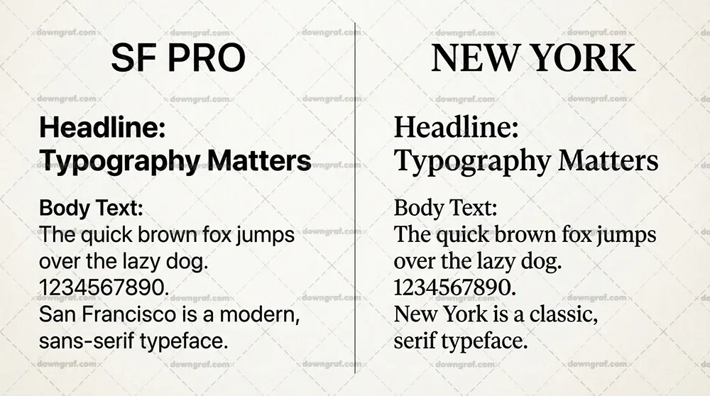
In 2019, Apple introduced New York, a custom serif typeface. While San Francisco handles the interface, New York handles the reading experience. You’ll see it in Apple Books, Apple News, and as a sophisticated contrast in the Journal app. It’s a “transitional” serif that looks traditional but feels modern on a high-resolution Retina Display.
Design Philosophy: Why San Francisco Replaced Helvetica
For years, Apple used Helvetica Neue as its primary font. However, as screen resolutions increased and devices got smaller, Helvetica began to fail. This failure was most apparent when viewing text on high-density Digital screens.
Helvetica is a “static” font. It was designed for print in the 1950s. At small sizes on a screen, the tight apertures (the holes in letters like ‘a’, ‘c’, and ‘e’) tend to close up, making the text look like a blurry mess.
Apple needed an in-house solution that prioritized readability. San Francisco was the solution. Here is why it works:
1. Optical Sizing: San Francisco is actually two fonts in one: SF Pro Text and SF Pro Display. The system automatically switches between them. At 20 points and above, it uses “Display” with tighter spacing. Below 20 points, it uses “Text” (wider spacing and larger apertures).
2. Adaptive Tracking: The font communicates with the operating system to adjust its own letter spacing in real-time.
3. Vertically Centered Colons: In a digital clock, a standard colon looks off-center. Apple designed San Francisco to automatically align numbers vertically in the center.
A Chronological History of Apple Fonts
Apple’s journey to San Francisco was long and full of experimental detours.
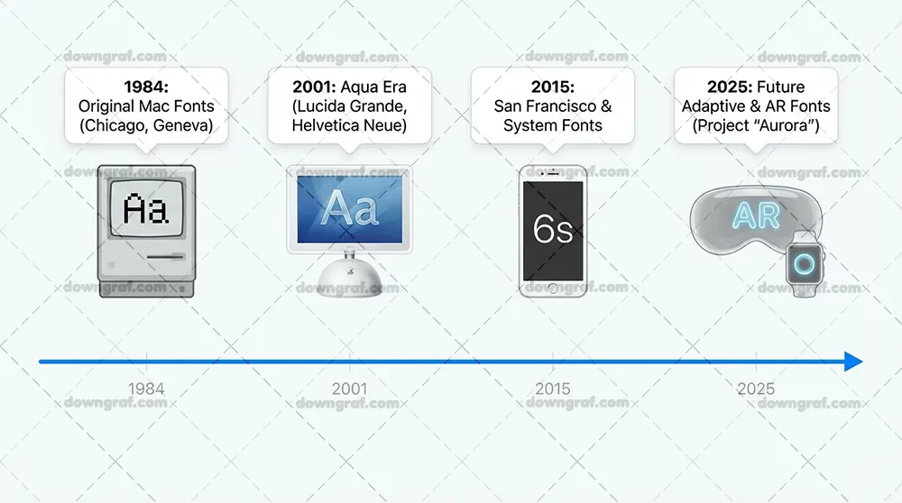
1970s: Motter Tektura
Before the Macintosh, Apple used Motter Tektura for its logo. It looked “space-age” and futuristic, fitting the hobbyist computer era.
1984: The Susan Kare Era (Chicago and Geneva)
When the first Macintosh launched, Steve Jobs insisted on beautiful typography. Designer Susan Kare created a suite of fonts named after world cities. Chicago was the star—a thick, legible font used for the original Mac menus and eventually the first iPod.
1990s: Apple Garamond
For its marketing and the famous “Think Different” campaign, Apple used a condensed version of Garamond. It was elegant, intellectual, and defined the brand for over a decade.
2000s: Lucida Grande & Myriad Pro
With the launch of OS X, Apple moved to Lucida Grande for the system interface. Meanwhile, the company shifted its corporate branding to Myriad Pro, the clean sans-serif font you remember from the original iPhone and MacBook boxes.
2014: The Helvetica Neue “Mistake”
With iOS 7 and OS X Yosemite, Apple moved to Helvetica Neue. While it looked beautiful in marketing, users complained about its thin weights and poor legibility on non-Retina screens. This frustration paved the way for the release of San Francisco in 2015.
Licensing: Can You Use Apple’s Fonts?
This is where things get tricky for designers. While you can download the San Francisco family from the Apple Developer website, the license is highly restrictive.
The Legal “Catch-22”:
* You CAN use SF Pro for creating mockups and UI designs for iOS or macOS apps.
* You CANNOT use SF Pro for your personal website, a commercial logo, or a non-Apple app interface.
Apple treats San Francisco as proprietary software. If you try to embed SF Pro as a web font on your site, you are technically violating the license.
The CSS Workaround
If you want your website to look like an Apple product without breaking the law, you should use the system-ui CSS property. This tells the browser to use whatever font is native to the user’s device.
“`css
font-family: -apple-system, BlinkMacSystemFont, “Segoe UI”, Roboto, Helvetica, Arial, sans-serif, “Apple Color Emoji”, “Segoe UI Emoji”;
By using this code, Mac and iPhone users will see San Francisco, while Windows users will see Segoe UI. It provides a native, minimalist feel without any licensing headaches.
The Top 5 Best Free Alternatives to San Francisco
If you love the Apple aesthetic but need a font you can legally use for your brand or website, these Google Fonts are the closest matches.
1. Inter: Designed specifically for computer screens, Inter is nearly indistinguishable from SF Pro to the untrained eye. It is free, open-source, and highly legible.
2. Roboto: Google’s system font. While slightly more “mechanical” than San Francisco, it offers a similar modern, neutral vibe.
3. Public Sans: A sturdy, neutral sans-serif developed by the US government. It shares the clean, corporate DNA of Apple’s typography.
4. Helvetica Now: The modernized version of Helvetica. It fixes many of the legibility issues of the older version but requires a paid license.
5. Arimo: A great choice if you need a font that maintains the same width as Helvetica and San Francisco for layout purposes.
Typography in the Age of Spatial Computing (visionOS)
With the release of the Apple Vision Pro, typography had to evolve again. In a 3D environment, text isn’t just flat; it’s a layer.
In visionOS, Apple uses a slightly heavier weight of San Francisco by default. Because text is rendered on a “glass” material with varying backgrounds, the font needs more visual weight to remain legible against the real world. Apple’s in-house type team is actively working on San Francisco, making it a dynamic project.
Conclusion
Apple’s use of typography is a masterclass in brand consistency. From the quirky Chicago of the 80s to the surgical precision of SF Pro today, the goal has remained the same: make the technology disappear behind a wall of clear, beautiful communication.
For designers, understanding what font Apple uses is about more than just copying a style. It’s about understanding the balance between form and function. San Francisco isn’t just a font; it’s an interface tool designed to scale from a tiny watch face to a massive 6K display.
Next Steps for Designers:
* Check out the Apple Human Interface Guidelines for deep technical specs.
* Experiment with Inter for your next web project to get that “Apple feel” legally.
* Always remember: the best typography is the kind the user doesn’t even notice.
Related Topics
We haven’t started working on the topics below just yet, but we’ll definitely get to them soon!
* UI/UX Design Principles: How typography impacts user retention.
* Minimalist Branding Trends: Why more companies are moving to custom sans-serif fonts.
* Mobile App Typography: Best practices for font sizes and line heights.