Logos can often look the most simple of things. In fact, all the best generally are. A basic target, a swoosh or two looping arches.
Yet, there are so much more complex than that. Designing a logo takes skill, sophistication and a real eye for detail.
Creating a kick ass logo is so important for a brand, it’ll remain their identity for the rest of their existence. It’s a first impression and gives off key ideologies no matter what the business.
Which is why getting it right is key. Fortunately, logo design software is better and more accessible than ever before, so you can create the image in your head perfectly. Conjuring up that image is where many falter though.
Here are our top tips on making your brand a real stand out image that will blow the socks of consumers and keep your brand in the public eye for years and years to come…
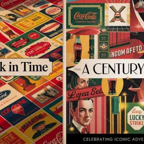
Best Summer Party Flyers for AdvertisingKnow Your Brand
One of the most important things to know is that your logo is the first representation of a brand a customer will likely get. Therefore it needs to instantly portray the key brand values and ethos that you hold.
 Of course, you’ll likely be thinking about how you’re going to create your logo at a similar time to building the rest of your business and brand, so we’d certainly recommend confirming your core values before getting the sketchbook out.
Knowing what you want your brand to represent is one of the first things you need to consider.
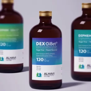
Top 20 Pharmaceutical Packaging Designs for InspirationWhen moving on to your logo you’ll then have a clear idea of what it needs to suggest to the consumer though ideology. AI-driven logo makers like Looka make it easy to design a logo that accurately represents your brand’s values and mission.
A mood board is a good way to help elaborate on this during the design stage. Write down the buzz words in which you want the consumer to understand and surround imagery that you relate to those words around them.
For example, sustainability may offer up images of nature, while quick thinking or fast-paced may have lightning or a fast-moving animal for example. Greyhound buses are a good example of the latter.
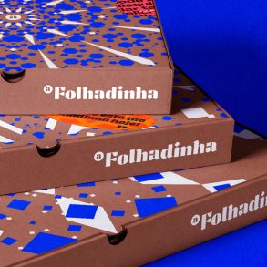
Folhadinha Arabic Branding and Packaging DesignFrom there you can then consider how to implement your messages into your logo.
What type of imagery and what type of messages you use again comes down to knowing your brand.
Think about who your brand is targeting as an audience and think about what type of imagery is most relevant to them. What will bring out the most emotion from them and consider using you as a brand?
Pharmaceutical Packaging Trends 2024: What’s on the Horizon?Keep Things Simple
Think of all the biggest brands and most recognisable logos on the planet, they all have one thing in common, simplicity.
 Simple logos are successful for a variety of reasons, but for the most part they’re simply more recognisable.
You should be able to glance at a logo and instantly know the brand. The need to examine it means there is too much going on and your brand messages may become confused.
Recognisable and simple leads to memorable. They require less brain power and aren’t necessarily reliant on being in a certain colour or size.
Take the Nike Swoosh for example. It’s iconic no matter what colour it is in, what size it is and even which way round it is.
The Swoosh has a very basic meaning, ultimately representing motion and speed. Nothing can get mixed within those messages. It’s simplicity offers clear values that have well and truly stood the test of time.
Be Versatile
With simplicity will often come versatility and every logo should have some form of it, especially if your brand is a product.
![]() Think about where your brand logo will appear and make sure it looks good everywhere it needs to be.
Think about where your brand logo will appear and make sure it looks good everywhere it needs to be.
For example, if you’re opening a restaurant, your logo might really stand out on an advert in the local newspaper, but simply doesn’t look right on a menu.
Adidas have mastered this in the retail world. The Three Stripes logo often appears above the brand name in a triangular form, although you would simply only need three stripes to appear anywhere on the garment to understand it’s the German sportswear giant.
As well as that, the stripes can also adapt to any colour scheme, just as the likes of Apple and Levi’s can, although the latter is mostly associated with red.
Be Unique!
Being unique really can’t be underestimated. It’s absolutely vital you create a unique logo for a variety of reasons.
![]() First of all, it is your representation within the market and if it’s similar to something that’s been done before, then you’re feeding an impression to the world you don’t have ideas of your own.
First of all, it is your representation within the market and if it’s similar to something that’s been done before, then you’re feeding an impression to the world you don’t have ideas of your own.
That’s not to mention the plethora of other reasons. If too similar to another logo, it could quite easily get confused with that, meaning your ideologies, brand and products potentially get muddled in with a different company.
Perhaps most importantly however, it could get you in all sorts of trouble as you’ll likely be breaking copyright laws. To bypass this you can use a trademark search to make sure you aren’t stepping on any other brands’ toes.
Think About Colours
While some logos can flip colours with ease, others are very much reliant upon their colour.
![]() The colour of your logo can portray a number of messages. The Science Behind Colour is a good tool to understand what every colour suggests to an audience.
The colour of your logo can portray a number of messages. The Science Behind Colour is a good tool to understand what every colour suggests to an audience.
For example, a red logo will imply energy, sexiness and bold, while greens offer ideas of growth, eco-friendly and instructional.
Yellow, a colour synonymous with McDonalds, suggests optimism, sun and happiness.
A colour can often put the finishing touches to a simple logo and add an extra dimension to how it portrays your brand values.