
The best adverts of the 1930s blended bold ideas with tight budgets. Brands leaned on radio, print, cinema, and outdoor to reach people living through the Great Depression. This guide ranks the 15 best adverts of the 1930s, explains why they worked, and shows their long-term impact.
You’ll see how slogans, characters, and jingles boosted recall and sales. We cover famous 1930s advertisements from Coca‑Cola, De Beers, Lucky Strike, Lysol, Woodbury, and more, and link each to tactics like social proof, scarcity, and problem‑solution framing. You’ll also learn design and copy trends of 1930s ads, what products dominated, and how regulations started to shape claims. By the end, you’ll have a clear set of 1930s advertisement examples and practical takeaways for today’s marketers.
What made 1930s advertising unique?
This decade fused mass radio with national print, while the economy forced persuasive, value‑led messages. Ads used trust signals, medical authority, and catchy music to lower risk and build habit.
Short radio spots and full‑page magazine spreads became the norm. Sponsors funded hit programs, creating the “soap opera” model that linked brands to daily entertainment. Visual styles favored clean type, airbrush illustration, and geometric layouts influenced by Art Deco. Copy often promised proofs like “tested,” “clinically shown,” or “doctor recommended,” mirroring the period’s faith in science. Scarcity and seasonal themes drove sales, and coupons and premiums added value when money was tight.
How did media channels shape the best adverts of the 1930s?
Radio made brands household names, while magazines delivered authority and premium placement. Cinema ads added spectacle before newsreels and features.
20 Beautiful Mockups for Food Packaging Design- Radio: Network sponsorships placed brands inside content, not just between it. Jingles improved memory and created ritual.
- Magazines: Titles like Life, The Saturday Evening Post, and Ladies’ Home Journal gave national reach and aspirational contexts for 1930s products.
- Outdoor and transit: Posters used bold shapes and limited color for quick comprehension.
- Cinema: Short ad reels used movement and music to dramatize product benefits.
The 15 best adverts of the 1930s
These campaigns show strong creative ideas, clear value, cultural fit, and staying power. Each listing includes why it stood out and what we can still use today.
1) Coca‑Cola’s “Santa Claus” holiday campaigns (Haddon Sundblom, 1931 onward)
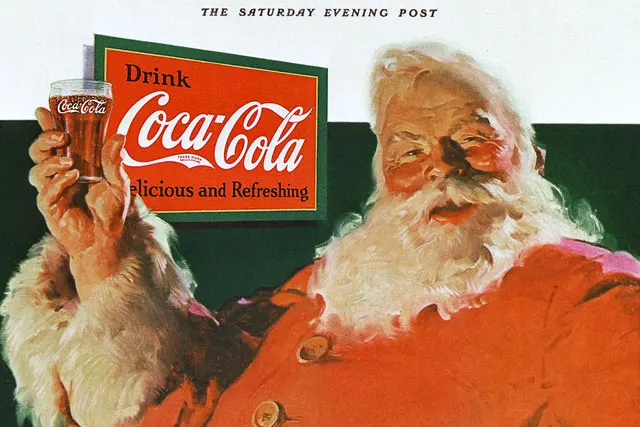
Coca‑Cola’s red‑suited, jolly Santa unified a modern image of Santa for mass culture and linked Coke to holiday cheer. Running yearly, the art placed Coke in family scenes with warmth and generosity.
The ads helped anchor winter seasonality for a cold drink, a smart response to sales dips in colder months. The color match between Coke red and Santa’s suit aided recognition. This long‑running platform reinforced memory by repeating familiar scenes with small variations each year.
Android Neighborhood Signage2) De Beers “A diamond is forever” origin work (late 1930s groundwork)
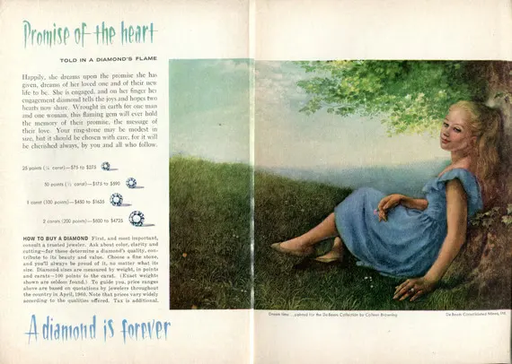
De Beers began shaping the link between diamonds and commitment, backed by market planning that later led to the 1947 tagline. Early magazine placements romanticized diamonds as symbols of lasting love, not just luxury goods.
By tying purchase to life events, De Beers reframed value from carats to meaning. The approach shifted demand from the wealthy to the middle class and set a cultural standard that still defines engagement rings.
3) Lucky Strike “Reach for a Lucky instead of a sweet”
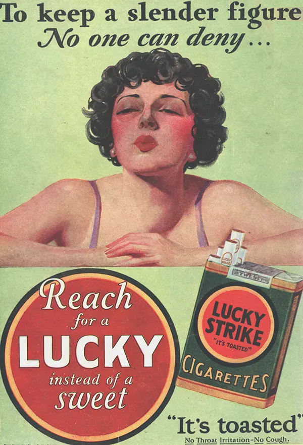
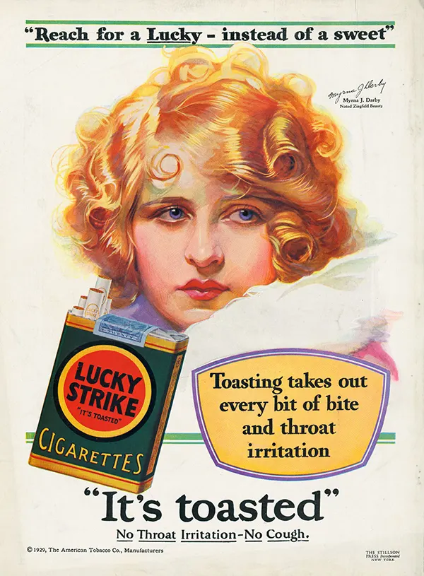
Lucky Strike promoted weight control as a reason to smoke, making a bold lifestyle promise. The slogan worked across print and radio with celebrity tie‑ins.
Folhadinha Arabic Branding and Packaging DesignPositioning cigarettes as a substitute for sweets exploited diet culture and vanity. The line was easy to repeat, and simple benefit framing drove top‑of‑mind recall. It became one of the most quoted cigarette lines of the era.
4) Wheaties “Breakfast of Champions” athlete endorsements
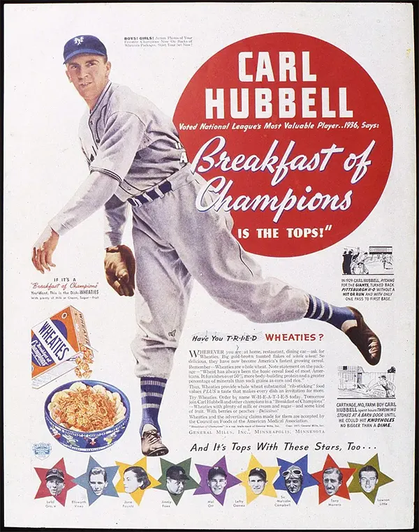
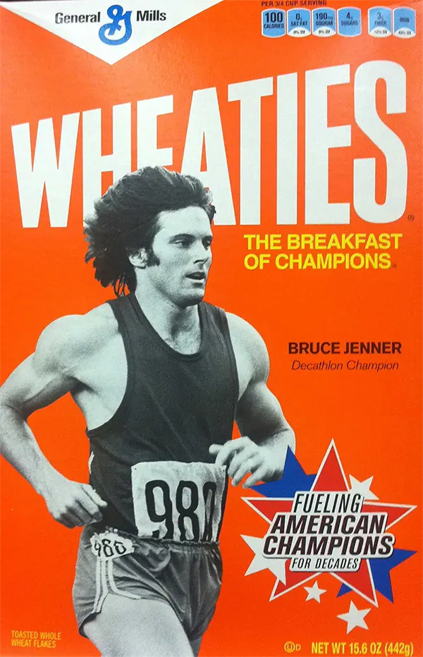
Wheaties grew by pairing athletes with a simple promise: performance starts with breakfast. Box fronts and print ads showed champions alongside the cereal.
Using credible role models delivered social proof. Repetition across packaging and media built a single memory node. The phrase still runs, showing the power of a timeless claim tied to a universal moment.
296 UX Flowchart Cards for Desktop and Mobile5) Ovaltine and “Little Orphan Annie” radio premiums
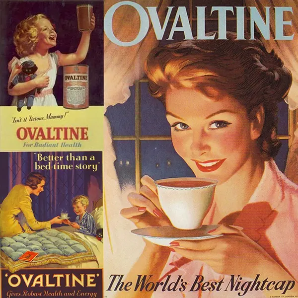
Ovaltine sponsored the hugely popular Little Orphan Annie radio show and offered secret decoder badges sent by mail. Children and families drank Ovaltine to join the club and receive the badge, then used it to decode on‑air messages and feel part of the program.
This was a masterclass in content tie‑in and direct response marketing. The decoder badge created social status and a sense of belonging, while also building a routine and habit at home. Making the product integral to the show experience reduced customer churn and drove repeat purchases, turning casual listeners into regular consumers and reinforcing brand loyalty through an engaging, participatory mechanic.
6) Woodbury Soap “The skin you love to touch”
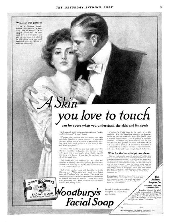
Woodbury’s copy linked soap to romance and touch, an emotional shift from pure cleanliness. Airbrushed portraits and soft focus gave a dreamy mood.
The line offered a social outcome rather than a functional claim. It appealed to desire and intimacy, making a commodity feel special. The phrase was short, memorable, and easy to associate with the brand.
7) Palmolive “Keep that schoolgirl complexion”
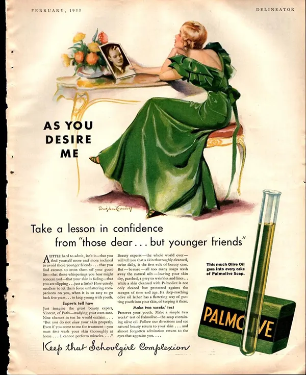
Palmolive promised youth through mildness and natural oils. Its ads contrasted harsh soaps with Palmolive’s gentle clean.
By defining the negative (harshness), Palmolive set the frame and won by comparison. The “schoolgirl” image was vivid and aspirational, and consistency across years built equity.
8) Lysol household and personal hygiene advertising
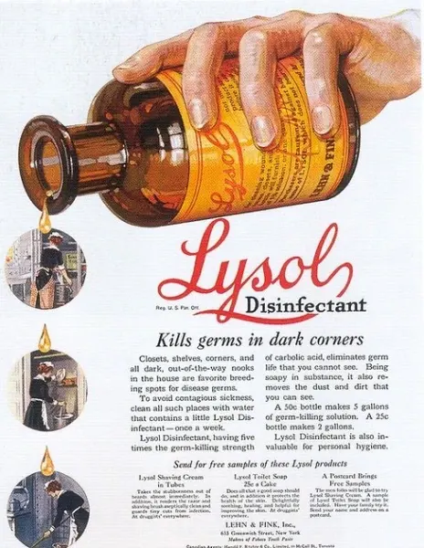
Lysol used fear of germs to sell cleaning and hygiene. Charts, lab coats, and clinical language gave authority to claims about disinfection.
Problem‑solution storytelling fit a decade that respected science. Simple visuals of “before‑after” and checklists made action clear. The brand became a default in home care through trust and frequency.
9) Listerine “Halitosis” social‑proof ads (continued strength in the 1930s)
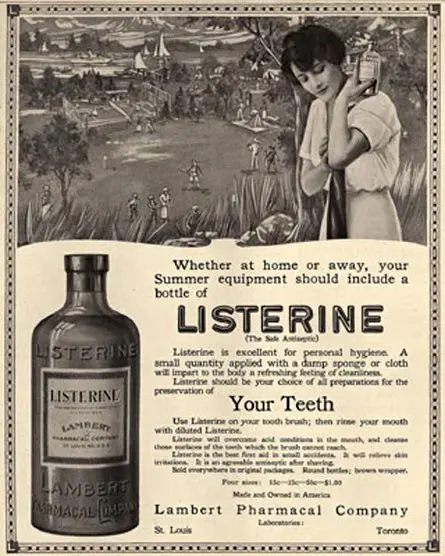
Listerine kept pushing the fear of bad breath ruining social chances. The medical term “halitosis” sounded official and serious.
By naming the problem, Listerine owned it. Stories of lost jobs and failed dates were sticky, making routine mouthwash use feel necessary. This tactic helped create a category habit.
10) Camel “More doctors smoke Camels”
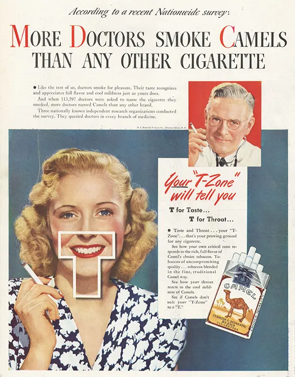
Camels featured physician endorsements to signal a smoother, cooler smoke. White coats in print implied safety and expertise.
Authority cues lowered perceived risk. The phrasing suggested a comparative win among experts, even as the product remained a vice. The line spread widely and shaped brand choice.
What design and copy trends defined 1930s ads?
Design merged Art Deco clarity with soft realism in portraits and product renderings. Copy favored short slogans, proof points, and social outcomes like love, respect, or success.
Large headlines grabbed attention in crowded magazines. Body copy used columns, bold subheads, and testimonials for skimmability. Illustration carried idealized faces and shiny product surfaces. Color palettes leaned to rich reds, greens, and golds that reproduced well in print. Call‑to‑action lines asked readers to cut coupons, mail for samples, or visit dealers.
What products dominated 1930s advertisements?
Household goods, beauty, tobacco, food, beverages, radios, cars, and health remedies filled the pages. These 1930s products solved daily problems and offered small comforts.
- Personal care: soaps, cold creams, hair tonics, toothpaste.
- Household: cleaners, disinfectants, appliances.
- Food and drink: cereals, malted drinks, canned goods, soft drinks, beer.
- Tobacco: multiple brands competed with lifestyle and authority cues.
- Durable goods: radios, cameras, sewing machines, and cars featured value and financing.
1930s advertisements examples you should know
This quick list helps you spot patterns in the best adverts of the 1930s. Use it to guide research or creative references.
- Coca‑Cola holiday Santa spreads
- Lucky Strike dieting angle print
- Woodbury Soap romance copy
- Palmolive gentle‑care claims
- Listerine halitosis stories
- Camel doctor endorsements
- Guinness vitality posters
- Ovaltine radio premiums with badges
- Wheaties athlete tie‑ins
- RCA family radio scenes
Why did these ads work during the Great Depression?
They promised control, comfort, and status at reachable prices. Clear outcomes and social proof reduced risk and made small purchases feel wise.
When people cut back, brands had to prove value fast. Emotional benefits like confidence or family time gave reasons beyond features. Media choices met audiences where they were: at home with radio, in theaters, and in weekly magazines. Repetition turned slogans into habits.
How did regulation and ethics start to shift claims?
Scrutiny rose around medical claims and endorsements. Trade groups and early federal actions pushed for clearer labeling and fewer unproven promises.
Brands adapted with softer language like “helps,” “may,” and “recommended by.” Visual authority cues remained, but evidence standards slowly increased. This nudge shaped the balance between persuasion and proof in later decades.
What can today’s marketers learn from the best adverts of the 1930s?
Focus on one big idea, show a vivid outcome, and repeat it across channels. Pair emotion with a simple proof that people remember.
- Anchor a brand to a season, ritual, or daily moment.
- Use characters, music, or motifs to build memory structures.
- Make offers tangible with premiums, trials, or simple CTAs.
- Keep language short and concrete. Avoid empty claims.
FAQs: Key questions about 1930s ads
What media channels did brands use most in the 1930s?
Radio, national magazines, outdoor posters, and cinema ads carried most spend. Radio delivered intimacy and frequency, while magazines provided visual impact and authority.
Did jingles and slogans really improve sales?
Yes. Short, repeatable lines improved recall and nudged habits. Brands like Wheaties, Coca‑Cola, and Camel built equity through steady slogan use across formats.
Were celebrity and expert endorsements common?
Very. Athletes, singers, actors, and doctors appeared often. Endorsements acted as shortcuts for trust when consumers were cautious with money.
What are the defining features of 1930s advertisements design?
Bold headlines, clean layouts, idealized illustrations, limited but rich color, and a clear focal image. Copy used benefits first, then proof, then a call to action.
The complete list recap: the 15 best adverts of the 1930s
To close, here is the ranked set you can reference for research and creative work.
- Coca‑Cola Santa holiday campaigns
- De Beers early romance positioning
- Lucky Strike “Reach for a Lucky instead of a sweet”
- Wheaties “Breakfast of Champions”
- Ovaltine “Little Orphan Annie” premiums
- Woodbury Soap “The skin you love to touch”
- Palmolive “Schoolgirl complexion”
- Lysol clinical hygiene ads
- Listerine halitosis stories
- Camel “More doctors smoke Camels”
- Guinness “Guinness is good for you”
- RCA home radio lifestyle ads
- Electrolux demo‑driven vacuum sales
- Chevrolet value and trade‑in print
- Pond’s “Before and After” cold cream narratives
Conclusion
The best adverts of the 1930s turned constraint into creativity. They used simple promises, strong symbols, and consistent repetition to win trust and build habits.
Study these 1930s advertisements examples to see how one big idea can live across media. The lessons still hold: be clear, be consistent, and tie your brand to moments that matter.