

Everyone always says to never judge a book by its cover, but who sticks to that rule? If you’re in a bookstore, browsing through, not knowing exactly what you want, there’s no way you won’t take the covers into account when picking out what to buy. Sometimes, the cover feels just ‘right’, and you can’t help wanting to find out more about it.
The truth is, book covers are salespeople in a way. Before you read a title or the blurb, your brain is already making guesses about the story inside. Is this a light-hearted read? Maybe it’s a mystery that will keep you on your toes? An emotional journey, perhaps? What you see on the cover gives you clues.
Every book genre has its own look. Fonts, colors, images, layout. These elements all work together to send a message about what’s inside. Of course, those signals are off sometimes, which makes the readers skip past even if the book is great.
Let’s see what defines book categories and how they make books stand out to the right people.
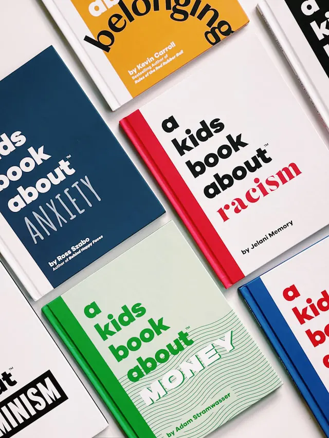
What Points to a Genre at a Glance
If you’re a writer and you’re trying to get your book out there, it’s smart to use a book design service because readers always scan the covers before picking up the books. And if the cover is well-done, it’s packed with visual cues that point to a genre. The clues are anything but random, they’re very carefully chosen.
4 Easy Tips to Record Better Quality Screen Recording VideosHere are visual elements that do the heavy lifting.
Colors
Color is one of the fastest ways a cover communicates mood and genre. Dark colors like black, navy, and blood red are perfect for thrillers and horror because they suggest danger, suspense, even violence. Soft pastels, however, are all about being light and emotional, so they’re more common in romance or contemporary women’s fiction. Bright, bold colors are common in children’s books or upbeat non-fiction, while blues and silvers show up a lot in sci-fi.
Colors tap into emotion – a thriller needs tension, romance needs warmth, fantasy needs magic. And what sets the tone before the reader even looks at the title? Colors.
Understanding Legal Fees: How to Budget for Legal RepresentationImagery and Illustrations
The images or illustrations on a cover paint a quick picture of what’s inside. A memoir or a biography will usually have a photo of the subject. A fantasy novel might use hand-drawn illustrations of castles, mythical creatures, or magical landscapes. Young adult books usually have bold, artistic styles, while literary fiction usually stays more minimalistic.
These choices are a reflection of the tone and content of the book.
When a reader sees a certain style of art, it gives them a hint about what the story is like.
Strategic Advantages of Custom Web Development for BusinessTypography
The font on the cover says a lot about the book you’re about to read. Serif fonts (the ones with little ‘feet’ on the letters) feel traditional and they’re usually used for historical fiction or literary novels. On the other hand, bold sans-serif fonts look much more modern and sleek, so they fit well in sci-fi or action genres. A horror novel might use jagged or distressed fonts to create unease.
The choice of font is more than just style, though. It has to be readable and on-brand for the genre.
Layout and Composition
Every detail on the cover has a job to do, even the details like where the title sits, how the elements are spaced, and what draws the eye first. It all contributes to setting the tone. If you’re writing a thriller, you might want to have a strong central image with the title in bold on the top, to create a sense of intensity and urgency.
Vector or Raster – Which Type of Graphics Should You Use?A romance novel will go for something softer, with balanced elements and flowing text. Indie or experimental fiction can play with off-center titles or unusual alignments to suggest creativity and nonconformity.
Iconography and Symbols
Symbols are shortcuts to meaning, so they’re very powerful. What does a dagger remind you of and what would you think if you saw it on a book cover? Murder or mystery, right? A spaceship points to sci-fi, a castle points to fantasy. Genres often rely on visual icons that readers recognize in an instant.
However, they don’t necessarily need to be front and center, they can be in a corner or in the background. They’re just another layer of communication, but a very important one. If you’re writing a series, it’s good to repeat the same icons across it to create a sense of continuity.
Conclusion
When you think about it, a book cover is kind of like a first date. It only has a few seconds to make the first impression, and all you have to work with is what you see right then and there. If you get it right, your readers will feel like your book is exactly what they’re looking for.
Of course, none of this means you have to follow some ‘rules’ to the letter, but knowing what readers expect gives you a huge advantage.