As a web designer or business owner, you understand the importance of a solid landing page. You know that grabbing the attention of the right audience at the right time can make a huge difference between a prosperous, long-term customer relationship and an instant bounce.
However, there’s more to it than solid landing pages or customer relationships. Whether you put hours of professional design time into your landing page’s creation or are actively looking for a site makeover, there are some small changes you can make that can increase the effectiveness of your landing page.
What Are Your Goals?
Before starting, suggesting or implementing any website changes, it’s critical to consider your goals. More specifically, what is the main goal of your landing page? Why does it exist in the first place?
Your answer doesn’t have to be complicated. The goal of your landing page should be similar to the goal of your website. You’re looking to convert. You want to draw the interest of potential customers and/or clients to share what your business or brand has to offer. From there, you want your visitors to follow a specific course of action. This could include making a purchase, visiting a specific page within your site, signing up to join your e-mail list for future contact opportunities, entering a contest, sharing an article that you’ve written or gaining followers on Twitter and likes on Facebook. There’s something specific that you should have in mind for the ultimate goal of any landing page relating to your business.
Regardless of your desired course of action, you want to maximize your conversion rate. While it’s an excellent goal to bring in more traffic, the most important component of any landing page is to maximize conversions. Think about this as you move forward.
Facts to consider when Choosing between iPhone 5 and Galaxy S3Below, check out what a few other sites did to make effective landing page changes.
Make Your Options Clear
Visitors should know what to do from the moment they land on your webpage until a conversion happens. If anything is unclear or difficult to find, the purpose will be lost and you’ll likely have a higher bounce rate than desired.
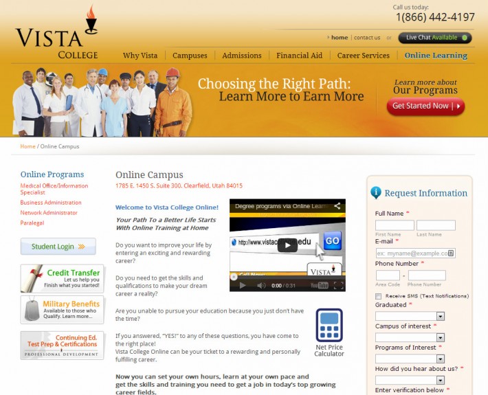
7 Tips for Getting The Best Work From Your Infographic designerCheck out Vista College’s previous landing page above. The site was attractive and easy to follow. But something was missing. Because of the assumption that students would know how to proceed, the critical links are hidden and difficult. The result? Students could easily leave this site without taking any further steps by moving onto another school that makes information more easily accessible.
Source →
Get The Product Made For You, From The Top Shopify StoresThis online college remedied the situation by improving their landing page. By increasing the size of the top banner, adding a red “Get Started Now” button and by moving the “Request Information” box to the right corner, right in the initial point of view of any visitor, the site makes it easy for potential students to proceed and to learn more about what the school has to offer.
These steps may seem small; however, by making it clear how a website visitor should proceed, conversion rates can soar.
Consider Even the Smallest Details
Small details can make a huge difference in the success or failure of a landing page. It’s important to take the focus of your brand into consideration when looking at a landing page. What is the feeling you’re hoping to procure in your visitors? What subliminal messages are you hoping to send? Are you trying to reach potential customers or clients on an emotional or logical level?
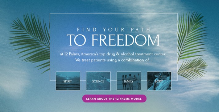
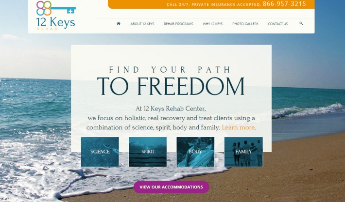
Vector or Raster – Which Type of Graphics Should You Use?These questions matter. To demonstrate how this makes a difference, look at the original landing page for 12 Keys Rehab above. Does the site share information about the center and what it has to offer? Sure. But, does it create a “this is the place I should go to recover” feeling among potential visitors in need of the services the center provides? Perhaps not.
Source →
12 Keys understood this and changed their landing page. With just one small alteration – a new background image – the page exudes relaxation. The new photo and background color offer more than a pleasing focal point, they offer hope – which is exactly what a rehab center’s website should do.
By taking the time to evaluate your image choice, font selections and use of white space, you’ll be able to make quick changes with big results.
Study Your Navigation
Navigation, especially for brands with more complex service and product offerings is essential to a successful landing page. If users cannot find the information they’re searching for easily, without a hassle, they’ll go somewhere else where they can.
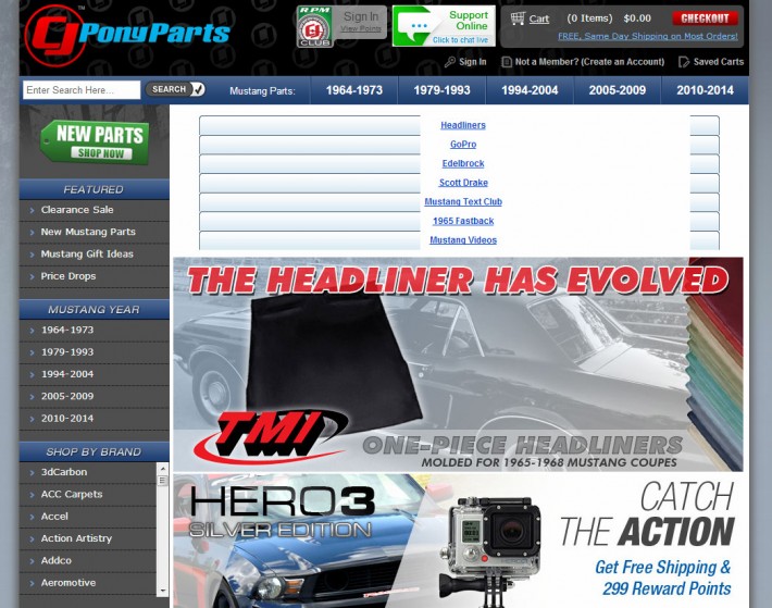
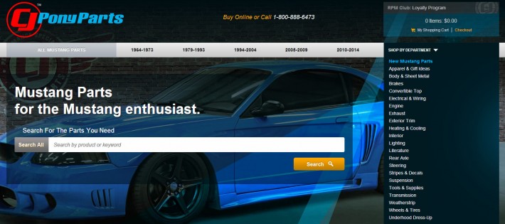
CJ Pony Parts, a Ford Mustang parts and accessories retailer, took this advice seriously. Check out their original landing page above. Because of a complex, dated navigation system, the brand did nothing to position themselves as a worldwide, cutting-edge Mustang parts provider.
Source →
However, with a few changes to the navigation’s layout, the brand underwent a virtual makeover. You can view the changes on CJ Pony Part’s website. The new navigation, which did away with repetitiveness and the need to scroll for information, gives off a new, welcoming vibe that makes it simple to find exactly what any visitor could be searching for. Was it a small change? Yes. Was it necessary? Absolutely.
Regardless of your brand’s service offerings or goals, your top priority for a landing page should be conversions. Take the time to look at your current landing page from an unbiased perspective. Consider a few small changes and watch your small alterations make a huge impact.


