Responsive is the new buzz word in Web Design industry. Be it the companies or the individuals, all are desperate to get a new website designed and developed using Responsive Design. And for those who already have a website, are looking ahead to get it redesigned and developed so that it is able to adapt to different screen sizes and give better user experience. The prime reason for this sudden shift in preferences from Mobile Site to Responsive Web Design is nothing but the feasibility to serve the end user, who has become quite tech savvy and surf the web on smartphones, with the same content as on a desktop website in a better way.
However, there are still many people who aren’t in full favor of responsive design yet. That’s because, the lack of support from web browsers. But leading companies like Adobe and Google have a different point of view on Responsive Web Design, and they both are doing their bit to make people adapt to it. Recently, Adobe has updated its Creative Cloud with Responsive Design tools such as Adobe Edge Reflow. And as far as Google is concerned, for developers it has recommended to use responsive design by detailing its positive aspects.
But, for a novice it would be hard to understand what responsive design is all about, and its advantages over fixed layout websites and mobile sites. But with this blog post, everyone will get to know about Responsive Web Design, how does it work, and why people should use it. So let’s understand what the responsive web design is all about.
Responsive Web Design
A responsive web design is a type of flexible or scalable web design that resizes itself depending upon the view port size of the output device. Be it the images, text, or any other web element, everything scales down to get fit into the device screen size it is viewed using. For making a responsive website, @media queries are used to decide the breakup point of the design. The website, WordPressIntegration.com is an example of responsive design, and you can check its preview using responsivetest.net, an online tool to check & test responsive web design across all leading smartphones, tablets, laptop and desktops with different screen sizes.
The prime benefit of having a responsive web design is that your single website would work across almost all devices with varied screen resolutions. And this will help you save money and time spent on building a desktop based site and a different mobile site.
Modern Trends In Furniture 2022Advantages associated with Responsive Web Design
[list style=”1″ underline=”1″]
- Target Smartphone and Tablet Users
When we say a responsive website would work smoothly across all devices, we mean that you can target both smartphone and tablet users easily with a single website. That means you need not to spend money on getting a separate mobile site or app designed and developed. In this way you would be able to target millions of prospect customers all around the world. - Brings Downslide in Bounce Rate
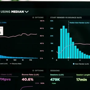
A responsive site that runs across all devices with varied screen sizes tends to have a low bounce rate in comparison with static sites. That’s because, visitors accessing the site from all sorts of web browsing enabled devices can access your web content. And the more users you’ll have on your site reading the content, the more you’ll be able to keep the bounce rate in control. - No Duplicate Content Issues
With responsive design, you need not to produce same web pages twice or more for different viewports, like you do while opting for separate desktop and mobile sites. - Cost Effective
Having a single responsive site will save your money that you would spend on getting a separate mobile site or mobile app designed specifically to target the mobile and tablet users. Additionally, this will also help you manage and optimize your site from a single backed interface. - Saves Money on SEO Campaigns
If you opt for a separate site for all mobile, tablet, and desktop users, then you would be required to optimize all of them accordingly which will suck money out of your pocket. However, if you choose to go with a responsive design, you only need to concentrate on optimizing it for better search engine visibility across all devices. - No URL Redirection
In its guidelines for responsive web design, Google has clearly stated that it recommends developers to choose responsive web design, as with it you can serve all your smartphone, tablet, and desktop visitors with the same content using a single URL. And that also makes it easier for Google’s algorithms to index the content in a better way. In addition to this, a URL redirection enhances the page loading time, which eventually affects the website rankings, as site loading speed is one of the 200 factors that Google take into consideration for web rankings on search result pages. - Improved Conversion Rate
Concentrating on one website is always better than concentrating on two different sites serving same content with the same objective, i.e., to convert visitors into customers. However, when you have a separate site for desktop, and mobile as well as tablet users, you need to analyze both of them separately and make the required changes (depending upon the user behavior), but with a responsive site, you only need to analyze the visitors data at one place, as web analytics tools such as Google Analytics, help you track all sorts of device users from one place.
[/list][margin_15b]
We are sure that the advantages of responsive web design we have listed above would help you choose what’s best your online business. However, we strongly recommend you to switch to Responsive web design and target your visitors in a much better way than before. Moreover, you can join the conversion on responsive web design by leaving your comments/feedback below.
15+ Most Valuable & Powerful Wireframing Tools For Web Designers[divider_1px_bg]
Editor note: Contributor Ajeet is a professional web programmer, and He is passionate about writing on web design and development. He is associated with SeoSemanticXHTML, a leading company that provides high quality Photoshop to HTML Conversion, and like to keep myself updated on the latest trends. You can also follow me on twitter
Personal Identifiable Information – Why You Need to Know More