When you’re designing a website, the temptation to show off your skills can be almost overpowering. You studied hard at your craft. You might be as great at graphic design as you are at coding.
You might even be a skilled animator. If you rely on your own website to generate business for you, it might feel like the most important thing you can communicate to people is the full range of your skills. And so, you demonstrate them all at once. It’s completely understandable. It’s also a big mistake. In practice, a website that’s far too noisy and far too loud can be off putting to the casual viewer. If you’re designing your own website, it’s important to show a little discipline when it comes to the home page. If you’re paying someone else to do it for you, it’s just as important that you impress upon them that you want something simple, to the point, and effective.
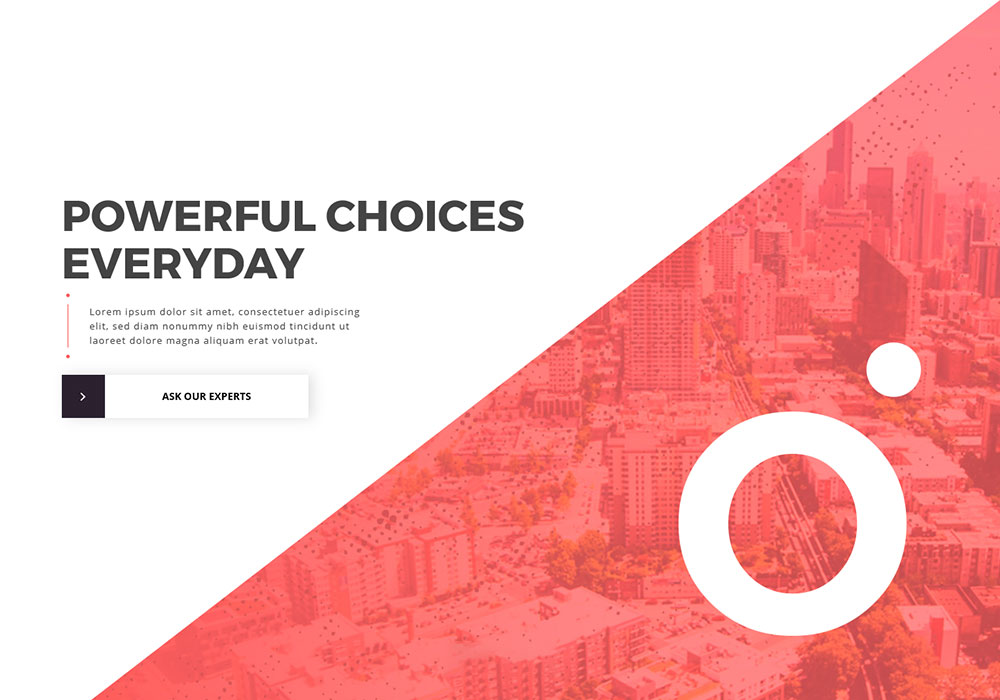
The last thing you want is for someone to arrive on your page and be confused about its purpose. Think about popular websites you’ve used, and how easy it is to know why they’re there. It’s impossible to log onto AirBnB and believe it’s about anything other than finding holiday homes. The name “Aviva” may not tell you much about what the firm does, but one glance isn’t is enough to understand the company. They tell you exactly what they’re there to do, front and centre, as soon as you land.
More Than Just Staying on Message
A simple, clear design does more than just relay your message, though. It keeps your website clean and tidy. Having fewer distractions means that the viewer can focus right in on the information you want them to understand. People browsing the web shouldn’t have to look up and down your homepage twice to find out how to navigate around it. The links should be clear and bold, and the layout should be simple to follow. Whilst this sound easy to explain, it’s not always so straightforward to execute. How do you manage to look basic and sophisticated at the same time? This is especially difficult if you work in the design or marketing industries, where people are actually assessing you on your ability to create a look that catches the eye. Fortunately, there are a few tried and tested tricks that will help you hold the reader’s attention at the same time as providing a user friendly experience. We’re not just talking brand new websites here either – even if your current website is a little too busy, there are a few little tweaks you could implement in order to simplify it.
Choose Your Cornerstone Content
Fascinate: 2014 The Year Of Smart Glasses!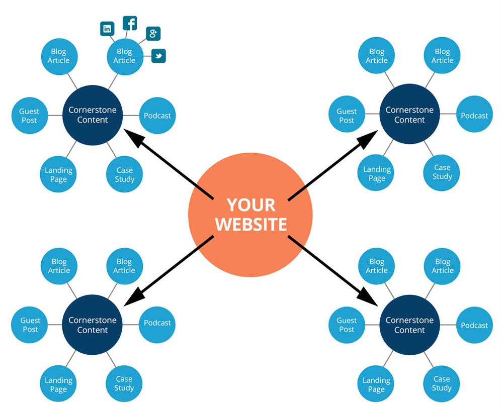
Not every page or area of your website is likely to be of the same importance. If you’re selling something, your list of products deserves to be on a better looking platform than your FAQs or Terms and Conditions. Nobody logged on to your site just to read through them!
If all the contents – and the links to that content – are given exactly the same emphasis, then two things will be true. Firstly, your site will look crowded. Secondly, your site will look bland. Think of your website like a news report. Decide which aspects should be the headlines, and make sure they’re featured as such. The less important ‘stories’ should be given less focus, in much the same way that minor stories are found in the side columns of newspapers. What counts as important will vary depending on what your website actually does or will do, but for the majority of people, contact information is essential, and this should be easy for the reader to obtain. Don’t leave people fumbling around the footer of your page trying to find out how to get in touch with you. If you take the time to write a blog on your site, and your blog is full of useful and up to date information, then make sure people can see it. Your headlines should go where headlines always are – right at the top. Leave the full index of the site in the footer.
Think about the number of images you use, too. Only select what’s relevant. They should complement the point you’re trying to make, not distract from it. If readers have to scroll past a series of images to find really important information, you’re doing it wrong.
10 Must-Follow Tips How to Secure Your Small Business?Don’t Keep Writing If There’s Nothing More to Say

Someone, way back in the history of the internet, must have decided that great websites should have thousands upon thousands of words of content. That person has a lot to answer for. Unless your industry requires it, or reading is the whole purpose of your site, there shouldn’t be any more content than the minimum required to explain what you do, why you’re good at it, and persuade people to get in touch. Be concise. Your “About Us” page should be about five hundred words long, at most. In most cases, you shouldn’t require more than four or five pages in total. Think about whether each topic you’re writing about truly needs a page of its own, or if it’s actually just a different aspect of something you already have a page for. If you need to be more expansive, group pages together into different categories, and let people click on the link to the category rather than each individual page.
Go Easy on Color
Webydo Rapidly Growing 93K Designer Community
Simplicity and minimalism cannot be achieved if your homepage looks like someone threw tins of paint at it! If you’ve followed all of the above advice, you can still throw all the good you’ve done away if you go crazy with the color palette. There are certain color combinations that are difficult to read when placed together. Red text on a blue background, or vice versa, are notoriously hard on the eyes. You want a cool, neutral shade as a background, and maybe a couple of other colors for the text, and to highlight major details. Going with the colors of your company logo is a tried and tested format, and it rarely fails.
Feel free to pass this link on to your web designer. If you are the web designer, think long and hard about whether you’re working to the above guidelines. They can be the difference between someone staying on your site and getting in touch, or moving on to the next one.
The Best Business Apps For Your iPhone 5