In this article, top resources for mobile web design will be featured.
You’ll find very useful list of mobile web design tools, plugins and resources.
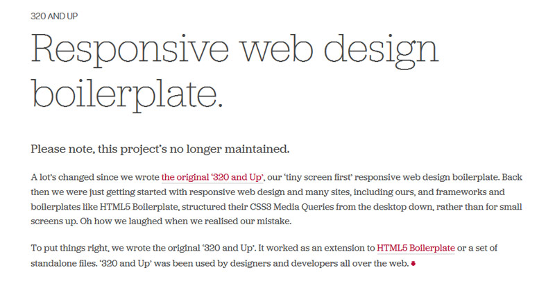
320 and Up
This is a starter kit for HTML5. It works on the basis that mobile phone browsing is the only type that exists in the world and so tailors every aspect of it HTML5 builder around that fact. It allows you to create a very basic mobile website and then scale it up. This means that you do not have to debug your mobile website as much as you do with the normal method of mobile website creation (of scaling down to fit, etc.).
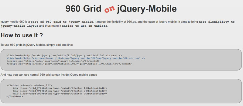
960 Grid on jQuery Mobile
This works with the jQuery Mobile software but is a plug-in that allows you to scale your grid-based layouts up or down. This means that you can adjust your designs a lot easier if you are scaling them down to fit a mobile device. If you are the type of person who likes to create a full and sexy website and then scale it down to fit a smart phone, then you may appreciate this plug-in. You will also appreciate this plug-in if you want to scale up your website from a smartphone plug-in to a tablet website.
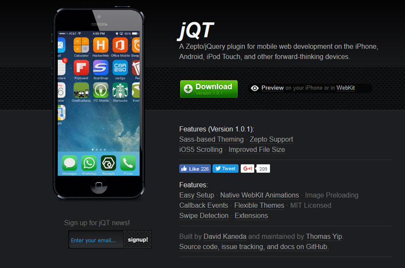
JQTouch
This tool concentrates on “swipe” technology. People on androids and IPhone are able to take advantage of the swipe function and the more than one finger function. Taking advantage of functions such as this is going to become more prominent in the future, so you are better off getting to grips with it now rather than later.
jQuery Mobile
This tool is geared towards creating websites that are used via touch screen. Many other tools do the same thing, but this tool puts that consideration first before design elements. It means that the websites you create are easier to use with a touch screen device.
Vector or Raster – Which Type of Graphics Should You Use?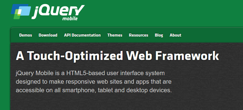
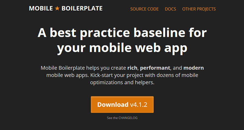
Mobile Boilerplate
This has tools that allow you to create HTML5 mobile websites. It works on the principal of creating a website that is geared towards each browser and smartphone/blackberry. Instead of creating one website that pleases all, you are able to create a website for each.
W3C mobileOK Checker
This is a handy little tool for checking to see if your mobile website is suitable for a mobile device. It simply reads the website and then tells you where you may have a few problems. It gives you a summary of any problems you may have, such as external resources you have embedded (they take time to check manually) and file sizes, etc.

Zepto.js
This tool has been developed to create small files that are easy to load with mobile Internet connections. It uses JavaScript so you will be unsurprised to discover that it is jQuery compatible. If you are already using jQuery, then you will be able to pick up this tool and use it without any bother.
Interview with multidisciplinary art director Ilya Sizov