The packaging of a product is as crucial as the physical design itself. Striking a balance between the need to be eye-catching, yet increasingly environmentally aware is an ongoing challenge for developers and marketing departments worldwide.
Even in the past decade, the way in which packaging is designed has changed enormously. If you were to compare the way a supermarket aisle looks today with one from 2003, the differences in packaging may well be subtle to the eye, yet upon closer inspection those changes become magnified.
There are many reasons for this evolution, the five most compelling of which are explored in more detail here.
Going Green
The need to be seen as environmentally friendly is rapidly becoming the overwhelming concern for businesses. From reducing carbon emissions from manufacturing and transportation, through to using eco-friendly materials in their packaging, much has changed over the past ten years.
One of the largest developments is seeing companies reducing the size of their packaging, often by offering alternatives to their traditional methods – or by making physical economies of scale in their packaging. Many manufacturers are moving away from the traditional tin can or glass jar and heading towards the tightly packed refill bag, such as the example below brought out by Nescafe.
6 Responsive Web Design Tips Developers Would Die To Get Their Hands On
By managing to fit the same 150g of coffee granules that you’d get in a cylindrical glass jar into a physically smaller, yet tightly packed cuboid-shaped foil package, savings can be made on the space required to transport the product. The result is that lorries can carry up to 20% more coffee.
Of course, by using these durable yet softer packages, such as tetra-paks or foil packaging, the chances of breakages are greatly reduced also. A study in China in the 1970s found that as much as 20% of all glass products were unable to be sold due to breakage.
How Can You Keep Your iOS System Secure?Simplicity Sells
A trip to the shop these days will find your attention much less likely to be attracted by big bold colours screaming out from the shelves, than more subtle colour schemes and designs. A lot of packaging these days will rely on the natural colour of the product to sell itself, whilst using snappy buzz-words to stand out from their competition.
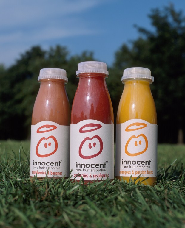
Innocent’s natural smoothie range is a perfect example of this idea. Rather than adding further bold colours to the already colourful juice, the packaging is a simple white label around the centre of the product. Once your attention has been caught by the colour of the juice, the simple use of the ‘innocent’ brand name tells the consumer that their product is healthy – there is no guilty pleasure, just an entirely healthy and innocent one. It’s a simple message, but enormously effective.
How WhatsApp Business API Enhances CRM Integration for Better Customer ExperienceResealable
The resealable packet has really come into its own over the past decade. Whilst the package itself hasn’t changed enormously in design, the simple addition of a resealable tab or seal at the top of the packaging means that there is less need for consumers to use economically damaging cling-film to keep food fresh.
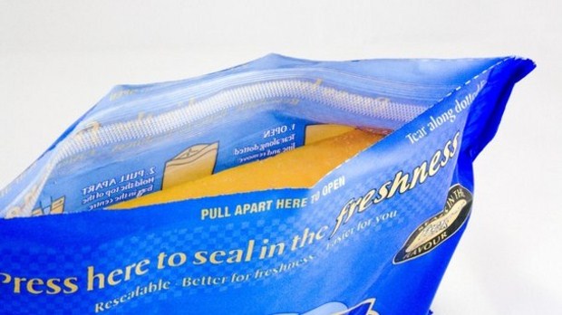
This works really well with not only food kept in the fridge or freezer, such as cheese (pictured above) or fish and meat products, but also with cupboard foods, such as pasta and rice, as well. Keeping them fresh is extremely important, and the evolution of the seal has made this task much easier than it was even 10 years ago.
How to use BIM design in modern architecture?Ring Pull Openers
The days of the tin opener may well be numbered, and not before time. More and more tin can manufacturers are turning away from the sealed top that requires the use of a difficult piece of equipment to get into, and towards the easy-to-use ring-pull tops.
There is no doubt that the ring-pull top is far simpler, quicker and tidier to use yet the greatest benefit to the introduction of this type of tin can is immeasurable in its ecological value. Using a ring-pull top ensures that the can is opened cleanly – there are none of the dangerous jagged edges that you get with tin openers.

This is great news not only for your fingers, but for curious animals too. One of the big dangers for overly nosey foxes and household pets, previously, was catching themselves on these sharp edges whilst investigating the contents of discarded tin cans.
Tech It Up
Technological advances have given packaging designers more options than ever before when it comes to coming up with a unique selling point for their products. Whether it’s the introduction of a snazzy new font or recreating the feel of a popular package from a by-gone age, there is little that cannot be achieved by a tech-savvy person behind a PC and a digital printing agency.
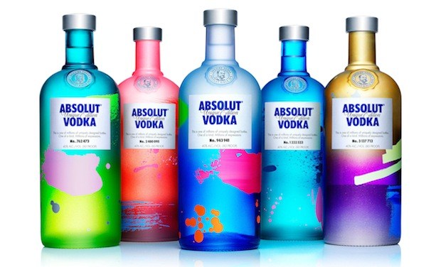
This technology has also helped change the physical design of packaging immensely as well. The humble glass bottle continues to be redesigned as designers try and get their products to be at the forefront of consumer’s minds. The Absolut Vodka bottle designs pictured above are immediately recognisable by their shape and fully distinguishable from their competitors, such as Smirnoff. More and more companies are recognising the benefit of a unique shape, in order for their product to stand out.