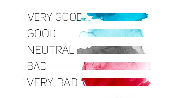
What do we mean when we talk about color semiotics? We’re talking about how colors express certain coded information that make the viewer feel a certain emotion – for example, when someone sees a red sign, they take it as a warning, think of danger and can even feel anxiety.
Image source →
People pay more attention to color than you might think, and it can play a huge part in influencing decision making beyond tastes, likes and dislikes. These coded pieces of information that color provides can and should be harnessed by brands to help the consumer build an emotional connection with the brand and develop brand loyalty, but how can this be done?
Colors influence mood and can even effect our energy levels – think of how you feel when you are in a room which is painted in dark, sombre colours. By harnessing the power of the right colors to say what you want to say with your designs, a strong brand connection can be built before the target audience has even used the product. Whether you’re creating your brand from scratch or deciding on a palette for a new piece of work, you need to be aware of color and the effect it has on people, for example yellow can evoke feelings of optimism if used in a certain way or a feeling of anxiety if used in a different way and blue in the right shade and use can make people trust in a piece of new technology. Shades of color can also influence moods; pale pink can put people in a calmer mood whilst a bright, vibrant pink can have the opposite effect and energise people. A successful brand will know how to use color properties for maximum effect.
10 Best-of-the-bread PSD to WordPress Conversion Service ProvidersThe Apple stores’ staff all wear blue tshirts which subconciously helps the visitor believe they can trust their advice on new technology.
It’s not just a case of choosing a colour which evokes the mood you’re looking for; it’s also about appealing to your target market and choosing colours which will make your customers feel a certain way and choose your brand. If your target audience is ‘new mothers’ you would want to choose colours that suggest safety and protection so they feel comfortable using the brand with their new baby.
Musk’s Rebranding of Twitter: The Journey to XPampers use aqua which suggests it is fresh natural product, combined with yellow which is positive and playful. The pastel shades suggest comfort and softness, perfect for a new born baby.
Different societies and cultures might associate certain colors with different moods, meanings or ideas so it is important to research these when developing a brand. As an example, black in western society is often associated with death, whilst in eastern countries, white is used to symbolise death. These different colour associations highlight how important it is to research your target audience and have cultural awareness when designing… but that’s another topic.
7 Ways to Practice Essay Writing Skills Outside of CollegeWith brands that are more established, color semiotics can be harnessed to maintain awareness of the brand whilst pushing creativity. Think of the most successful companies such as McDonalds, CocaCola and Nike and their corporate colors quickly come to mind.
There is no logo on this coke advert but it is still recognisable.
Effective SEO Strategies That Will Help Reach Future Client ProspectsOnce strong color associations for a brand are established the designs can move away from the key brand properties and push boundaries using color to create brand recognition. All McDonalds needs to do now is use a yellow M with a red background (in the right Pantone color) on a piece of material and it becomes instantly recognisable. Successful color branding allows for more creative freedom long term.
Using the right colors in your design could make or break your brand, so it’s vital to take the time to research your target market, brand and the impact you’re looking to make before choosing colors which then appeal to your customers. Thinking about the colors you use in your designs at the start is vital for the long term success of your brand and used correctly color will really boost your brand.
[divider_1px_bg]
Author bio: This article and focus on Color Semiotics is brought to you by The Pink Group, a creative communications agency based in London.


