Drinking beer is a national pastime in most countries, and when you aren’t flirting with the opposite sex, rooting for the local sports team, or making outrageous claims about your abilities, there’s plenty of time to sit quietly and meditate over the meaning of life, the universe, and the label on your beer.
To set themselves apart from the competition, beers have different tastes, different ingredients, and different logos. Most beer logos are there for a reason, and that reason is usually a story long on detail and short on believability. But that’s part of what makes drinking beer so fun. Here’s a look at how X famous beers got their logos.
St. Pauli Girl
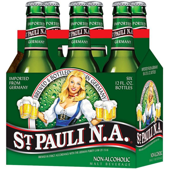
St. Pauli Girl is almost a little too spot on considering the average guy knocking them back is probably ogling the girl on the bottle from the minute he pops the top. The St. Paul Girl might look like a waitress but she has another job that pays the bills more frequently. Yes, the original St. Paul Girl was an employee of the red light district in Hamburg, Germany, back in 1977 and also appeared in a popular poster series. From 1999-2008, the beer switched to using Playboy models on its bottles, and not surprisingly, sales increased.
Pabst Blue Ribbon
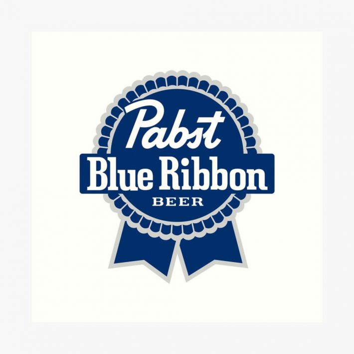
A little less raunchy than its predecessor, Pabst started named Best Select, then Pabst Select, then Pabst Blue Ribbon based on its wins at various competitions. To augment the win, the powers-that-be started putting real blue ribbons around the bottlenecks just in case you had forgotten who the champion was.
Rolling Rock 33
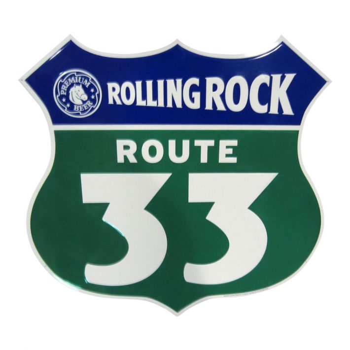
When the first bottle rolled off the assembly line at LaTrobe Brewing Company in 1939 there was a tiny 33 on the label. There have been many mysteries and conspiracy theories passed around since then. One suggests it was to celebrate the end of prohibition in 1933, other theories are that it is the precise number of steps from the brew master’s office to the brewing floor. Other thoughts include that it was the number of a lucky racehorse or perhaps the highest level of Freemasonry attainable. The slogan has changed more than a few times for this brand, but the story remains a mystery.
Constructing Beautiful Valentine’s Day Email TemplatesGuinness
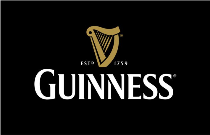
Arthur Guinness unleashed his first stout beer on the world in 1759 but the logo – the harp of Brian Boru – did not appear on the bottle for more than 100 years. The harp of Brian Boru was the fateful symbol, one that appears in Ireland’s heraldic emblem and is a symbol of unity. It also appears on the Euro coin. Boru was a real guy, King of Ireland from 1002-1014, and protected his people from the invading Vikings during that period. The harp is not just a real thing, but a real surviving thing. It is one of three harps dating back to the 14th or 15th century and can be seen on display at Dublin’s Trinity College.
The Horn of Stella Artois
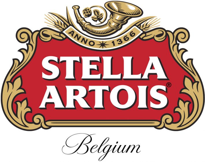
Stella Artois was a special beer for Christmas in 1926, the original name was a combination of the Latin word for “star” and Sebastian Artois, the brewmaster from Louvain, Belgium who worked at the Den Hoorn Brewery, whose own roots traced back to 1366. Den Hoorn is Dutch for “The Horn” which was prominently displayed. The frame around the name on the logo is the style of Flemish architecture in the city proper.
Final Thoughts
Beers are a great example of products not being afraid to be different and tying their unique stories into their logos. If you’re looking to do some similar branding, try a service like Tailor Brands for your logo needs. It lets you choose from potentially hundreds of different freelancers all eager to get your work.
Creating Low-poly Art Portraits with Adobe Photoshop and Illustrator