While the white trifold brochure is the staple for many kinds of businesses, in today’s world one has to be a bit bolder and flashier. Here in this tutorial, we will teach you how to create something slightly opposite to the standard (and boring) types of brochures.
Here, we are going to go through the step by step process of creating a dark and sleek type brochure design using Adobe Photoshop. This can be an invaluable design style, especially if your own brochures are just the typical cut and paste white style brochure print. So carefully read on and learn.
STEP 1
To start creating a brochure design in Adobe Photoshop, we will first start of course with creating a new document. To make things easier, we will use a letter-sized dimension in landscape orientation. This will allow you to print the design event at the office or at home. So we create a new document with these specifications.
a. Width: 11 Inches
b. Height: 8.5 Inches
c. Resolution: 300ppi
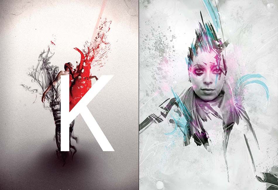
Designing a Glazed Top Business Card
STEP 2
Now, before we start with the design, we will have to setup the margins first. Bring up the rulers by pressing CTRL+R. From there you can click and hold the left mouse button and drag guidlnes into your document canvass. Position 4 guidelines at 0.25 (1/4) inches away from the edges of the document.
15 Best Collection Of Adobe Photoshop Tutorials
STEP 3
Next, count 3.5 inches from the initial left margin we created and mark another guideline. Then do it again 3.5 inches after that first inner guideline. This will divide our canvass into three major parts representing the three main panels.
Useful Collection Of Photoshop Tutorials
STEP 4
Now, with the guidelines set, we are ready for our dark background. To start with, we use the gradient color tool. Select it in the tools panel, then click on the gradient box in the options bar above. Select two dark colors for your dark and sleek theme. Here we used two darker hues (#050404-#25201A). Then, just inscribe the gradient across our canvass. It would be your decision to angle it diagonally if you wish.
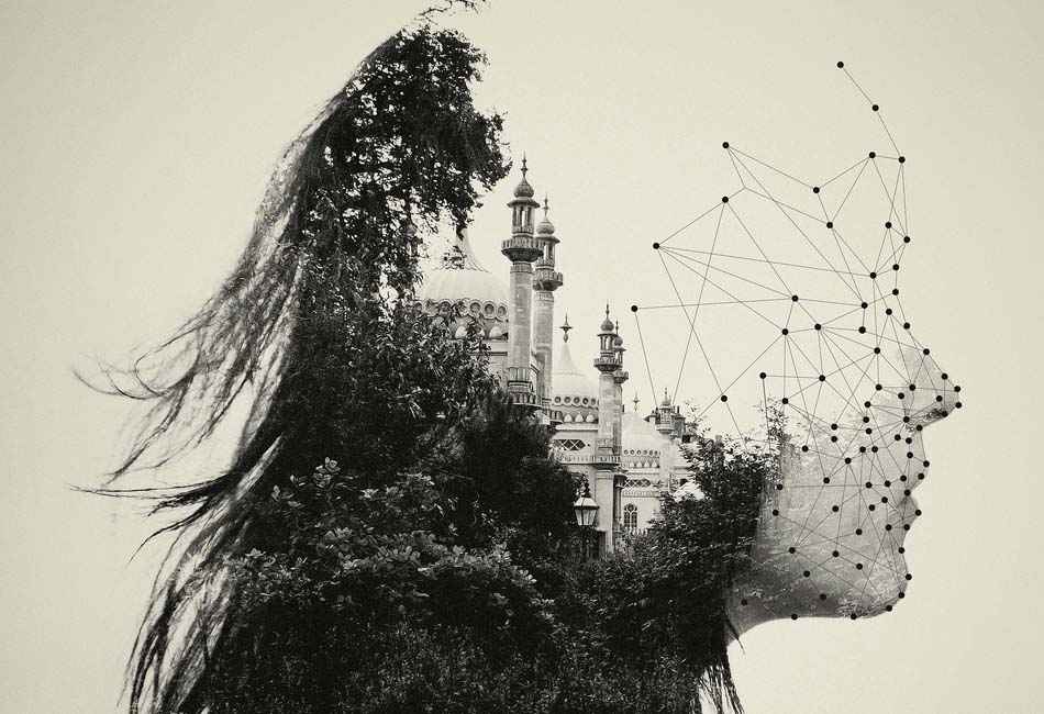
Collection of Double Exposure Effect Photoshop Tutorial
STEP 5
Now we will add our first background element, some light bands. To do this, we first use the rectangle shape tool to create a nice large and tall white rectangle. Do not worry about the guidelines for now. Just make it as tall and wide as you see fit.

STEP 6
Now, select the “eraser” tool and click on the shape. Photoshop will ask you if you want to Rasterize the layer. Rasterize it of course. Then, use a large and soft brush to erase one side of the rectangle.

STEP 7
Next, change its blend mode to “overlay” so that it creatively blends with the background. Also set its opacity to 50%.

STEP 8
We then duplicate this layer several times. You can do this easily by holding the ALT key and then click dragging the selected layer. Position these duplicates creatively across the design. Vary their opacity so that you get some soft combinations with these shapes. Also, you may want to re-orient some of these light bands to the opposite side for more variety. You can easily do this by pressing CTRL+T with the layer selected and then right clicking on them to choose the option “flip horizontal”. Keep duplicating and adjusting the orientation and opacity of these layers until you get some nice creative bands across the design.

STEP 9
To be more organized, we grouped all the bands into their own layer group. You can do this by clicking on the “Add Layer Group” icon in the layers panel. Then, just drag all the light band layers to the layer group.

STEP 10
The next step is to add a bokeh effect for the cover. Create a new layer on top of all the other layers. We named it Bokeh01. Then, brush in some white circles using the Brush tool. Make sure you vary the master diameter of each circle and of course have a hardness value of 100%. We have limited the circles on the rightmost panel for now, as this is the one that will act as the cover.

STEP 11
Create another layer, name it Bokeh2, and create some spots again. This time, use smaller diameter brush circles. You can repeat this process several times until you get the look that you want. Note that it is good to overall circles, especially if they are from different layers as this will have a great effect layer on. In the end for our example, we had four different bokeh layers and this look.

STEP 12
Now, we reduce the opacity of each of our Bokeh layers. You can adjust the opacity of each layer of course in the layer panel. However, we vary it so that they have some great overlapping effects. Here are the opacity values we used for the four layers in the example.
a. Bokeh01: 50%
b. Bokeh02: 40%
c. Bokeh03: 30%
d. Bokeh04: 20%

STEP 13
Select one of the Bokeh layers. Then go to Filter -> Blur -> Gaussian Blur. On the window that opens, set a pixel value of 1.

STEP 14
We now extend the bokeh design across the other panels. Just repeat the process that we did for the cover. However since these areas will have more text, we dial down the bokeh spots a bit.

STEP 15
Once you are satisfied with the positions of the bokeh spots. Select all the bokeh spots and merge them together. Just right click on them once they are selected and choose the option, “merge layers”.

STEP 16
Now it is time to add some color. To do this we create a new layer on top of everything else by pressing CTRL+SHIFT+N. Then using some soft brushes we just paint up different color spots all over the canvass. Pay particular attention to the areas with design elements.

STEP 17
Then, right click on this color layer and select the option create clipping mask. Make sure of course that the merged bokeh layer is just below this color layer.

STEP 18
You should then see the nice color effect on your bokeh elements. To make things stick that way though, it is best to select both layers and then right click on them. With the context menu open, select merge layers to merge the color with the shape of the Bokeh. If the bokeh colors are too bright, feel free to adjust the merged layer’s opacity to around 40-50%.

STEP 19
Finally, to make our design a lot more darker, select the background layer with gradient. Adjust it by going to Image -> Adjustments -> Brightness/Contrast. We adjust the brightness to -60 and the contrast to 14.

STEP 20
Make sure you are happy with all the positions of the bands and bokeh. Once you are ready, right click on any layer and select “flatten image”. Save this as your main background template.

STEP 21
Then, we type in our brochure cover headline text. Of course use the type tool to render the text into the canvass. Choose a nice font style that matches the theme. You may want to use sans serif style fonts here for a cleaner sleeker look. Keep in mind that you can alter the text spacing, line spacing and other text adjustments through the character panel.

STEP 22
Now, double click on the headline text layer to get to its layer styles. Click on the gradient overlay option. Then, set the following settings for the gradient overlay.
a. Blend Mode: Multiply
b. Opacity: 11%
c. Gradient: (choose the most colorful or customize your own theme colors)
d. Angle: 5 degrees

STEP 23
Next, duplicate our text layer by pressing CTRL+J. Select the duplicate that appears on top of the text layer. Right click on it and select “rasterize”. Then go to Filter -> Blur -> Guassian Blur. In the window that opens, use a 4 pixel value for the blur effect.

STEP 24
Finally, reduce the opacity of the original text layer to around 70%. This will add a light translucent effect to our headline.

STEP 25
Duplicate the same style for all your headlines in the brochure design.

STEP 26
Then we type in our text. Make sure to write well between the main lines. Use clear sans serif fonts here too to maintain the sleeker look of the text.

STEP 27
Great! Now here is a special trick. FOR EACH of the layers below, you can easily apply the same glow effect that we used on the headlines. Just make sure that the last filter effect that you used was our same Gaussian blur effect. If you are sure, then select each one of your body text layers. Press CTRL+J to duplicate them, and then press CTRL+F to apply the Gaussian blur effect. This makes all your text glow creatively.

STEP 28
Then, we add some images. Interestingly enough, you can use the same trick we used in the text to add a soft glow effect unto our images. Just copy and paste the layer style from the text to our images. Then Press CTRL+J and CTRL+F to duplicate the image and make the image look fuzzy. The difference here is that you MUST reduce the opacity of the duplicate image layer to 40%.

STEP 29
Finally, create a new layer just behind our background layer. With a soft large brush splash in some light colors into our image. Change the blend mode of this layer to Overlay to get a nice integrated effect.

STEP 30
That should finish our FRONT cover design.

FINAL IMAGE
Just use the same techniques to create our back cover design. With that you now know how to create a nice, sleek and dark styled brochure.

You may also like this