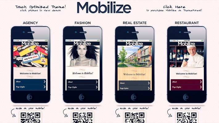
You have a beautiful website. You took great care to place every image, text, and link in the most perfect places ever to make your website as aesthetically pleasing as possible. “I wonder how my website would look on a smartphone,” you wonder.
Bad idea. You open your website on your smartphone… and oh, the horror. The header’s the wrong size, huge white boxes have taken the place of your images, and the text isn’t formatted at all.
Don’t curl up in a ball and cry yourself to sleep just yet! You can definitely fix this problem without overhauling your website.
You just need to mobilize your website. That can be done in 4 steps.
1. Set your mobile browser window to 100%.
You want to set the full screen width to be the same as the width of your mobile device. To do this, add the following meta tags to the head of your site:
Best Free Project Management Tools For Designers[html]
<meta http-equiv=”X-UA-Compatible” content=”IE=edge,chrome=1″>
<meta name=”viewport” content=”width=device-width, initial-scale=1, maximum-scale=1″>
10 Best Photoshop Alternative Tools<meta name=”apple-mobile-web-app-capable” content=”yes”>
<meta name=”apple-mobile-web-app-status-bar-style” content=”black”> [/html]
2. Resize the title bar background and the menu button icon to fit the layout on a smartphone.
In your responsive.css file, set up the mobile CSS to contain two media queries that will resize the title bar background and menu button. Use the following code:
Arrow Navigation Styles Effects using SVG[css]
/** retina display **/
@media only screen and (-webkit-min-device-pixel-ratio: 2),
Why Tape Backups Are Important?only screen and (min–moz-device-pixel-ratio: 1.5),
only screen and (min-device-pixel-ratio: 1.5) {
#w #pagebody header {
background: #0b1851 url(‘img/[email protected]’) top left no-repeat;
background-size: 640px 44px;
}
#w #pagebody header #menu-btn {
background: url(‘img/[email protected]’) no-repeat;
background-size: 53px 30px;
}
}
[/css]
3. Add a small arrow icon over to the right side of each menu link.
With small arrows, your visitors will have much easier time navigating your mobile website. Add the following code to your style.css file:
[css]
#w #navmenu ul li a::after {
content: ”;
display: block;
width: 6px;
height: 6px;
border-right: 3px solid #d0d0d8;
border-top: 3px solid #d0d0d8;
position: absolute;
right: 30px;
top: 45%;
-webkit-transform: rotate(45deg);
-moz-transform: rotate(45deg);
-o-transform: rotate(45deg);
transform: rotate(45deg);
}
#w #navmenu ul li a:hover::after { border-color: #cad0e6; }
[/css]
Note that the point of the “transform” property is to create a small border after the content.
4. Create a JQuery file.
If you don’t already have the document called script.js, create one with the following code:
[javascript]
$(document).ready(function(){
var pagebody = $(“#pagebody”);
var themenu = $(“#navmenu”);
var topbar = $(“#toolbarnav”);
var content = $(“#content”);
var viewport = {
width : $(window).width(),
height : $(window).height()
};
// retrieve variables as
// viewport.width / viewport.height
[/javascript]
Now, add some page variables where you can reference elements in the document.
[javascript]
function openme() {
$(function () {
topbar.animate({
left: “290px”
}, { duration: 300, queue: false });
pagebody.animate({
left: “290px”
}, { duration: 300, queue: false });
});
}
function closeme() {
var closeme = $(function() {
topbar.animate({
left: “0px”
}, { duration: 180, queue: false });
pagebody.animate({
left: “0px”
}, { duration: 180, queue: false });
});
}
[/javascript]
This is pretty much all you need for a simple mobile website. Always remember to make all those changes in your child theme. Never touch your parent theme, because if you make a coding error, you’re able to refer back to your parent theme to reverse the error.
[divider_1px_bg]
This guest article was written by Simon (better known as SimonTheSorcerer online). He is working for Jangomail a mass email service provider. You can check out more of his work at his online marketing blog.


