The number of users who access the Internet via mobile now exceeds those who do so using laptops and desktop computers. Ergo, when you build an ecommerce website, the experience of mobile users should be a top priority. Yet, many ecommerce websites aren’t giving as much attention as is needed to the mobile version of their stores.
That’s why the add-to-cart rate for desktop users is nearly double that of mobile users while the sales conversion rate is three times higher. If you want mobile users to respond to your call to actions (CTAs), you have to make their experience on your site worthwhile. Here’s how to do it.
1. Use Google’s Mobile Testing Tools
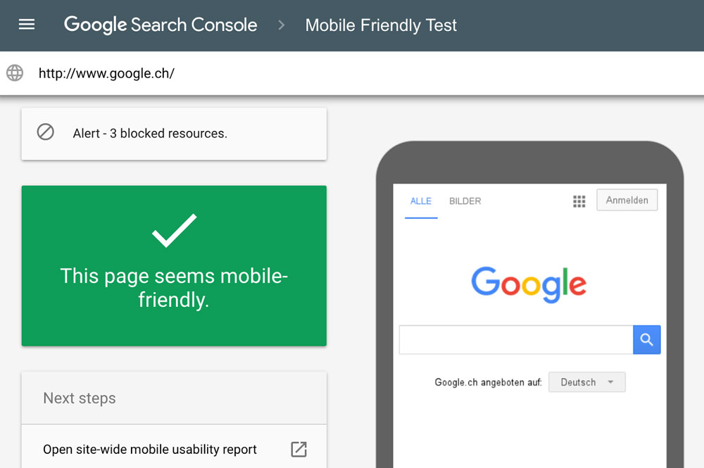
The first step to mobile optimization is to establish how well your site is doing in the journey to becoming a mobile usable and mobile friendly site. Google, the Internet search behemoth, provides two free services that can help you do that.
The Mobile Test tool helps you unearth and repair the basic problems the Googlebot would run into when it crawls the site. The Mobile Usability Report highlights issues related to Flash use, viewport configuration, content incorrectly sized for viewport, overly small font size, buttons and/or links too close to each other, 404 errors, server connectivity challenges, DNS and URL errors.
There are also more platform-specific tools. For example, if your website is hosted on Azure cloud servers, Azure monitoring software can provide valuable insights on performance.
How to Create a Stunning Logo For Your Brand?2. Make Checkout Intuitive
The goal of setting up an ecommerce website is to drive sales. You therefore have to make the payment process as flawless as possible. Remember that the majority of users who add items to the shopping cart end up abandoning the process before they can complete the purchase.
On desktop screens, you have a lot of space to play with when it comes to positioning the call to action (CTA). On mobile, you will be best served by placing the CTA at the start of the screen for maximum visibility. Even better, have embeddable buy buttons that will prompt users to buy directly whether they are browsing your social media account, your blog or reading your email.
3. Keep Everything in the Thumb Zone
You probably have your smartphone within reach as you are reading this. Now think about how you hold it and what finger movements you use to navigate it. If you are like the overwhelming majority of mobile phone owners, you likely heavily rely on your thumb for one-handed navigation.
Advanced Shopify SEO Techniques for Enterprise-Level E-commerce StoresTherefore, when creating a mobile friendly ecommerce site, make sure all key navigation actions are within easy reach of your thumb.
4. Offer Search and Browser Options
Due to the size of a smartphone screen, the arrangement of a website’s menu options cannot be the same as those of its desktop version. You have to rearrange the menu for ease of navigation. Sometimes, you may have to remove some menu options to have a more compact and readable mobile site.
To compensate for this reduction or reduced visibility of menu options, the mobile website must have search and browse features. That way, if a user does not find what they are looking for in the menu tabs, they can search for it.
Free 3D Models: Get Free 3D Elements From Tf3dm5. Embed Videos
One of the disadvantages ecommerce stores have over brick-and-mortar businesses is the inability of shoppers to physically examine an item before they buy it. This is already a problem on desktop websites and is only further compounded on mobile sites. Users have to zoom in and zoom out of product images in the hope of catching details that aren’t covered by the product description.
You can mitigate against this pain by embedding video demos of products. A video not only allows you to show the product in greater detail than an image can but, through the narration, ensures you can explain items in more depth and quickly.
Follow these tips to create a mobile website that’s friendly to users and delivers the desired ROI.
How Stickers Can Be Preserved As Arts