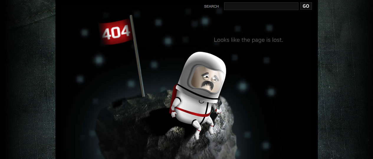
At any given moment, someone somewhere is uttering a string of expletives at their computer. What is the source of this global frustration? Eight little characters tucked into the upper left hand corner of their screen against a field of snow white. Yes, the culprit is the “404 Error.” When this horrific phrase appears, you know that you have entered a virtual dead end and the only way out is to go back. Unfortunately, going back means leaving your site.
Yes, these lost travellers–and potential followers–will likely go somewhere else to be informed and entertained. And you will have missed the chance to earn another subscriber.
How can you avoid losing these valued visitors? It’s really quite simple. Rather than presenting them with a generic and very unhelpful “dead end” sign, give them an easy-to-follow set of options. And keep them entertained. Yes, silence those expletives with a custom-designed 404 page and turn those proverbial frowns upside down.
Here are a few tips to consider when designing your unique 404 Error page.
Maintain your overall design
There is nothing scarier than finding yourself in totally unfamiliar territory. That is why it is important to make sure that your 404 Error page is in keeping with the rest of your site. This will let the lost visitor know that they are still within the safety of your domain.
Say you’re sorry.
It is hard to get mad at someone who is displaying a healthy dose of contrition. A sincere apology will go a long way in silencing a Yosemite Sam-styled rant and making the reader more receptive to friendly redirection.
Selling Out Women: How Web Design Targeting the Female Demographic Fails its CustomersOffer an explanation.
When a driver encounters a dead end in the real world, there is usually an obvious explanation for why the road stops. For instance, no one expects the road to continue across a raging river or a seeming bottomless ravine.
In cyberspace, we do not expect dead ends. That is why it is important that your 404 page contains an explanation that is easy for even the most technologically-challenged individuals to understand.
Help them out.
Now that you’ve mended the broken fences–caused by broken links–you need to help the lost individual find their destination. You can accomplish this in a number of ways.
Responsive Web Design: 7 Advantages on Why You Should Opt It For[list style=”1″ underline=”1″]
- Search Tool. This awesome option benefits both you and the lost individual. The visitor can search your site for the information they were initially seeking and this search data will provide you with a crystal clear picture of what people are looking for. This will give you ideas for future content that will have broad appeal.
- Recommended Links. This is the perfect opportunity to dazzle this visitor with your brilliant prose and convert them to a loyal follower. By providing links to your most popular or most recent posts, you can ensure that they stay on your site and encounter some of your finest work.
- Contact info. It is important that you make it easy for your lost visitors to get in touch with you and report problems with your site. Ensure that it is convenient and easy to use. And, take advantage of this golden opportunity by including fields that ask the visitor for their name and e-mail address.
[/list][margin_15b]
Entertain them.
It’s hard to hurl hair-curling expletives while your funny bone is being tickled. Keeping your misdirected visitor entertained is a great way to keep their fingers off the “back” button. Here are a few ways to keep them smiling–even when confronted with a “dead end.”
How to use BIM design in modern architecture?[list style=”1″ underline=”1″]
- Make them laugh. Whether you engage in a little self-deprecating humor, tell a tasteful joke, or include a funny image, creating a comical 404 page will keep tempers cool. Just make sure that you do not make a joke at the expense of the user or engage in off-colored humor.
- Invite them to play. Including a game or mind-bender on your page is a great way to distract visitors from their frustrations and make them want to check out more of your offerings.
- Give them a factoid. Everyone loves an “a-ha” moment. Include awe-inspiring bites of information to tempt them into reading more.
[/list][margin_15b]
Make an offer.
Your 404 error page is a great place to offer a great deal to the people who have been “lucky” enough to land there. By including a cleverly placed advertisement for your current special offers or a new featured product, you will be able to lure them into your site. From there, you will be able to make a sale, garner a new subscriber, and, if all goes well, gain some positive referrals through word-of-mouth.
It’s time to take down that dreaded “dead end” sign. Instead, welcome your stranded visitors with a helpful 404 Error page– a virtual tour guide that offers them a reassuring smile, while bidding them back to the comfort of your site. Do your part to end the expletives and watch your readership multiply. Get designing.
What qualities do you look for in a 404 Error page?
[divider_1px_bg]
Editor note: Contributor Kimberley Laws is a freelance writer and avid blogger. She has been known to engage in a few Yosemite Sam-ish rants in her day. The best way to silence her is to stick a cookie in her mouth and remind her that excessive cursing is harmful to her online reputation. You can follow her at The Embiggens Project and Searching for Barry Weiss.