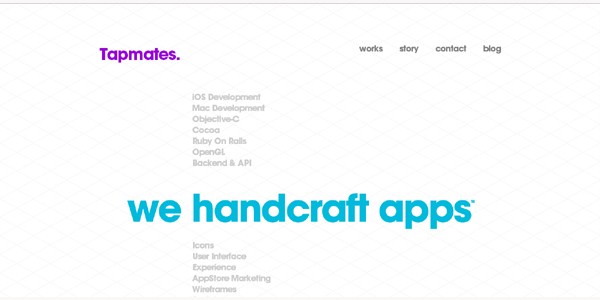
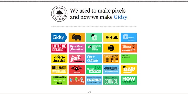
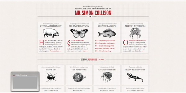
We’ve all heard this, right? It’s the idea that by refusing to clutter our designs up with lots of stuff just to make it look like we did something, people actually end up seeing more because they can focus on what’s really important and impart their own meaning on the blank space. That’s certainly the case with a well-done minimalist web design. Some of the most impactful websites utilize the technique, and the results can be striking, elegant, and classic.
But beware: when minimalist web design is done poorly, it can work against you. When you don’t have a whole lot for people to look at, what’s there better be good or you’ll draw attention to flaws and appear unprofessional. So how do you capture that elegant and classic look you want?
Define the objective.
Minimalist designs work best when there is a clear goal for the website. Do you want people to make a purchase? Sign up for a pre-order? Try to pick a single goal for each page – or even the entire site – and focus your entire design around succeeding at that goal. You can use the simplicity of the design to draw complete attention to that singular call-to-action.
Find your focus.
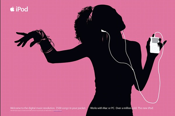
Collection of Superb Poster Designs of Various ArtistsLook for what’s iconic, beautiful, or memorable. It can be as simple as focusing on the white headphones of an iPod or as complicated as the musculature of an athlete running. As long as it’s all a part of the same iconic image, people will be able to take it in with singular focus. The idea is to draw attention to what makes the company’s product, service, or brand stand out from the crowd. What’s the emotion you want to evoke from your visitors?
Create an unexpected juxtaposition.
Build a bridge between two ideas or images that seem unrelated. Technology and history. Young and old. An oasis in the middle of the ocean. If the brand is looking to unite two opposites or show growth, this is a great way to do it. People may find it jarring at first, but if you do it well, they’ll end up paying more attention because they’ll want to make the dots connect so that they understand what you’re doing. For example, if you’re designing a website for a store that’s been around for decades, you can focus on what their product looked like when they first began and what it looks like today. That image will likely be more powerful than a page-long story about their company’s history.
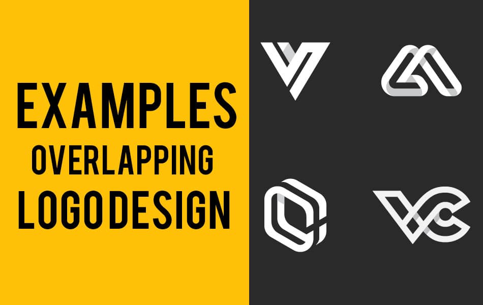
Fresh, Creative & Clever Logo DesignsGet united.
One of the worst things that you can do is have your design look like a bunch of disparate items that don’t seem to have anything to do with each other. This is the bad version of trying to create an unexpected juxtaposition, where visitors won’t make connections; they’ll just feel like you tossed random elements together. To avoid this, make sure that all of the page elements fit together seamlessly in style, color, and size. And if you have one or two features that don’t match, they should do so for a reason: to grab the visitor’s attention. Use these items or areas on the page to draw the focus to calls-to-action, the brand name, or other important things.
Embrace whitespace.
Wonderful Digital Art of Russian Artist that Will Inspire YouThis is often the biggest challenge when communicating with clients. When they see “blank” areas, they tend to want to fill them up with stuff. But, of course, with a minimalist design (or often with any good web design), this will detract from the final product, drawing attention away from the things that matter and making it less clear where the eyes should go. Try removing items and providing more spacing between areas to see if it improves the overall effect.
Get squared away.
Alignment that’s off by just a few pixels may be unnoticeable on a busy design, but it sticks out like a sore thumb in a minimalist design. Consider using a grid. This will allow you to keep everything neat and regimented and looking good. Then, if everything else on your page is following a perfectly straight alignment, including one element that’s askew can help to instantly draw attention to it. Lots of designers do this with different kinds of calls-to-action because they want people to see them immediately.
20 Best Illustration of 2014Details, details, details.
One of the biggest differences between a well-done minimalist web design and a shoddy one is attention to detail. Go over it with a fine-tooth comb. Get feedback from multiple sources. And when in doubt, remember the fundamental principle of minimalist web design: less is more. Often pulling back will result in a more powerful effect for your web design.


