
Infographics

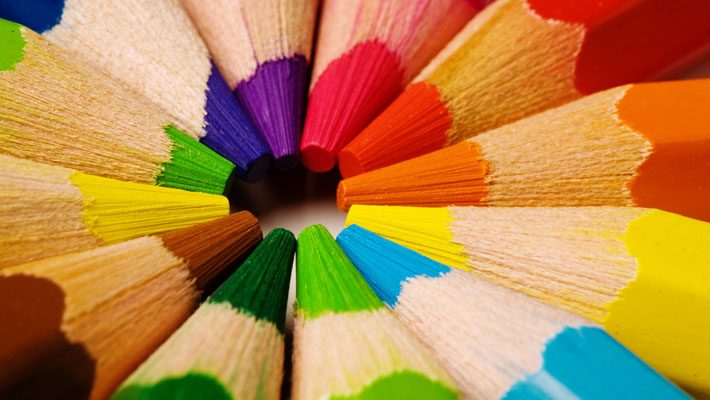
A Color Selection Guide For Designers – Infographic

Maan
Feb 9, 2013
1 min read
105 words

Even before the rise of graphic perfection, colors have played a major role in determining the way that designs are interpreted. In web design, for example, colors can transmit in a split second the mood and intention of a website before a single word is read. In advertising, colors are used to establish a baseline expectation, to set the mind in the place the advertiser wants them to be emotionally, and to highlight the most important components. In short, color is the “body language” of design.

This extended infographic by RIPT Apparel gives us a visually stunning presentation of how colors affect the design world.

Maan

Author

Maan is a Lead Frontend Engineer and Creative Director with 10+ years of industry experience blending UI/UX design with React-based development. A multifaceted practitioner, he has spent a decade turning abstract inspiration into deployed, scalable reality. Maan’s expertise lies in high-fidelity prototyping and component architecture, which he shares through insightful technical writing with the next generation of developers. His unique approach ensures that pixels not only meet passion but also rigorous performance standards.

View all posts

Continue reading

You might also like

Leave a Reply

Your email address will not be published. Required fields are marked *

Menu