Making a logo can be an exciting and creative process. It is also something that needs to be done carefully since logos are important for brand identity. Mistakes can happen, though, and the right design company will be able to help you avoid them.
A logo is crucial for branding and identity of a business. Whether you’re just beginning or looking to refresh your look, there are common design mistakes that should be avoided at all costs. 08 logo design mistakes should avoid while designing a logo. Designing is very vast field as it is beyond limitation.
Designers are supposed to design electronic media such as logos, magazines, product and websites. Shapes, typeface, animation, billboards, photography, walls, building faces and colors can be used in order to make design readable, perfect and awe-inspiring.
It is also apt to show a short description of any product, organization, company or website. Some designers use airships, flags and smoke indication that represent product or website of any country. Whatever shape, color, sign or animation you apply is only for satisfying your client by creating wonderful design. In article “How to Become a Graphic Designer”, we deliberated that what a person should do to become a graphic designer. Those eight tips were useful for those who are really interested to make name in designing arena. There are many new designers who just started their carrier and don’t know how to get excellence in designing. So, this post is for those actually as it contains guideline for them. In this article I’ll talk about the 08 logo design mistakes that must be avoided. These logo design mistakes can leave bad impression. That’s why I chose this topic to talk about. In fact these are not about logo design mistakes, rather its advice.
1. Make Your Own Design
That’s the most important point to keep in mind. In logo designs mistakes, this mistake has become common as some designers try to restyle the design of others. I’ll advise don’t copy design of other because you’ll lose your name and repute. Make sure of research, think over all aspects and create your own design. Make strategy, see keenly about organization, company or website by whom you are going to make a logo.
A Few Simple Ways to Clean Your Computer from Junk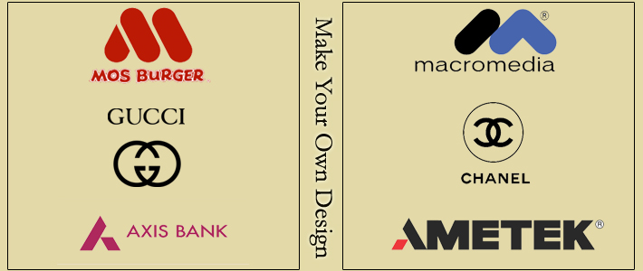
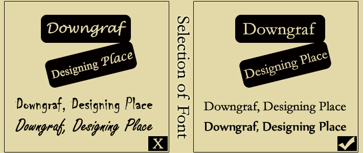
2. Selection of Font
Font selection matters a lot. Make sure that you have chosen the right font for the project. Don’t use more than two fonts as it will jumble up and in logo design mistakes this is one of the poorest to use. It would be difficult to make changes later because of too much fonts. Single font is best to apply in any logo. But if you want to use more than one type then use it in a way look suitable with each other.
Another thing, avoid deprived typeface as it can make or break message content. So, don’t use thick, clumsy, expected, cracked or ultra-thin fonts. Be cautious of kerning, sizing and spacing. Simpler is best. Simple font leave good and adequate impact as it is not easy to read but memorable too. So make sure that you have chosen the fine looking and easy readable font. Nike, FedEx, IBM, Visa and other famous’ brand can be seen for more clearing up.
3. Color and Special Effects
Many graphic designers think that color and special affect make logo sturdy. It’s absolutely wrong and false myth. I don’t believe that special effect and color can make your logo strong. Rather depend the way you design matter a lot in this case. First work with black and white, then add the colors and effects accordingly. You may be confused why I’m saying use color and special affect far ahead. Actually, special effect won’t help you out to emphasis on shape. You’ll be confused when designing. That’s why I am saying to avoid unnecessary shadows, bevels, filters and textures. Going for color or effects should be your second choice. Avoid embossing, drop shadows and other layer styles to polish your design as it will leave bad impact.
Smartest Apps For A Better iPhone 5 Experience
4. Raster VS Vector
Raster images are made out of pixels that cannot be scaled to any size. As a result, purpose of design would decease itself. I personally suggest you to create your logo in a vector graphic program so that it can be scaled to any size without losing its quality. It facilitates you to apply design in any other media as well. Adobe illustrator and Coral Draw are the best program for this purpose.

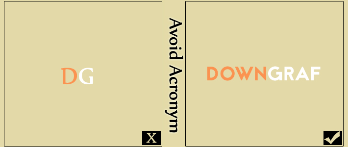
5. Avoid Acronym
In logo design mistakes, this mistake isn’t much common but few designer attempt to create logo by initializing it rather than giving complete name of product, brand, organization or website. Usually they do this to create hype. This concept is totally wrong and flop especially if you’re creating logo for the one who just start business or site. Remember, you need much time to build reliability to convey your planned message via that monogram. So, don’t use acronym at all. Let’s suppose, I write DG rather than Downgraf, it would be difficult for readers to understand the meaning of it. They will think DG stands for? Which kind of site, company or product is it? I mean readers will be confused by seeing acronym of DG. But after building trust, reliability and credibility among people, it won’t problematic for me at all to turn into abbreviation. I can freely shortening name then. GM, IBM and HP never started out as shortenings, they turned name into abbreviation after many years after publicity and experience.
6. Don’t Depend on Colors
I saw many designers who prefer to add color in their design. They rely on it which is completely wrong. Directly above I told you to make your logo in black and white color then go for color if needed. On t-shirts, books, magazines, stationary and some other places black and white color considered okay. I’ll suggest, adding colors must be your last choice. If you want to match color of logo with website or organization’s color scheme or want to represent anything then color can be used accordingly. Remember, selection of each color should be selected appropriately so logo can look fine and eye-catching. But if black and white look satisfactory then don’t need to add any color.
Designing for Impact: An Interview with Hannah Meng
7. Color Combination
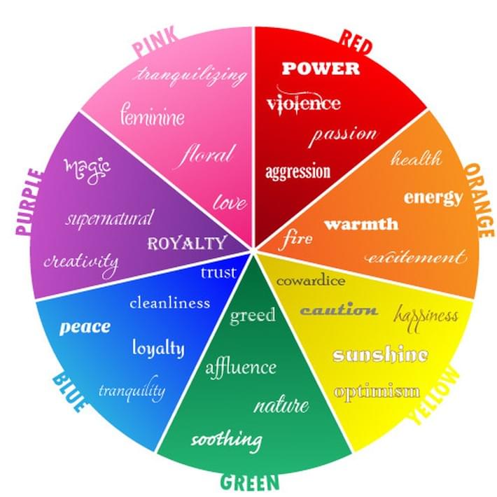
Color combination is compulsory in any design. Take care of color mixture when designing a logo. Design a logo according the color scheme site or organization has. But if it doesn’t suit, choose black and white color. As a designer, you must know about color combination. Choose the color look suitable and perfect. Pink color is more or less for girls, red and green considered for Christmas and green have a tendency to be eco-friendly companies, organization or sites. Match the color wisely by focusing on audience.
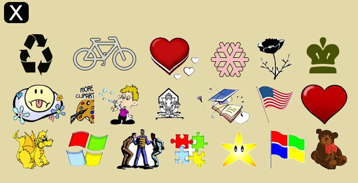
8. Using Clip Art
If you’re thinking of design a logo, using clip art can be a good idea. But I’ll say, avoid it to make logo design unique. Make your own symbol or mark to make design awesome and exclusive.
These are 08 logo design mistakes that can leave bad impression on your project. Honestly saying, these aren’t logo design mistakes but a guideline of designing a logo as well. If you take care of mentioned blunders, you’ll be able to design a perfect and awe-inspiring logo for you and your client as well. So, feel free to design and I wish you best of luck for your project of designing.
Most Valuable Firefox Addons for Web Developers