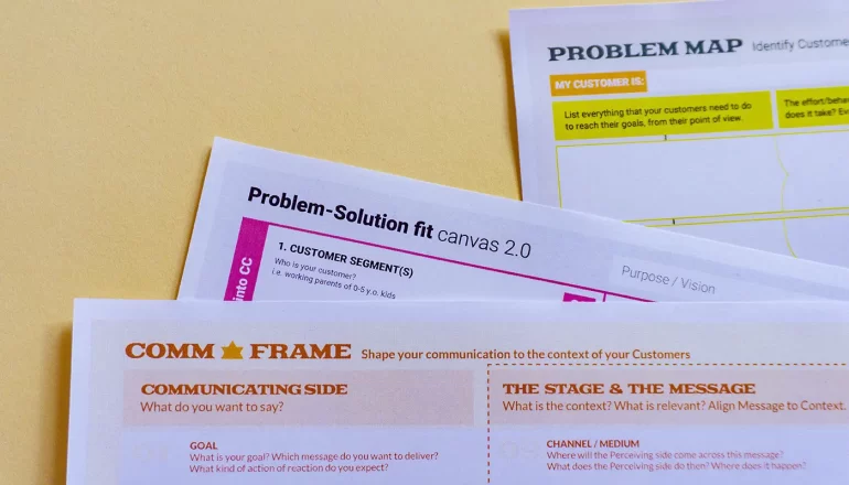
Anyone running a business needs to understand the best typing formats they can use for their everyday-use documents. Choosing the right typing format is an important task that requires careful consideration of factors such as purpose, compatibility, security, and accessibility. This article explores some business-related documents and what’s the best typing formats you can use on them.
What’s Document Formatting?
Document formatting refers to its presentation and general organization on a page. This format includes font choice, font size, use of bold and italics, spacing, margins, alignment, columns, indentation, and lists. A document with proper format is consistent in its look and easy to comprehend. Below, we’ll detail what styling and formatting you should strive for in the ones you use for your daily business operations.
Business Letters
A business letter must have certain parts to attain the required format. These parts should be in the order of sender’s address, date, recipient’s address, salutation, body, closing, enclosures, and typist initials.
Paying attention to the format and font when composing business letters is crucial. Block format is the style of business correspondence used most frequently. It’s important to write letters in this arrangement, except for the double space between paragraphs, which is left justified throughout.
Times New Roman in size 12 is the standard font for most letters. Always consider your audience when choosing a font. Use Times New Roman if you are addressing a conservative business. However, you have more font options if addressing a less restrictive business.
Logo Design Guidelines for a Better ResultMemo
Memos follow the basic rules of business writing. It is usually two pages, single-spaced, and justified to the left. Business writing should be clear and simple to comprehend; therefore, it is advantageous to use headings and sections to aid the reader in locating specific information.
Dividing the various parts of the memo so that the header takes up 1/8 of it is essential. In addition, the opening context should take up 1/4, and the summary and discussion section should take up 1/2. The closing segment and attachments can be the remaining 1/8 of the document.
Business Proposals and Reports
Most professional documents have lengthy sections that must be simple to scan. They should also show a clear organization all the way through. Serif typefaces are appropriate in this situation. Business proposals and reports should use the Garamond and Times New Roman letters in their format. Baskerville is used by some writers for business documents when they want to stand out a little from the leading fonts.
Color semiotics – how can they work for brands?The font sizes take both readability and available area into account. While digital papers must not be larger than 14, printed documents may have a maximum size of 12. The ideal font size for formal business proposal papers enables easy reading and avoids the appearance of an elevated tone.
Financial Statements
Delimiting what fonts financial statements should use can get tricky, as templates from various word processors tend to vary a lot on this. More often than not, it is an AOE typewriter typeface with slight modifications. The fonts are distinctive enough that some people claim that looking at them makes them think of money.
Contracts
A good contract font must be simple to read because of how lengthy these tend to be and how long lawyers and people generally spend reading them. In addition, the font should convey the importance of the content by being professional. Since contracts are legal papers, Sans Serif fonts often become the best option—either that one or the same font used in legal documents.
10 Web Design Trends You Should Know for 2014It’s also vital to consider the font size, particularly if someone with visual impairment will read the contract. Legal papers can come in various sizes, but the best choice is to use 14, which is easy to read and won’t look too large.
Flyers and Brochures
The font must be readable for the print work for flyers and brochures to avoid wasting paper. Verdana, Century Gothic, and Helvetica are the three fonts most frequently used for printed papers.
You can consider any of the options mentioned here when deciding on the best style for documents that require printing. Keep your identity in mind as you select the font. Many businesses adopt a special font to help recognize all their documents. To maintain the formatting, send the processed papers as PDFs or make sure the font you select is accessible on all computers.
How to Design Labels That Work for Your BusinessConclusion
Choosing the right document typing format for your business needs is crucial as it can affect your communication and workflow. Remember that you’re aiming for professionalism, efficiency, and effectiveness with proper formatting. Consider the type of document you are creating, the software and devices your audience uses, and the level of security and compatibility you require. Visit here if you need help securing document typing services from professionals. They will ensure your business operates with professionalism and keen attention to detail in all your formatting needs.


