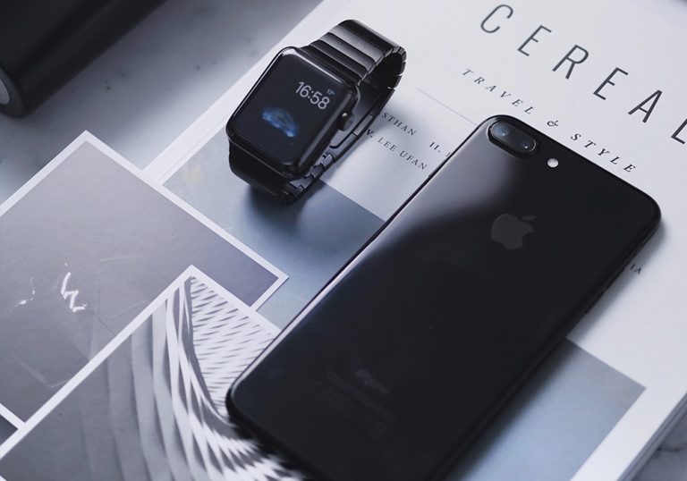
Launched in November globally, Apple’s special tenth anniversary smartphone – simply named the iPhone X – has not been the runaway success that the tech giant would have hoped for.
Despite some first-class reviews, the device has seemingly struggled to capture the public’s imagination with the company even reportedly taking the step to cut production due to weak demand, as Reuters reported on February 20th.
However, although its sale figures have not set the world alight, one thing the iPhone X has managed to do is reopen an age-old debate about which combination is the best – black text on a white background or white text on a black background? This is because both Apple aficionados and other commentators have spotted that switching the smartphone to its Smart Inverted Color mode and a black background actually has a practical use. As black pixels on an OLED display tend to apparently use less power, the mode means that precious battery life can be saved.
Going dark
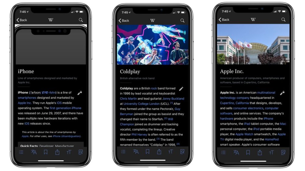
These types of “dark” or “night” modes have existed on devices for years, with Amazon’s Kindle range of e-readers often carrying the option to switch between a black and white background. In recent redesign work, YouTube also introduced a similar mode for use in low-lit areas, while Wikipedia recently jumped on the iPhone X’s capabilities by introducing its own “black mode” to its iOS app. Of course, all of this raises that classic question – does this mean that black is the, er, new black? Perhaps more succinctly, is it set to take white’s crown as the go-to background for graphical user interfaces like websites and apps. Frankly, should we all simply be turning to the dark side for inspiration?
Style more than substance?
As we have already touched upon, the debate has of course rumbled on for a great number of years, with early computer interfaces such as MS-DOS tending to operate with the classic combination of black background and white text. However, as technology evolved and GUIs have developed so too has the drive towards the opposite, perhaps to evoke in users the classic combination of writing black text on white paper. Ultimately there are many factors to the white vs black debate, with one of them simply being the issue of style.
Design Necropolis And Ways To Avoid Design Wastage
Take for example The New Digital School design we showed in our look at education websites, with the darker edge meaning its clean lines and clear layout shine with some bright lettering. Netflix has a similar style, with its simple dark background meaning that the colors of the wildly diverse avatars used to showcase its shows and films stand out. The international website of Mercedes-Benz and the US site for Jaguar also push this theme into the car world, with large, stylish imagery being displayed across its black backing. In that the use of darker colors can really work when sites are focused more on images it is displaying rather than large blocks of text.
A question of usability
However, as we all know, sadly style is not everything. With design, there is always the question of usability to consider, particularly when it comes to taking the leap and embracing black for the background of your website or app. To say this is a thorny issue is a bit of an understatement, with many people across the web arguing the merits of black and white backgrounds.
Tatham Oddie’s blog on the issue carries some interesting references to research on the issue, including a study which revealed that reading accuracy tended to be higher when people were viewing dark text on a light background. This is thought to be linked to many people having astigmatism and how a dark display can make the iris do more work and lead to issues in terms of focus. However, despite this information, it is worth noting that the same author added an update to this piece from 2008 around six years later, stating that accessibility issues had improved greatly across the years so his simple view was that people should just use the background which “makes them happy”. And perhaps, ultimately, he is right.
Setting Up and Running a Media Heavy WebsiteGreat design always wins
The iPhone X’s launch and the benefits of its inverted colors option is just the latest development to shine the spotlight on this long-running design and usability debate. However, with the device’s disappointing sales, it will be interesting to see whether this leads to a shift towards black backgrounds in general.
For now, the answer seems simple though. As with so many things in terms of art, graphic design and creativity, it seems that the only way to approach the issue of background color is simply to do what feels right to your product or creation. After all, surely it is the case that a well-designed and thought-out product will often win out, regardless of the color scheme it adopts.
Entertaining Moments that Make You Smile When You’re Fed up

