Like web design trends, the mobile trends have also become an ever fluctuating field. With evolving user behavior, users nowadays demand agile mobile experience. Thus, determining what to do and from where to begin can be a tricky question. While mobile designs include both websites and apps, there are several other aspects as well that must be considered while designing.
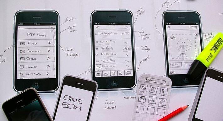
Designing for mobiles includes numerous complexities like a set of different screen sizes, aspect ratios, pixel densities, mobile platforms and more. Understanding the fact that designing for the entire ecosystem of mobile devices is not a child’s play, here is a list of the ultimate mobile design approaches that can help deliver a remarkable mobile design. Let’s uncover them.
1. Don’t Ask For Signups in the Beginning – For Enhanced Engagement
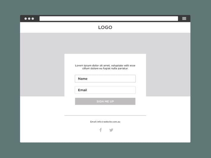
One of the greatest challenge that most of the mobile web developers and designers face is to create an intuitive and intriguing interface that can keep users engaged and captivate them to return back to the product. Asking your users to provide their details in the very beginning might leave them frustrated and in the worst case, your users will probably choose to abandon your product. Thus, it is advisable to incorporate forms and ask details only when they are necessary. This way, you can at least allow your users to explore the service and understand the product.
2. Implement Image Carousels
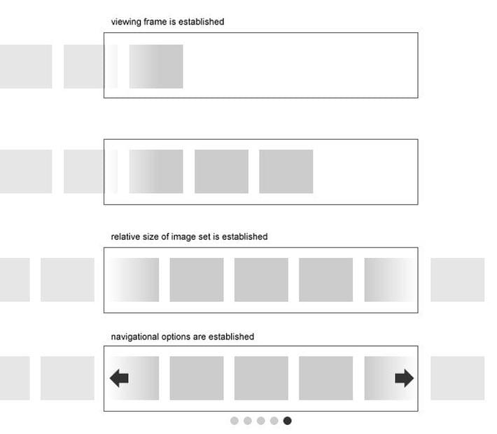
For those who are designing for an ecommerce site or any other service that can be leveraged by including images, image carousel offers a great choice. By implementing huge image carousels in mobile, you can dramatically improve the mobile experience. There are numerous advanced devices available in the market that feature high DPI screens. However, there are a few challenges involved. If you can efficiently overcome them, you can reap the benefits of quality mobile hardware’s and deliver a native look and feel.
- Optimizing performance: Since, most of the mobile devices are not powerful enough to render several objects in a row, inserting image carousels can ruin the overall performance. It can be handled appropriately by restricting the available inactive slides to consume any space on the web page. And most importantly, by making an optimal use of CPU resources, the performance can be substantially improved.
- Navigating between the images: The navigation issue can be efficiently resolved by creating a grid view from the carousel. This will certainly allow viewers to conveniently choose a suitable option and navigate through the carousel.
3. for Seamless and Consistent Experience
To ensure a smooth performance without any performance hiccups, the UI patterns offer a great help. By making their proficient use, you can heighten your design and its usability. As, UI patterns offer guidelines to facilitate users to seamlessly navigate and interact with the design, they play a vital role.
Morphing Modal Window Made of CSS and JQueryThere are several UI patterns for mobiles, including
- Dashboard Pattern: It organizes the icons in a grid format on the screen when a product (app/website) is launched on a mobile device. It offers top notch navigation and focuses over all the prime areas of the product.
- Ribbon Menu: It straight away launches users into the featured content and allow them to flawlessly navigate by offering navigation options in a menu. This menu slides in the screen from left when a screen is scrolled up.
- Action Bar: This intuitive design approach informs users about their current position and provide all the available options to conveniently navigate further.
4. Incorporate Alphabetic List
To create a native-like look and feel, you can consider attributes of native design while designing for the mobile web. For instance, you can think of integrating an alphabetic list that will add to native visual appeal while making the content intuitive and easily navigable. To allow a native functionality in web work in harmony with its native counterpart is not an easy pie. This can be efficiently accomplished by implementing a double carousel and iscroll.js (from the GitHub). By doing so, you will eventually get a desired alphabetic list within the list’s container, thereby not affecting the rest of the page content.
Tutorial: Create Retro logo Design With CSS3 LogoFinal Thought
Thoroughly go through the above mentioned mobile design techniques and create an outstanding mobile design. By making an appropriate choice and taking your business goals into account, you can ensure a great mobile UX.
Check Responsive Websites with Dimensions Toolkit