
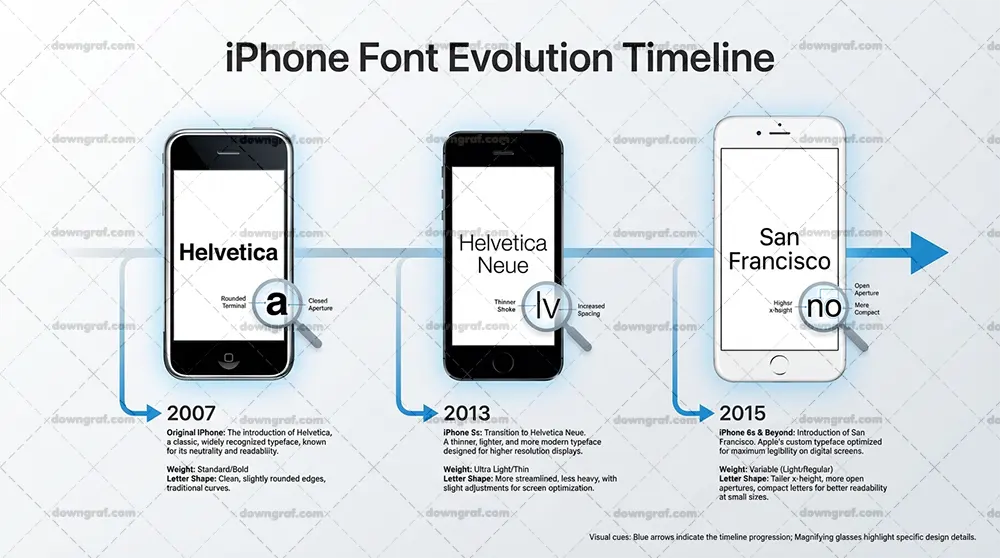
iPhones running iOS 9 or later use a typeface called San Francisco, which Apple distributes as SF Pro. Apple introduced it in 2015, and it has been the system font on every iPhone since — the text you see in Settings, Messages, the keyboard, notifications, and Control Center is all set in it. If you’ve seen older answers claiming iPhones use Helvetica Neue, those date back to iOS 7 and 8. Before that, iOS 1 through 6 used plain Helvetica, which is why answers to this question vary depending on when they were written.
Why Apple switched from Helvetica to San Francisco
San Francisco actually debuted on the Apple Watch in early 2015 before rolling out to the iPhone with iOS 9 that fall. Apple built it from the ground up for screens rather than adapting a print typeface, and the change addressed a few specific problems.
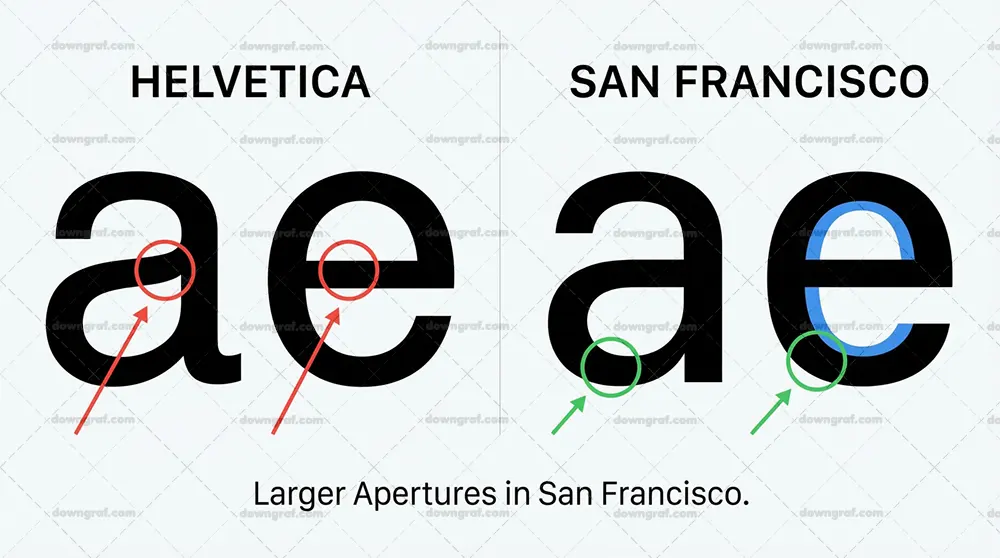
Helvetica, designed in 1957 for print, becomes cramped and harder to read at small sizes on high-density displays. San Francisco was drawn to stay legible at tiny sizes, with clearer letterforms and spacing tuned for screen rendering.
It also gave Apple a single typographic voice across the Watch, iPhone, iPad, and Mac, replacing the mix of fonts those devices used before. And it plugs directly into Dynamic Type, the iOS feature that lets apps scale text up or down to match the user’s preferred reading size — something the font was explicitly engineered to handle across a wide range of sizes.
Where SF Pro shows up — and where it doesn’t
SF Pro is everywhere in Apple’s own interface: system apps, menus, alerts, the lock screen, and the keyboard all use it. Any app built with Apple’s default typography settings gets SF Pro automatically, so a lot of third-party apps display it too, at least for their body text.
4G/LTE – RRC: Understanding the Master Information Block (MIB) and Its Transmission CyclesBut not everything on your screen is SF Pro. Apps are free to ship their own custom fonts, and many do for headlines, logos, or their entire interface. If you screenshot a branded app and the text looks nothing like the system font, you’re probably looking at a custom typeface — not something you can replicate by downloading SF Pro.
The SF family: Display, Text, Compact, Mono, and New York
“San Francisco” is really a family of related fonts, and knowing the variants helps you pick or identify the right one:
- SF Pro Text and SF Pro Display were originally two separate families — Text optimized for small body sizes, Display for large headlines — because letterforms need different spacing and proportions at different sizes. Apple has since streamlined them into a single SF Pro family that handles optical sizing automatically.
- SF Compact is a narrower variant designed for the Apple Watch, where screen space is scarce and letters sit close to the curved edge of the display.
- SF Mono is the monospaced version, used in developer contexts like Xcode and Terminal, where characters need to align in columns.
- New York is Apple’s companion serif typeface, introduced a few years later and used in apps like Apple Books. It’s a common source of confusion — if the iPhone text you’re trying to match has serifs, you’re looking at New York, not SF Pro.
Can you download and use SF Pro?
Yes, with a catch that matters for most people searching for this font. SF Pro is a free download from Apple’s developer fonts page, alongside SF Compact, SF Mono, and New York. You don’t need special software to install it.
What Font Does IG Use? A Comprehensive Guide to Instagram TypographyThe catch is the license. Apple allows the fonts to be used for designing and developing for its own platforms — iOS app interfaces, watchOS screens, macOS software, and the mockups for those products. It does not license SF Pro for websites, logos, Android apps, print materials, or general company branding.
Using it as your small business’s logo font or as the typeface on your website technically violates the license terms, even though the download itself is free.
If you want a similar look for projects outside Apple’s ecosystem, two safe substitutes come up repeatedly:
Looking For The BuyBest Alternative? Check Out Our Top Picks!- Inter is a free, open-source typeface widely regarded as the closest match to SF Pro’s clean, neutral style. It’s a popular default for modern websites and apps.
- Roboto is Google’s system font for Android and is free to use under an open-source license.
Neither is identical to SF Pro, but both capture the same general feel and carry no licensing restrictions.
How to identify a font in an app or screenshot
If you’re trying to match a specific typeface you’ve seen, a few practical approaches help:
Compare it to the system font. Open Settings on an iPhone and look at the text there. If your screenshot’s letterforms match, you’re dealing with SF Pro. If they differ noticeably — different proportions, serifs, or quirky letter shapes — the app is using something custom.
What is a Technology Business Incubator?Use a font identification tool. Services like WhatTheFont let you upload a screenshot and suggest matching typefaces. They’re not perfect, especially with small or low-resolution text, but they’re a solid starting point.
Look at distinctive letterforms. SF Pro and Helvetica are easy to confuse at a glance, but there are tells. SF Pro’s numeral “1” has a flat base serif, which Helvetica’s lacks. SF Pro also has a taller x-height — the lowercase letters sit larger relative to capitals — and slightly more compact letterforms overall. New York, again, gives itself away with serifs.
Check the product’s design specs. Many apps and websites publish style guides or brand guidelines that name their fonts, and design-focused write-ups of popular apps often mention typography choices. If the font matters enough to match precisely, a quick search for the product’s name plus “design system” or “typography” can save you a lot of guesswork.
The active document appears to have no editable sections available to me, so here are the 5 FAQs ready to paste at the end of the post. Each is pulled directly from the content already in your draft, so nothing new needs fact-checking.
FAQs
What font does the iPhone use? iPhones running iOS 9 or later use San Francisco, which Apple distributes as SF Pro. It has been the system font on every iPhone since 2015, appearing in Settings, Messages, the keyboard, notifications, and Control Center.
Did iPhones ever use Helvetica? Yes. iOS 1 through 6 used Helvetica, and iOS 7 and 8 switched to Helvetica Neue. Apple replaced it with San Francisco in iOS 9 because Helvetica, designed for print in 1957, becomes cramped and hard to read at small sizes on high-density screens.
Can I download SF Pro for free? Yes — SF Pro, along with SF Compact, SF Mono, and New York, is a free download from Apple’s developer fonts page. However, the license only covers designing and developing for Apple platforms. Using it for websites, logos, Android apps, or print materials violates the license terms.
What’s a good free alternative to SF Pro? Inter is widely considered the closest match to SF Pro’s clean, neutral style and is a popular default for modern websites and apps. Roboto, Google’s Android system font, is another free, open-source option with a similar feel.
Is New York the same font as SF Pro?
No. New York is Apple’s companion serif typeface, used in apps like Apple Books. If the iPhone text you’re trying to match has serifs, it’s New York — SF Pro is a sans-serif with no serifs.