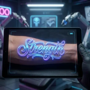

In 2026, the demand for authentic, human-touch typography has surged as a counter-movement to AI-generated uniformity. Cursive and handwriting fonts are no longer just for wedding invitations; they are essential tools for personal branding, “quiet luxury” marketing, and adding warmth to digital correspondence. While Microsoft Word comes pre-loaded with a few classics, the real magic happens when you expand your library with modern, high-quality scripts that mimic the natural flow of ink on paper.
This guide is a deep dive into the state of cursive typography in Microsoft Word for 2026. We will move beyond the overused Brush Script MT and explore sophisticated options that define current design trends. You will learn not just which fonts to use, but exactly how to install them on the latest Windows and macOS systems, how to pair them professionally, and how to ensure they display correctly for every reader.
Whether you are crafting a high-stakes certificate, a personal letter, or a professional portfolio, the right script font bridges the gap between digital efficiency and personal authenticity. Below, we detail the best native and downloadable options available today.
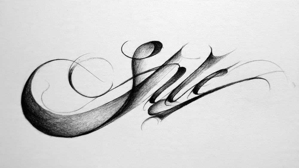
What are the best cursive fonts pre-installed in Microsoft Word?
Microsoft Word’s native font library has evolved, but a few staples remain the most reliable for immediate use without downloading extra files. These are universally available, ensuring that if you send a .docx file, the recipient will likely see exactly what you designed.
- Edwardian Script ITC: The gold standard for formal elegance in Word. It features elaborate capitals and a steep slant, making it perfect for wedding invitations or formal certificates. Pro Tip: Use at size 18pt or higher to keep the fine lines legible.
- Monotype Corsiva: A versatile calligraphic font that strikes a balance between readability and style. It is less ornate than Edwardian Script, making it suitable for softer professional headings or poetry.
- Lucida Handwriting: This is a casual, upright script that looks like neat penmanship. It lacks the connecting strokes of a true cursive, which actually makes it one of the most readable “handwritten” options for longer paragraphs.
- Segoe Script: A friendly, approachable font often used in casual notes. It has a marker-pen aesthetic that feels modern and less “historical” than the quill-style fonts.
- Brush Script MT: The classic heavy-stroke font. While iconic, it is often considered dated in 2026 design circles. Use sparingly, or strictly for retro/nostalgic projects.
Top 5 Formal Cursive Fonts for Certificates and Invitations
When the occasion demands gravitas—such as diplomas, awards, or gala invites—you need scripts that mimic traditional steel-nib calligraphy.
10 AI Game Generator Tools to Create Games Instantly- Edwardian Script ITC (Pre-installed)
- Kunstler Script (Pre-installed)
- Palace Script MT (Pre-installed)
- Great Vibes (Free download): A flowing, connecting script that is incredibly popular for its smooth loops.
- Allura (Free download): Clean, legible, and slightly less formal, making it great for modern wedding aesthetics.
Best Casual Handwriting Fonts for Personal Letters
For newsletters, journaling, or informal updates, these fonts simulate the “human touch” without looking messy.
- Caveat (Free download): A Google Font favorite in 2026. It has natural variations in letter height that make it look incredibly realistic.
- Shadows Into Light (Free download): A neat, rounded hand-print style that adds personality to headers.
- Segoe Script (Pre-installed): Reliable and clear for business-casual notes.
- Bradley Hand ITC (Pre-installed): A classic “marker” font, though best used for short annotations rather than full text.
How do I find and add new handwriting fonts to Word?
If the pre-installed options feel limiting, adding new fonts is the single best way to upgrade your document design. In 2026, the process is streamlined for both Windows 11 and macOS Sequoia.
Where to download high-quality free script fonts
- Google Fonts: The safest and most reliable source. All fonts here are open-source (free for commercial use). Look for the “Handwriting” category.
- Top Pick: Dancing Script (Playful and bouncy) or Pinyon Script (High-end luxury).
- DaFont: A massive archive with trending styles. Be careful to check the license button—many are “Free for Personal Use” only.
- Top Pick: Look for “Signature” or “Brush” categories for trending 2026 styles.
Step-by-Step: Installing OTF/TTF files on Windows and Mac
For Windows 11 (2026):
NVIDIA’s ‘Data-Sovereign’ Chip is the hardware star of Gartner 2026- Download the font file (usually a
.zip). - Right-click the folder and select Extract All.
- Locate the
.otfor.ttffile. - Crucial Step: Right-click the font file and select “Install for all users”.
- Note: If you just click “Install,” it may only save to your personal profile, causing Word (which is a system-wide app) to sometimes miss it.
- Restart Microsoft Word. The font will appear in your dropdown list.
For Mac (macOS Sequoia / Sonoma):
- Double-click the downloaded
.zipfile to expand it. - Double-click the
.otfor.ttffont file. - A preview window (Font Book) will open. Click the blue “Install” button.
- Troubleshooting: If Word doesn’t see it immediately, open “Font Book” from your Applications, find the font, and ensure it is not listed under “User” only. You can drag it to “Computer” to make it available system-wide.
- Restart Microsoft Word.
Which fonts look most like real handwriting in 2026?
Typography trends in 2026 have shifted toward “hyper-realism”—fonts that include “ligatures” (custom connections between specific letter pairs) to avoid the robotic, repetitive look of older fonts.
The ‘Quiet Luxury’ Trend: Elegant and Airy Scripts
“Quiet Luxury” in design means minimalism, fine lines, and plenty of white space. These fonts whisper rather than shout.
Your VPN Isn’t Hiding You from LLM Scrapers—It’s Training Them on Your Browsing Habits- Pinyon Script: A romantic, round-hand script that looks expensive. It pairs beautifully with wide-spaced sans-serifs.
- Monsieur La Doulaise: A highly decorative font with extreme loops. It mimics the intricacies of 18th-century couture invoices.
- Petit Formal Script: A very light, airy font that looks like a delicate dip-pen spiderweb. Perfect for high-end beauty branding or upscale event menus.
Artistic and Organic: Modern Brush and Ink Styles
The “Modern Brush” trend is about texture. These fonts look like they were painted with a brush pen or a dry marker.
- Alex Brush: A classic flowing brush script that remains legible.
- Rock Salt: A marker-style font that looks hasty and energetic—great for “rebel” branding or informal annotations.
- Kaushan Script: It feels unrefined and natural, retaining the “ink blot” texture of a real marker pen.
How can I make cursive fonts look professional in Word?
Using a script font requires more care than standard text. If you just type a whole paragraph in Edwardian Script, it will be unreadable.
Font Pairing Secrets: Combining Script and Sans-Serif
The golden rule of 2026 typography is contrast. Never use two script fonts together.
Can You Get Rich Off Stocks? Find Out Now!- The Luxury Pair: Pinyon Script (Header) + Montserrat Light (Body Text).
- The Modern Business Pair: Segoe Script (Signature/Accent) + Calibri or Arial (Body Text).
- The Wedding Pair: Great Vibes (Names) + Cinzel (Date/Location).
Adjusting Kerning and Spacing for Realistic Script Flow
Cursive fonts are designed to connect. If Word adds too much space between letters, the connection breaks, ruining the illusion.
- Highlight your script text.
- Press
Ctrl + D(Windows) orCmd + D(Mac) to open the Font dialog. - Go to the Advanced tab.
- Look at Spacing. Ensure it is set to “Normal.”
- Look at Kerning for fonts. Check the box and set it to “12 points” or higher. This forces Word to tuck letters closer together where necessary, ensuring the “tail” of an a connects perfectly to the n.
Troubleshooting: Why doesn’t my cursive font show up for others?
This is the most common issue with custom fonts. If you send your .docx file to a client who doesn’t have Great Vibes installed, Word will replace it with Times New Roman, destroying your design.
How to embed fonts in Word documents for sharing
Embedding saves the font file inside your Word document so it travels with the file.
- Go to File > Options (Windows) or Word > Preferences > Save (Mac).
- Select the Save tab on the left menu.
- Check the box: “Embed fonts in the file”.
- Optimization: Select “Embed only the characters used in the document” to keep the file size smaller.
- Save your document. Now, anyone opening it will see your custom handwriting font.
Saving as PDF: Preserving your custom typography
If the recipient doesn’t need to edit the file, always save as PDF. This “burns” the image of the font onto the page.
- Go to File > Save As.
- Choose PDF (*.pdf) from the dropdown menu.
- This guarantees your Quiet Luxury script looks 100% pixel-perfect on any device, including mobile phones where custom fonts almost never load.
Summary FAQ
Generally, no. Word Online (browser version) relies on cloud fonts. However, if you Embed the font in a desktop version file and upload it, it may display correctly, but you cannot install new custom fonts directly into the browser app.
This happens when the “Line Spacing” is set to a strict number (e.g., “Exactly 12pt”). Change your line spacing to “Single” or “1.15” to give the loops and flourishes room to breathe.
Yes. All Google Fonts are released under open-source licenses (usually OFL), meaning you can use them for invoices, logos, and books without paying a fee.