If you ask a professional web developer what is the most tiring part of his job, he will most surely point out towards the CSS framework. And if you enquire the same developer further, you will find out that his biggest nightmare is typography. Choosing the right font and presenting it in the prefect fashion is always the most difficult part of web designing. Twitter Bootstrap Framework cannot solve your problem of choosing the right font. But it can solve your problem of presenting it in a trendy fashion.
Every website is built on a HTML and CSS framework that most professional web developers create, very painstakingly, 100% from scratch. Building these custom frameworks however, consume a lot of time especially in properly arranging typographic elements such as line-height, font size, font-family, font color, border radius, margin, padding, and responsive media queries. The only way to speed up the web-development is to employ multiple teams of developers, but if your tools are not standardized, your website will develop a lot of inconsistencies.
While working at Twitter, Mark Otto and Jacob Thorton, also came face to face with the same problem in their organization. So what did they do to solve it? They created a set of prefabricated tools, arranged them in a comprehensive HTML, CSS, and JavaScript framework, named it as Twitter Bootstrap, and forever changed the way many developers now code their websites.
But then the question arises “How does bootstrap makes my typography simpler?” Answer is simple; Twitter Bootstrap accelerates your process of typography coding and web development as a whole. Prebuilt templates inside Bootstrap can take care of all your typographic needs, at least the presentation part, and allow you to focus on content and font selection.
Now before we go into details of bootstrap’s typographic components and elements, I would like to warn you first hand that this framework is not a complete cascading style sheet. You would have to create your own CSS that goes along with Bootstrap to get that unique look in your website. You must familiarize yourself with all the major Bootstrap classes and tags to use the framework in absolute manner.
Modern Technologies on WebsitesBootstrapping your layout
The first step in creating and using bootstrap typographic components is to create a layout in which these components will fit. Bootstrap comes with a responsive 12 column grid having a default grid length of 940px, which you can alter to create variable width layout. The grid can be rendered in a fixed layout or a fluid layout. You can even use a mixture of two but it will only create problems as you project evolves so try to avoid that. Depending upon the viewport this grid can adapt responsively to 724px and 1140px width. When the viewport dips below 767px, the columns become fluid and get stacked vertically.
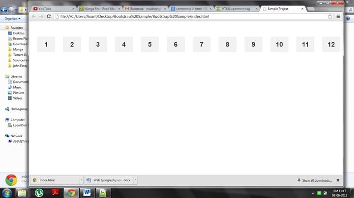
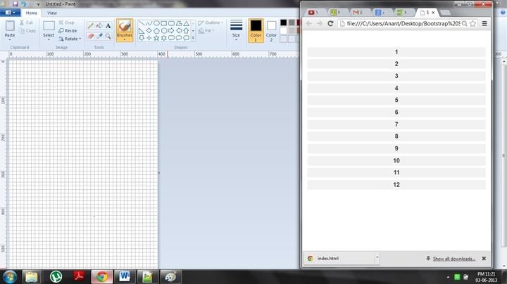
Bootstrap uses four main classes using which you can set your layout; row and container classes for creating fixed layout, and row-fluid and container-fluid classes for fluid layout. Most of the design elements that you will create would be nested in these classes. The length of each element can be defined using span1-12 class and the element can be placed at the desired position using offset1-12 classes.
Augmented Reality: What Is It and Examples of UseMajor Bootstrap Typographic components
The basic typographic details that you need to know about Bootstrap are that it uses 14px global font size, 20px line-height, and uses Helvetica Neue as the default font-family. If Helvetica Neue is not supported by the web browser, the default family switches to Helvetica, then Arial, and if none of these are present, then sans-serif takes over as the default font family.
Now with those basic points out of the way let’s take a look at the most awesome bootstrap design components
The Hero unit
Often you face a situation in which you have to create a design component that has really big text and distinctly highlight your content or product or image. This is especially useful for highlighting product or a promotional campaign on websites. Bootstrap has such a class for you that is called hero-unit. It comes with really large (60px large!!) h1 font size and 18px text font size. For this image example we have used btn-large bootstrap class.
The Design History behind the official Commonwealth Programmes[html]
Hero Unit: this is a big headings
I have a very awesome product that I wish to highlight with this big hero-unit style
[/html]
Protecting Your Privacy Online: Key Steps
Heading tags
I for one don’t like the default heading tags of html, and there are a lot of developers and designers who sympathize with me. Maybe some of them were behind the development of Bootstrap because it has different styles for h1-h6 heading tags. These tags are a little bigger than the default ones with sizes 38.5px, 31.5px, 24.5px, 17.5px, 14px, and 11.9px respectively,

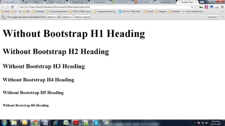
inherit the globally defined font-family and color, and are optimized to improve legibility.
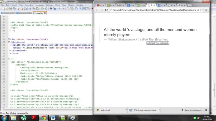
A special tag for quoting quotes
Bootstrap has a special tag to include quotes in an article or webpage, <blockquote>. This tag is especially useful for creating client testimonials or for highlighting some special quote in a post. The tag itself is very flexible and has special features for <small> and <cite> tags. Just wrap text around <blockquotes> tag and get a distinct quote block. In case you would like to include the source in your quote, wrap the source name in <small> tag and to include the source work, wrap it in <cite> tag. Moreover, you can also align your quote to the right by adding .pull-right class along with the blockquotes tag.
[html]
Love all, trust a few, do wrong to none.
William Shakespeare All’s Well That Ends Well
[/html]
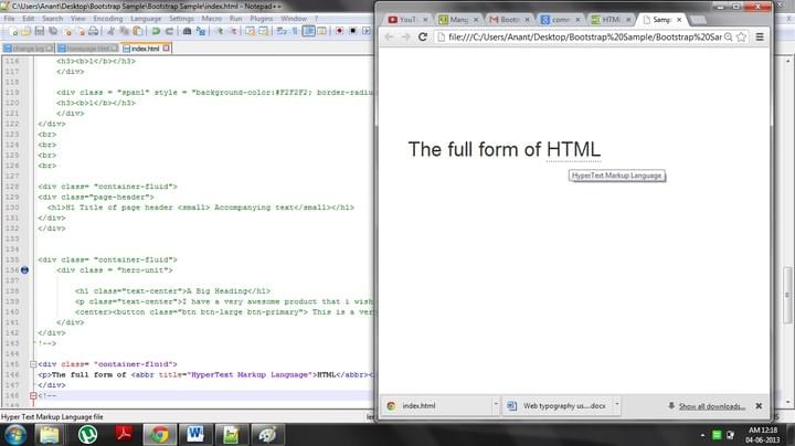
Abbreviating long words
When you have to write about technology or finance or anything with deep text bookish knowledge, you encounter a lot of abbreviations and long words. You have to include them but using short forms may confuse the first time readers. For cases such as these <abbr> tag in HTML was a god send. Bootstraphas custom styles for this tag also and has styled a unique class for it named as .initialism. In Bootstrap when you use <abbr> tag, a light dotted line comes under the abbreviated word and on hovering over the word the cursor changes to help cursor and of course you get to see the full form of the abbreviated word. You can use the class .initialism slightly reduce the font size of the expanded form.
[html]
The full form of HTML
[/html]
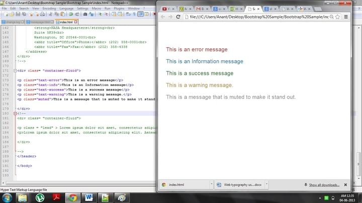
Classes to Emphasize the text
Bootstrap has some special styling for bold italics and small tags but they are not that different. You can use <strong>, <em>, and <small> tags freely and if you want you can even use <b><i> tags. You can also use the alignment tags <text-left>, <text-right>, and <text-center> to change the alignment of the text.
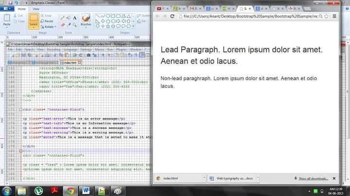
But what new Bootstrap has are special colorful Emphasis classes such as .muted, .text-warning, .text-error, .text-info, and .text-success. Here’s the effect that they give
[html]
This is an error message
This is an Information message
This is a success message
This is a warning message.
This is a message that is muted to make it stand out.
[/html]
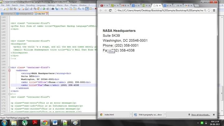
Styling for Address tags
The bootstrap also has some changes to the <address> tags. It has dropped the italics stylizations and offers a little different font, which you can change as per your requirements, and set the bootstrap specific margins and padding.
[html]
Phone: (202) 358-0001
Phone: (202) 358-4338
[/html]
Another special class to make your text stand out
The .lead class is another class that can give special style to you text. The class will change the font size to 21px and increase the font weight to 200. It’sespecially useful for styling first or leading paragraphs of an article, a trend followed by Smashing Magazine among others.
[html]
Lorem ipsum dolor sit amet, consectetur adipiscing elit. Aenean et odio lacus.
[/html]
Different types of list
For ordered and unordered lists, Bootstrap has no special styling but the difference is still noteworthy. The Bootstrap comes with 4 different types of lists such as unstyled, inline, description, and horizontal description. You can remove list-style properties and create unstyled lists using .unstyle class. Similarly you can create lists whose elements are displayed in the same line using .inline class.
Description lists can be created using the traditional <dl>, <dt>, and <dd> tags, though the CSS framework polishes the styling of these lists. In addition to this, you can use the dl-horizontal class that is specific to Bootstrap to create a description list in which the description and title goes side by side.
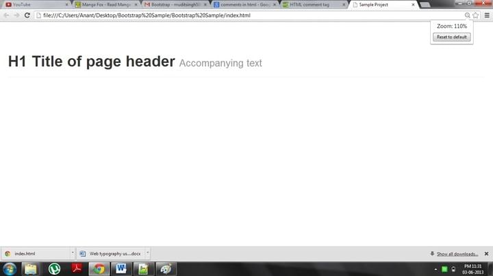
Stylized Page Headers
You can create a stylized page header using .page-header class of the Bootstrap. This class can be used to provide appropriate spacing between page elements or to distinguish one post from another in a single page. The component is best used in headings and in conjunction with h1 tags.
[html]
H1 Title of page header Accompanying text
[/html]
Tags for Displaying Code
This last component is for programmers and bloggers who wish to display code snippets in their HTML page. Bootstrap comes with <code> and <pre> tag that can stylize code that you wish to display on your blog or website. <pre> tag also comes with class named .pre-scrollable that allows you to attach a scroll bar to the code snippet.
Reshape the whole framework
As you may have noticed by now, bootstrap framework contains a lot of components and tools. Thus getting to know it perfectly may take some time. But for typography the most important variables that you need to know are @baseFontSize and @baseLineHeight that are present in a file named as ‘variable.less’. These variables define every line-height, margin and padding values used in the framework so by changing the value of these 2 variables you can change the entire scale of the framework’s typographic structure. But of course to do this you have to download the source files of Twitter Bootstrap and compile it yourself.
[divider_1px_bg]
Editor note: Contributor Ajeet Yadav , who’s associated with wordpressintegration.com, mostly writes about Convert Photoshop to WordPress Theme, WordPress Slicing and WordPress Theme integration. He holds sound knowledge of Content Management Systems as well as SEO. His blogs are known to be replete with information and detailed analysis. He is also interested in commenting about new and emerging strategies in this sphere.