
I am going to share best mobile emulators and RWD testing tools for your inspiration. Best tools that would be your preference to have for trying.
When creating a website, testing is one of the important part must designer should do. Although, it is very difficult to test website while creating a mobile and responsive web design on different devices and screen size because many designers don’t have them actually.
Check this tool for Download Instagram Photos and Download Instagram Video
But this is also necessary to check the website if it really look fine in all devices. A big issue. Isn’t it? Well, we’re going to resolve this issue by sharing this post. It has best mobile emulators and RWD testing tools that will facilitate you by providing the look as you’re testing in different devices with different sizes. So, mobile emulator and online testing tools can be used in order to check if site is responsive or not.
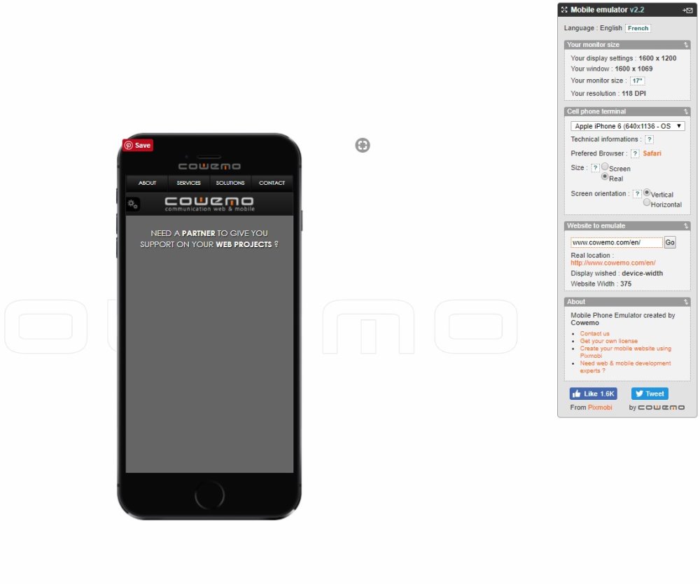
Pixmobi’s Mobile Phone Emulator
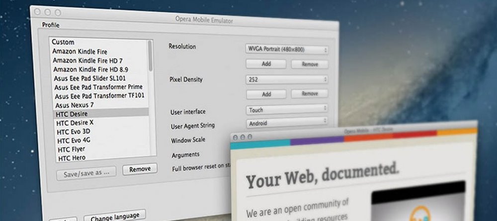
Opera Mobile Classic Emulator
Opera Mini is the world’s most popular web browser and is used by over 130 million users, so making sure your site looks good and works well on this browser is crucial. Opera Mini is used predominantly in emerging markets and often on feature phones, as opposed to smartphones. This means that navigation is performed with the keypad instead of a touchscreen, which this emulator allows you to test.
This emulator allows you to view your designs on 6 different phones, including the iPhone 4 and HTC HD 2. You can set the orientation of the device and even share the chosen configuration via email to remind yourself or a colleague of any bugs you might find. The emulator also tells you the default browser used by the devices as well as some useful technical information, such as the screen size in pixels and inches.
jQuery CDNJSMatt Kersley’s Responsive Design Tool

Matt Kersley, web designer and developer, has created a simple tool for testing responsive web designs. The emulator displays your site in 5 sizes: small phone, iPhone, small tablet, iPad portrait and iPad landscape.
Screenfly
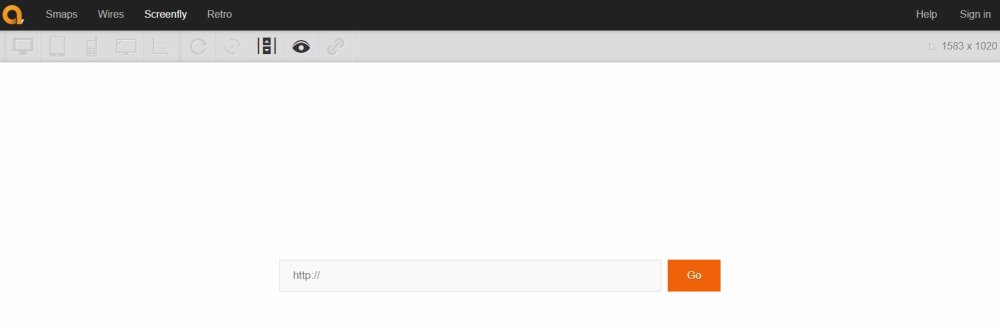
Screenfly by QuirkTools is a nice little responsive emulator with a choice of 25 devices and screen sizes, including 5 kinds of tablet.
Responsive Px
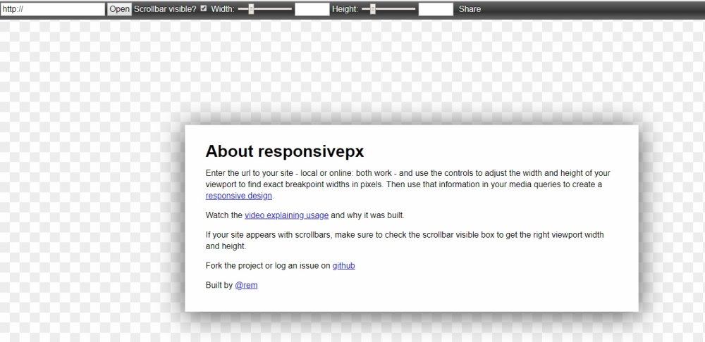
Responsivepx is a responsive emulator which helps you to find the breaking points in your designs so you can alter your media queries accordingly. You can change the test screen size pixel by pixel to see exactly where the problems in your site occur and it gives you the option to add or remove scrollbars too.
Make Your Own Background with Free Background GeneratorsiPad Peek

iPad peek is a simple iPad emulator. Although it does show Flash elements in tested websites, which do not render on actual iPads, so be aware of this when using it.
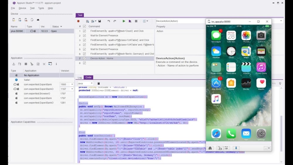
Appium Studio
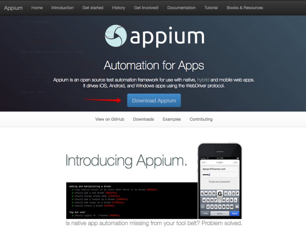
Appium
We hope you find these tools useful. If you know of any more that we have left out then please let us know in the comments and we will add them.
15 Fresh & Useful Resources for Web Designers and Developers