Logo design that succeeds in capturing the public’s imagination and builds brand awareness is much like capturing lightning in a bottle. Coca-Cola haven’t spent anything at all on logo design this year,
whereas BP’s most recent project reportedly cost something in the ballpark of $211 million dollars. Many of the more costly polygon logo designs become objects of derision, while cheaper, more minimal efforts often end up being iconic with a long shelf-life to their aesthetic and popular appeal. While trends in calligraphy logo creation often come and go, some leave a lasting mark on the schools of graphic design and calligraphy that will go on to inform logo creation in the future. For designers, it’s vital to keep abreast of the changing fashions of logo design, not least to keep on the good side of clients, as a frequent criticism of logo creation is that the finished product feels out of date. The best logos set trends instead of following them, and one of the dangers of following the latest logo fad is that a particular aesthetic can become saturated and therefore fail to stand out from the market. Let’s look at some of the better trends to have emerged of late.
Animation and Movement
This trend is picking up traction for a few reasons. Firstly, it provides the capacity for effects and animations without making a website grind to a halt. Previous web design informed by Flash animations had its place, but overuse often proved damaging to conversions. Moving logos go well with parallax effects if you want your work to look more interesting and eye-catching. Another useful aspect of this is that you can pair a moving logo on digital mediums with a static one for physical materials, such as the Intel logo.
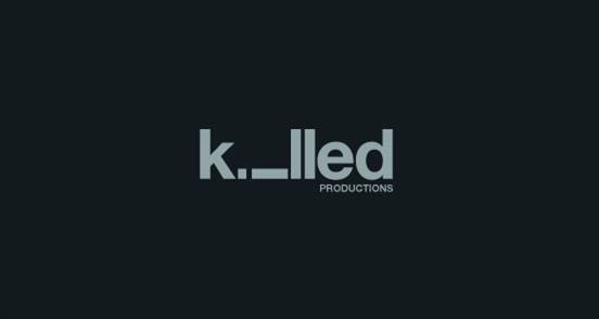
Letter Breaking
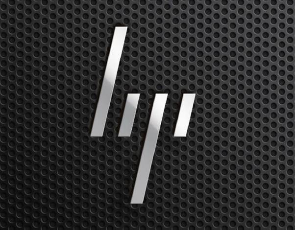
One of the earliest examples of this, the HP logo, took years to catch on but may have proved ahead of the curve. Today, the examples of this online casino uk design are everywhere, providing evidence of a shift to more modern design ideas in logo creation, and it leaves room for creativity while still maintaining the fundamentals of the brand.
Variegated Meanings
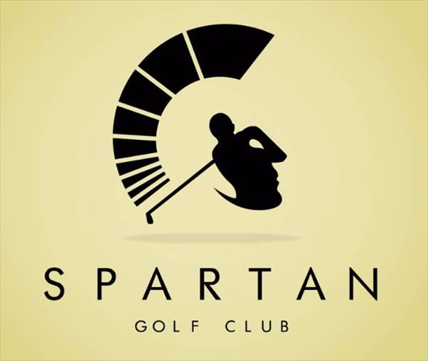
These pack creativity into fun logos with what can effectively be described as a visual pun that will be pleasing to the customers and can give a little more intellectual weight to a design. Check out the double meaning of the above logo and how the visual double-entendre relates to the brand name and business content.
Hand Drawings
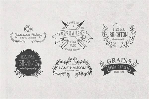
These provide a nice effect of paired down minimalism added with a human touch to logo design. While some of this retro logo design inspiration can venture too far into a desperate ploy for authenticity, if used well, they can help humanise a brand.
Weekly Logo Design Inspiration # 25Negative Space
![]()
Using a monochrome palette where the design itself forms a smaller part of the larger whole can actually focus the viewer’s attention more effectively on the brand itself and draw the eye more effectively to the key aspects of a design.
10 Basic Tips About Responsive Design – InfographicIf It Ain’t Broken
![]()
Some companies, particularly more established ones, can make themselves stand out by not going with the flow. In the world of changing design trends, Guinness opted for a slightly more modernised version of their traditional harp logo that helps convey the historic legacy of the brand to great effect.