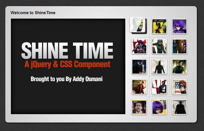
Addy Osmani shows us how you can create a kick-ass animated Shine Effect with jQuery & CSS3 and then use it to create your very own Shiny Gallery ‘ShineTime’. This effect is useful in making your user interface elements look like they’re a real polaroid photo (or made of glass) and the best part is, it’s not that difficult to achieve.
You’ll also learn today how you can successfully use layering in your designs to give your gallery that extra bit of detail that can make it stand out from the others. Whilst I’m going to leave it to David Walsh to provide you with galleries full of Christina Ricci photos, today’s component includes a set of pictures from the movie ‘Kick-Ass’ for no other reason than because ; )
The Animated ‘Shine’ Effect
The idea behind a Shine Effect is to give your graphics the appearance of being on a glossy surface that have just had a light beam pass over them. This can make them appear to be made of glass and can increase the visual experience your end users see.
JQuery Responsive Portfolio PluginBefore we get into any code, lets go through the basic concepts behind the effect. We want to pass a light-beam (in this case an image simulating a shine) past our image when the user hovers over it. Now because I wanted to style up today’s gallery so that each thumbnail appeared to float out of it’s container, the steps to achieving the below animation are as follows:
- Change the margins of the thumbnail element so that it floats away from it’s container
- Set the background-position of your “shine” graphic to be –1 * (it’s total width)
- Animate your background-position to value of the total width. Effectively we’re hiding the gloss off-stage and then animating it across the image.
How to Make a List in Python


