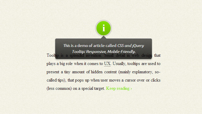
Tooltip is a splendid invention. Small detail in web design that plays a big role when it comes to user experience. Usually, tooltips are used to present a tiny amount of hidden content (mainly explanatory, so-called tips), that pops up when user moves a cursor over or clicks (less common) on a special target.
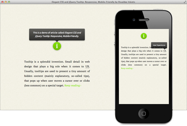
Osvaldas Valutis built a Responsive tooltip using CSS and jQuery. It relies on a maximum width value when viewed on large screens, adopts to narrow environments and picks the best viewable position relatively to the target. It’s mobile-friendly. It pops up when a call-to-action button is tapped and disappears when tapped on the tooltip itself.
Key Features:
[list style=”1″ underline=”1″]
Top 10 Free jQuery Map Plugins You Can Use- It’s responsive. It relies on a maximum width value when viewed on large screens, adopts to narrow environments and picks the best viewable position relatively to the target (top, bottom; left, center, right);
- It’s mobile-friendly. It pops up when a call-to-action button is tapped and disappears when tapped on the tooltip itself;
- It’s HTML formatting capable. Need to write some words in italic or so? No problem, this will work out.
[/list][margin_15b]
How To Implement
- Put the CSS code anywhere in existing CSS file or create a new one. You can also insert it in HTML file in head by wrapping the code with
<style>and</style>tags. - Put the JavaScript code in existing JS file or create a new one. You can also insert it in HTML file inhead or, better, body by wrapping the code with
<script>and</script>tags. - Assign the attribute
rel="tooltip"andtitle="Enter your tip here"to any of body tags in HTML file where you want the tooltip to pop up when called. Set title value with your tip (use<strong>,<em>etc. to distinguish text fragments, but avoid block elements).
Also, be sure that you already have jquery library included.