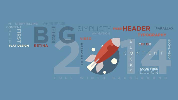
2013 saw the advent of some amazingly exciting web designs. Some turned out to be fads but some have stayed and have become the trends for the year 2014. The year is already underway and has been making use of the last years trendsetters in a big way. Let us take a gander at the 10 web designs that you should follow to make your website flourish are highlighted below.
Flat design
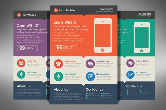
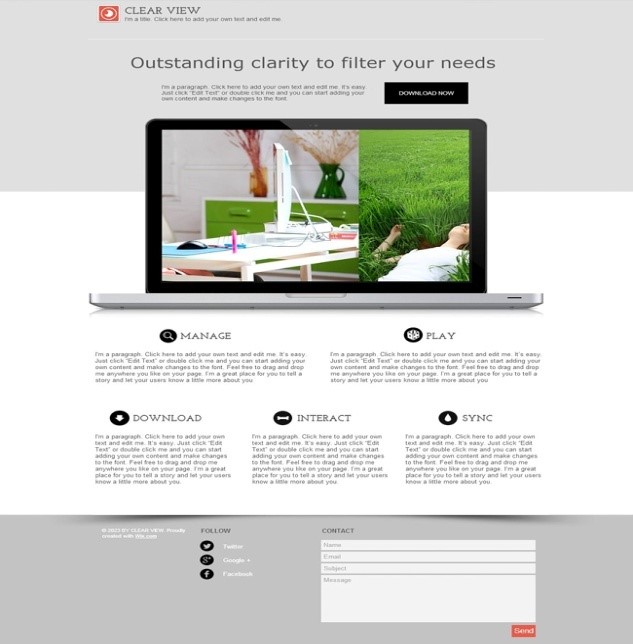
Flat UI is the hottest trend in web designing at the moment. With flat design, there is less clutter and the designers can use white space more to enhance the user experience. Initially many people thought it to be a fad, but they have been proved wrong. Big companies like Apple too are following flat design now. They dropped skeuomorphism for a flat design incorporated in their iOS7. CSS3 integration in Flat UI gives designers freedom to build flatter buttons by making use of text shadows, natural shadows or rounded corners. Gmail, Facebook all use a flat design. Less is more seems to be the trend. Follow it!
Responsive design
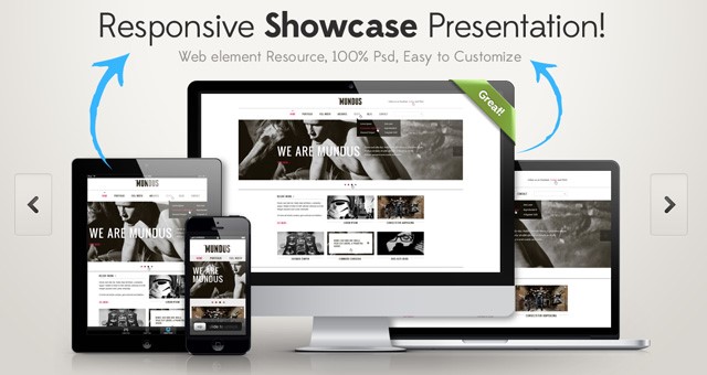
Responsive web design means a design that makes your website functional on both mobile and desktop. A responsive design makes the website work effortlessly on all the screen sizes. It is important as users of handheld devices are growing day by day. By developing a responsive design, web designers ensure that all the relevant data is present on a handheld device besides offering an enjoyable user experience. Currently, responsive magento themes are a big hit and are used widely by ecommerce businesses.
Harnessing the Momentum of Synergy to Achieve Digital SuccessMobile first design
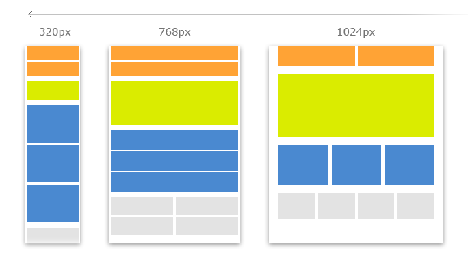
As discussed earlier, the number of people accessing web through their mobile devices is increasing rapidly. Things like log-ins, email subscriptions, social media incorporation and many more features have made the access easier on mobile devices. Hence, a site must be functional on mobile devices. This enables building client base for any business. Ignoring this facet can prove suicidal. Smartphone and tablet use is on the rise, it only makes sense to build a mobile first design.
Typography
Typography is no more a boring job for designers as the likes of Arial, Georgia, Times New Roman, Helvetica have given way to new and stylish typography. Web fonts have undergone a sort of evolution with so many choices that have come up with the development of mobile apps. These days the designers can have fun while designing a website and keep it artistic and professional at the same time. A font with personality is what the designers call it. It implies a design that is beautiful, artistic yet is different and highly professional. Individuality is the new trend in typography and many designers are using it in logos and websites. Also, larger fonts are trendy and user-friendly.
Navigation
The focus is more on rolldowns and icons and shrinking navigation as the user scrolls down. with more mobile first designs, there is a requirement of condensed navigation. Fixed navigation ensures that when the user scrolls down to check the whole homepage, the navigation remains fixed at the top so as to provide access to the rest of the site. A Mega navigation menu is growing in popularity as this contains huge amount of content and links.
Is Digital Art Really Art?Long Scrolling
With swipe becoming more commonplace with tablets and smartphones, long scrolling has made a comeback. It involves CSS3 and HTML5 for keeping the cost low and rev up the feel of the site. Also we will see more of horizontal scrolling, parallax scrolling, column-based scrolling and infinite scrolling in 2014. Parallax scrolling adds a new life to the images and text on the website by changing animations and graphics in order to show up as you scroll down a page.
Color scheme
In 2014, more and more websites will adopt the simple color scheme. Many sites launched recently have made very little use of color. The ongoing trend is to use white, black and then add a tint of some other color like red to add some drama. Even if more colors are used, the focus is more on selecting the right mix can to provide an impact and it works perfect with a flat design. Monochromatic colors are also in the trend.
How to Stop Telemarketers from CallingInfographics
Infographics have been in trend for quite some time now. A lot of websites use it for enhancing the visual representation of the website. They are mostly used for explaining any generic content in an interesting manner. They can be used to display statistics, causes and effects. It involves use of bold color schemes, typography and shapes to engage the onlookers.
Simple rich content
People want quick information. Therefore short, crisp content is the trend and will rule the web designing except for blog posts, 250 words is the norm. Along with this the content should be fresh and unique to engage the readers. A rich content combines the right amount of text, video, images, interactive functionality and just the right amount of scrolling. Have a look at some websites and apps. They have no text and depend on icons and images to deliver the information. Text is also provided in the form of video by a few websites.
jQery plug-ins
jquery plugins are free open source and aid in writing smoother javascript codes with lesser lines and also less clutter. Presently their demand is on the rise. The designers are using it big time.
These are the top 10 web designing trends and are here to stay. You can also try different layouts and web apps to amplify the visual effect. Employ them and make your website a success!